---
title: "Resultados"
---
```{r}
#| echo: false
pacman::p_load(knitr, digest, stargazer, sjPlot, codebook, summarytools, dplyr, tidyr,
tidyLPA, lme4, ggplot2, ggeffects, skimr, table1, patchwork, here, kableExtra, ggthemes, tidyverse,
ggbreak, texreg, coefplot)
options(scipen = 999)
```
```{r}
#| echo: false
base_madre <- readRDS("../../../input/data/proc_data/base_madre.rds")
socio <- readRDS("../../../input/data/proc_data/df_socio.rds")
psico <- readRDS("../../../input/data/proc_data/df_psico.rds")
trabajo <- readRDS("../../../input/data/proc_data/df_trabajo.rds")
educa <- readRDS("../../../input/data/proc_data/df_parvularia.rds")
antropo <- readRDS("../../../input/data/proc_data/df_antropo.rds")
```
```{r}
#| echo: false
base_madre <- base_madre %>%
filter(cohorte %in% c(2021, 2022, 2023, 2024))
```
## Análisis centrado en estudiantes
Esta sección tiene como objetivo presentar los principales resultados de la investigación. En primer lugar, se ilustran resultados descriptivos a nivel de Facultad y luego se detalla por carrera. Posteriormente, se exponen las asociaciones entre las notas y las variables sociodemográficas más relevantes (sexo, colegio de procedencia, nivel socioeconómico). Tercero, se analiza la relación entre las notas univesitarias y los resultados de la prueba de admisión a la educación superior. Por último, se estiman modelos de regresión para observar qué variables son más determinantes en las calificaciones de las/los estudiantes.
### Descriptivos
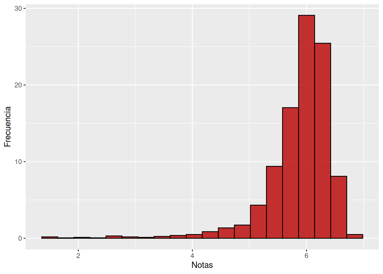
```{r}
ggplot(base_madre, aes(x = promedio_calculado)) +
  geom_histogram(
    aes(y = after_stat(count / sum(count) * 100)),
    position = "identity",
    bins = 20,
    alpha = 0.8,
    color = "black",
    fill = "#b90000"
  ) +
  labs(
    x = "Notas",
    y = "Frecuencia"
  )
table1(~promedio_calculado, data=base_madre)
```
```{r}
#| echo: false
calcular_stats <- function(notas) {
paste0(
round(mean(notas), 1), " ± ",
round(sd(notas), 1),
" [", round(min(notas), 1), "-", round(max(notas), 1), "]"
)
}
tabla_desc <- base_madre %>%
group_by(carrera, cohorte) %>%
summarise(
Promedio = round(mean(promedio_calculado, na.rm = TRUE), 1),
DE = round(sd(promedio_calculado, na.rm = TRUE), 1),
Min = round(min(promedio_calculado, na.rm = TRUE), 1),
Max = round(max(promedio_calculado, na.rm = TRUE), 1),
Estadisticas = paste0(
Promedio, " (DE = ", DE, ") [", Min, "–", Max, "]"
),
.groups = "drop"
) %>%
select(carrera, cohorte, Estadisticas) %>%
pivot_wider(names_from = cohorte, values_from = Estadisticas)
# Agrupar por Carrera y Año, calcular estadísticas
tabla_desc %>%
arrange(carrera) %>%
knitr::kable(
format = "html",
caption = "Estadísticas descriptivas del promedio por carrera y cohorte",
align = "lcccc"
) %>%
kableExtra::kable_styling(
bootstrap_options = c("striped", "hover", "condensed"),
full_width = FALSE
) %>%
kableExtra::row_spec(0, bold = TRUE) %>%
kableExtra::column_spec(1, bold = TRUE, width = "4cm") %>%
kableExtra::collapse_rows(columns = 1, valign = "top")
```
### Asociación de nota y variables sociodemográficas
#### Género
```{r}
#| echo: false
tabla_promedios <- base_madre %>%
mutate(
sexo = factor(
sexo,
levels = c(0, 1),
labels = c("Hombre", "Mujer")
)
) %>%
group_by(carrera, sexo) %>%
summarise(
promedio = mean(promedio_calculado, na.rm = TRUE),
.groups = "drop"
) %>%
pivot_wider(
names_from = sexo,
values_from = promedio
) %>%
mutate(across(where(is.numeric), ~ round(.x, 2)))
```
```{r}
#| echo: false
#| label: tbl-gen
#| fig-cap: Promedios por carrera según género
#| fig-cap-location: top
tabla_promedios %>%
arrange(carrera) %>%
kable(
format = "html",
align = c("l", "c", "c"),
col.names = c("Carrera", "Hombre", "Mujer")
) %>%
kable_styling(
bootstrap_options = c(
"striped", # filas alternadas
"hover", # efecto al pasar el mouse
"condensed", # reduce espacio vertical
"responsive" # adapta a pantallas pequeñas
),
full_width = FALSE,
position = "center",
font_size = 14
)
```
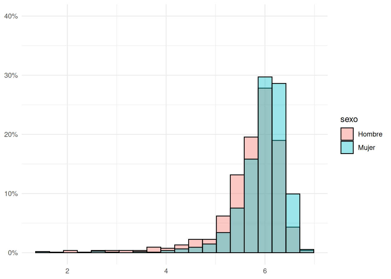
```{r}
#| echo: false
#| label: fig-hist-gen
#| fig-cap: Distribución de notas en FACSO según género
#| fig-cap-location: top
ggplot(base_madre, aes(x = promedio_calculado, fill = sexo)) +
geom_histogram(
aes(y = after_stat(count / tapply(count, group, sum)[group] * 100)),
position = "identity",
bins = 20,
alpha = 0.4,
color = "black"
) +
scale_y_continuous(labels = scales::percent_format(scale = 1),
limits = c(0, 40)) +
scale_fill_discrete(labels = c("0" = "Hombre", "1" = "Mujer")) +
labs(x = NULL, y = NULL) +
theme_minimal()
```
```{r}
#| echo: false
a <- ggplot(socio, aes(x = promedio_calculado, fill = sexo)) +
geom_histogram(
aes(y = after_stat(count / tapply(count, group, sum)[group] * 100)),
position = "identity",
bins = 20,
alpha = 0.4,
color = "black"
) +
scale_y_continuous(labels = scales::percent_format(scale = 1),
limits = c(0, 40)) +
scale_fill_discrete(labels = c("0" = "Hombre", "1" = "Mujer")) +
labs(title = "Sociología",
x = NULL, y = NULL) +
theme_minimal()
```
```{r}
#| echo: false
b <- ggplot(psico, aes(x = promedio_calculado, fill = sexo)) +
geom_histogram(
aes(y = after_stat(count / tapply(count, group, sum)[group] * 100)),
position = "identity",
bins = 20,
alpha = 0.4,
color = "black"
) +
scale_y_continuous(labels = scales::percent_format(scale = 1),
limits = c(0, 40)) +
scale_fill_discrete(labels = c("0" = "Hombre", "1" = "Mujer")) +
labs(title = "Psicología",
x = NULL, y = NULL) +
theme_minimal()
```
```{r}
#| echo: false
c <- ggplot(antropo, aes(x = promedio_calculado, fill = sexo)) +
geom_histogram(
aes(y = after_stat(count / tapply(count, group, sum)[group] * 100)),
position = "identity",
bins = 20,
alpha = 0.4,
color = "black"
) +
scale_y_continuous(labels = scales::percent_format(scale = 1),
limits = c(0, 40)) +
scale_fill_discrete(labels = c("0" = "Hombre", "1" = "Mujer")) +
labs(title = "Antropología",
x = NULL, y = "Porcentaje") +
theme_minimal()
```
```{r}
#| echo: false
d <- ggplot(educa, aes(x = promedio_calculado, fill = sexo)) +
geom_histogram(
aes(y = after_stat(count / tapply(count, group, sum)[group] * 100)),
position = "identity",
bins = 20,
alpha = 0.4,
color = "black"
) +
scale_y_continuous(labels = scales::percent_format(scale = 1),
limits = c(0, 40)) +
scale_fill_discrete(labels = c("0" = "Hombre", "1" = "Mujer")) +
labs(title = "Educación Parvularia",
x = NULL, y = NULL) +
theme_minimal()
```
```{r}
#| echo: false
e <- ggplot(trabajo, aes(x = promedio_calculado, fill = sexo)) +
geom_histogram(
aes(y = after_stat(count / tapply(count, group, sum)[group] * 100)),
position = "identity",
bins = 20,
alpha = 0.4,
color = "black"
) +
scale_y_continuous(labels = scales::percent_format(scale = 1),
limits = c(0, 40)) +
scale_fill_discrete(labels = c("0" = "Hombre", "1" = "Mujer")) +
labs(title = "Trabajo Social",
x = NULL, y = NULL) +
theme_minimal()
```
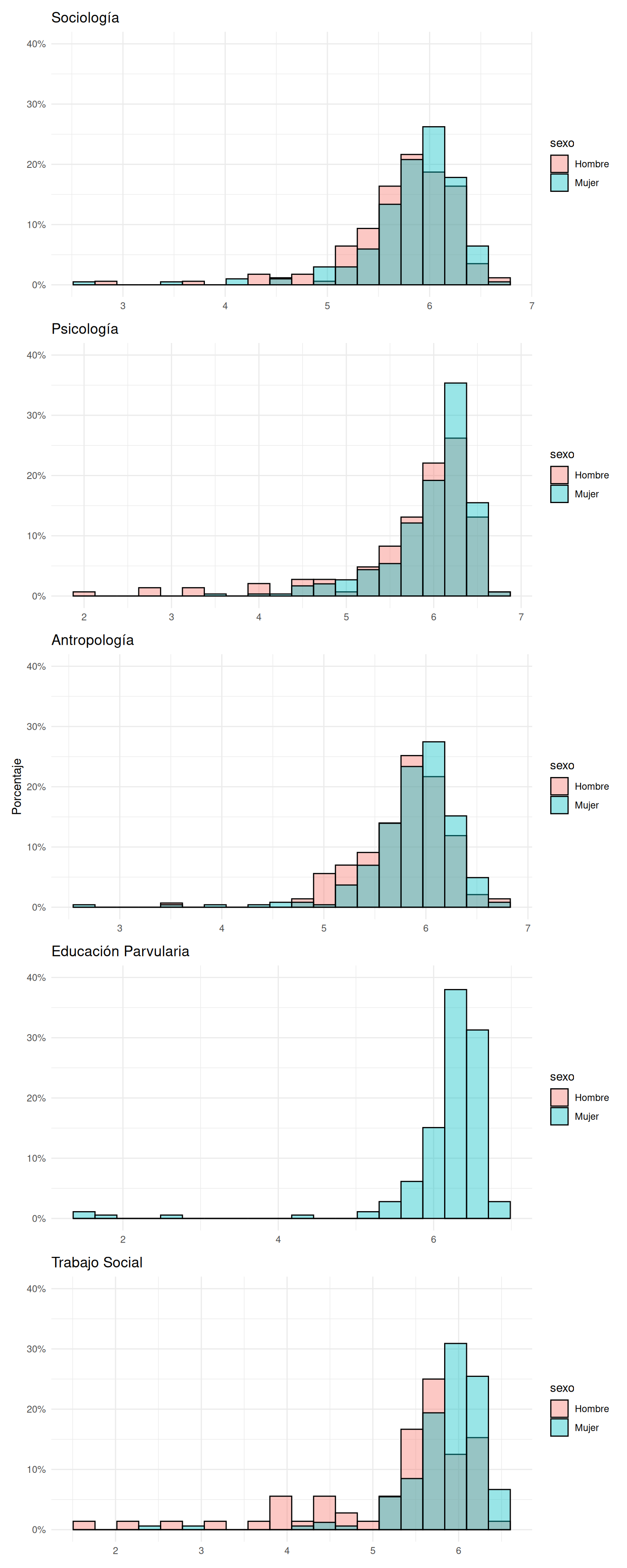
```{r}
#| echo: false
#| label: fig-hist-carreras
#| fig-cap: Distribución de notas por carrera según género
#| fig-cap-location: top
#| fig-height: 20
#| fig-width: 8
a / b / c / d / e
```
```{r}
#| echo: false
promedios <- base_madre %>%
group_by(cohorte, sexo) %>%
summarise(
promedio = mean(promedio_calculado, na.rm = TRUE),
.groups = "drop"
)
```
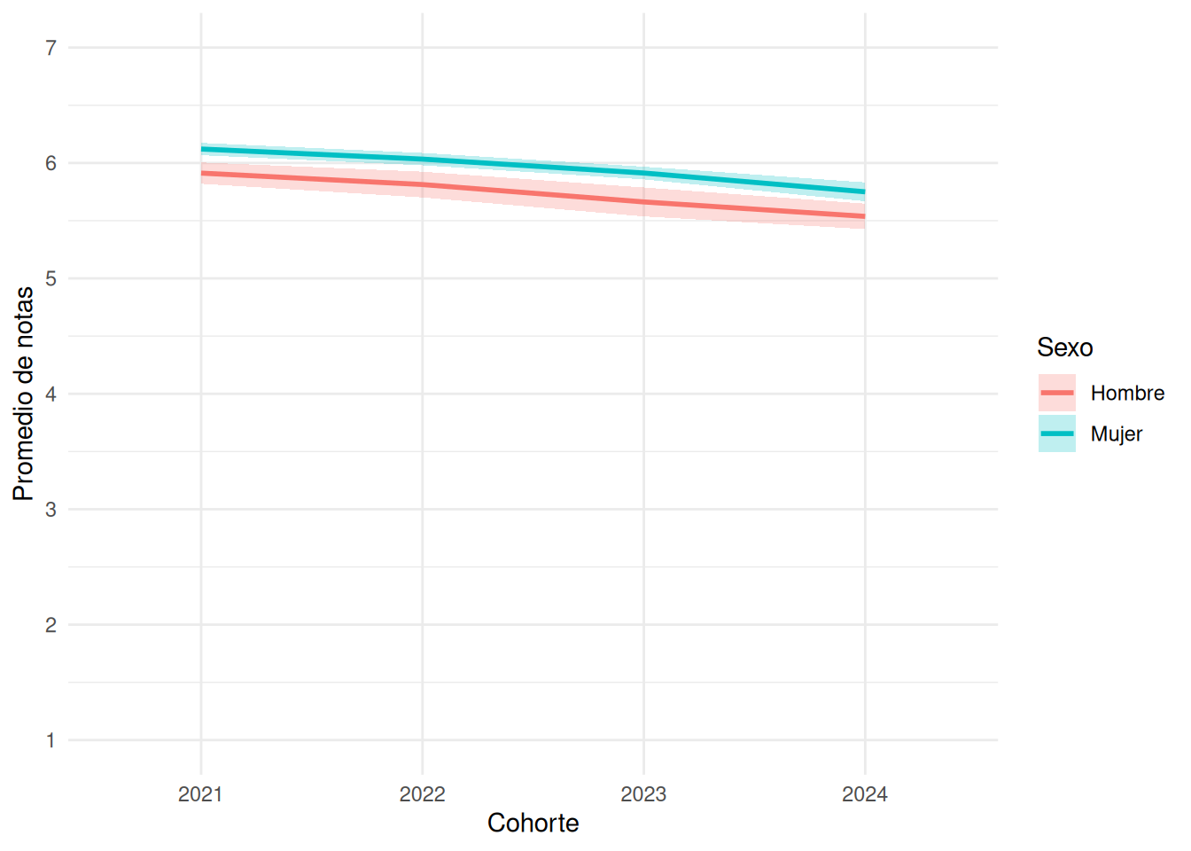
```{r}
#| echo: false
#| label: fig-gen-year
#| fig-cap: Promedios por año según género
#| fig-cap-location: top
promedios_ic <- base_madre %>%
group_by(cohorte, sexo) %>%
summarise(
media = mean(promedio_calculado, na.rm = TRUE),
se = sd(promedio_calculado, na.rm = TRUE) / sqrt(n()),
.groups = "drop"
)
ggplot(promedios_ic,
aes(x = cohorte,
y = media,
group = sexo,
color = sexo,
fill = sexo)) +
geom_line(linewidth = 1) +
geom_ribbon(
aes(ymin = media - 1.96 * se,
ymax = media + 1.96 * se),
alpha = 0.25,
color = NA
) +
scale_y_continuous(
limits = c(1, 7),
breaks = 1:7
) +
scale_color_discrete(
labels = c("0" = "Hombre", "1" = "Mujer")
) +
scale_fill_discrete(
labels = c("0" = "Hombre", "1" = "Mujer")
) +
labs(
x = "Cohorte",
y = "Promedio de notas",
color = "Sexo",
fill = "Sexo"
) +
theme_minimal()
```
#### Tipo de colegio
```{r}
#| echo: false
tabla_promedios_col <- base_madre %>%
filter(!is.na(colegio)) %>%
group_by(carrera, colegio) %>%
summarise(
promedio = mean(promedio_calculado, na.rm = TRUE),
.groups = "drop"
) %>%
pivot_wider(
names_from = colegio,
values_from = promedio
) %>%
mutate(across(where(is.numeric), ~ round(.x, 2)))
```
```{r}
#| echo: false
#| label: tbl-notas-col
#| fig-cap: Promedios por carrera según colegio
#| fig-cap-location: top
tabla_promedios_col %>%
arrange(carrera) %>%
kable(
format = "html",
caption = "Promedio de notas por carrera y tipo de colegio",
align = c("l", rep("c", ncol(tabla_promedios_col) - 1))
) %>%
kable_styling(
bootstrap_options = c(
"striped",
"hover",
"condensed",
"responsive"
),
full_width = FALSE,
position = "center",
font_size = 14
)
```
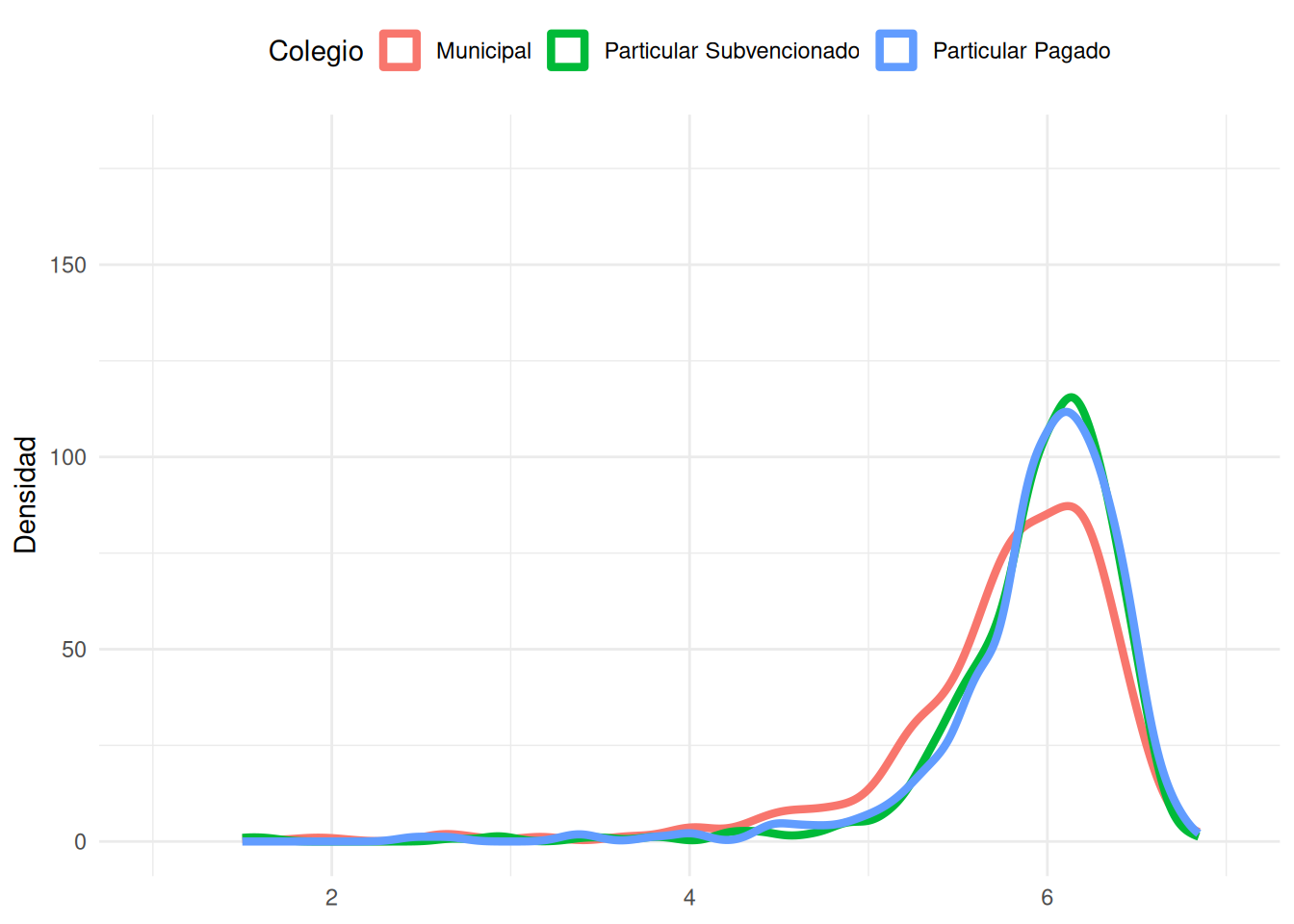
```{r}
#| echo: false
#| label: fig-den-facso
#| fig-cap: Distribución de notas en FACSO según colegio
#| fig-cap-location: top
ggplot(base_madre %>% filter(!is.na(colegio)),
aes(x = promedio_calculado, fill = colegio, color = colegio)) +
geom_density(aes(y = after_stat(density) * 100),
alpha = 0, linewidth = 1.5) +
coord_cartesian(xlim = c(1,7), ylim = c(0, 180)) +
labs(
x = NULL, y = "Densidad",
fill = "Colegio", color = "Colegio") +
theme_minimal() +
theme(legend.position = "top")
```
```{r}
#| echo: false
aa <- ggplot(socio %>% filter(!is.na(colegio)),
aes(x = promedio_calculado, fill = colegio, color = colegio)) +
geom_density(aes(y = after_stat(density) * 100),
alpha = 0, linewidth = 1.5) +
coord_cartesian(xlim = c(1,7), ylim = c(0, 180)) +
labs(title = "Sociología",
x = NULL, y = "Densidad",
fill = "Colegio", color = "Colegio") +
theme_minimal() +
theme(legend.position = "top")
```
```{r}
#| echo: false
ab <- ggplot(psico %>% filter(!is.na(colegio)),
aes(x = promedio_calculado, fill = colegio, color = colegio)) +
geom_density(aes(y = after_stat(density) * 100),
alpha = 0, linewidth = 1.5) +
coord_cartesian(xlim = c(1,7), ylim = c(0, 180)) +
labs(title = "Psicología",
x = NULL, y = "Densidad",
fill = "Colegio", color = "Colegio") +
theme_minimal() +
theme(legend.position = "top")
```
```{r}
#| echo: false
ac <- ggplot(antropo %>% filter(!is.na(colegio)),
aes(x = promedio_calculado, fill = colegio, color = colegio)) +
geom_density(aes(y = after_stat(density) * 100),
alpha = 0, linewidth = 1.5) +
coord_cartesian(xlim = c(1,7), ylim = c(0, 180)) +
labs(title = "Antropología",
x = NULL, y = "Densidad",
fill = "Colegio", color = "Colegio") +
theme_minimal() +
theme(legend.position = "top")
```
```{r}
#| echo: false
ad <- ggplot(educa %>% filter(!is.na(colegio)),
aes(x = promedio_calculado, fill = colegio, color = colegio)) +
geom_density(aes(y = after_stat(density) * 100),
alpha = 0, linewidth = 1.5) +
coord_cartesian(xlim = c(1,7), ylim = c(0, 180)) +
labs(title = "Educación Parvularia",
x = NULL, y = "Densidad",
fill = "Colegio", color = "Colegio") +
theme_minimal() +
theme(legend.position = "top")
```
```{r}
#| echo: false
ae <- ggplot(trabajo %>% filter(!is.na(colegio)),
aes(x = promedio_calculado, fill = colegio, color = colegio)) +
geom_density(aes(y = after_stat(density) * 100),
alpha = 0, linewidth = 1.5) +
coord_cartesian(xlim = c(1,7), ylim = c(0, 180)) +
labs(title = "Trabajo Social",
x = NULL, y = "Densidad",
fill = "Colegio", color = "Colegio") +
theme_minimal() +
theme(legend.position = "top")
```
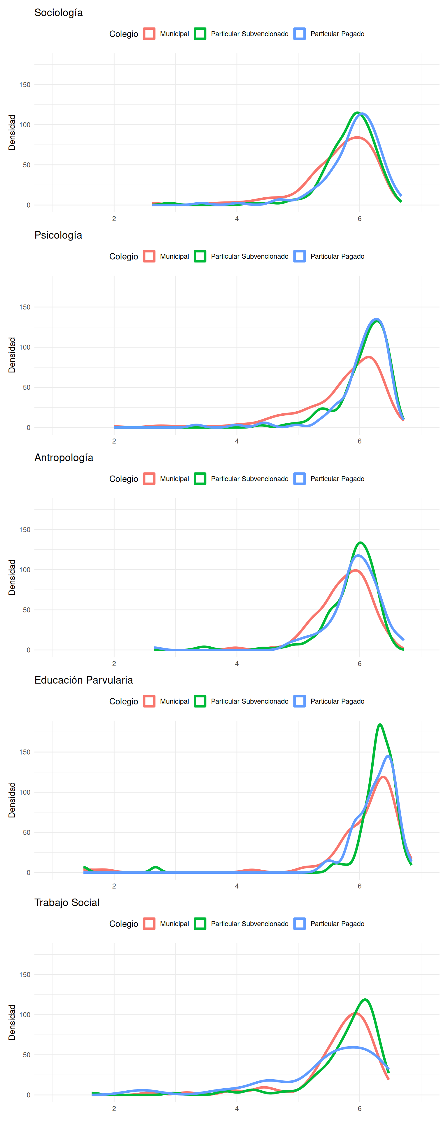
```{r}
#| echo: false
#| label: fig-dens-carreras
#| fig-cap: Distribución de notas por carrera según tipo de colegio
#| fig-cap-location: top
#| fig-height: 20
#| fig-width: 8
aa / ab / ac / ad / ae
```
```{r}
#| echo: false
promedios_ic_col <- base_madre %>%
filter(!is.na(colegio)) %>%
group_by(cohorte, colegio) %>%
summarise(
media = mean(promedio_calculado, na.rm = TRUE),
se = sd(promedio_calculado, na.rm = TRUE) / sqrt(n()),
.groups = "drop"
)
```
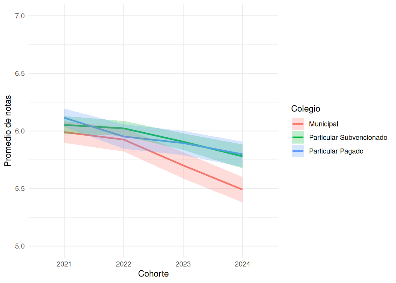
```{r}
#| echo: false
#| label: fig-time-col
#| fig-cap: Promedios por año según tipo de colegio
#| fig-cap-location: top
ggplot(promedios_ic_col,
aes(x = cohorte,
y = media,
group = colegio,
color = colegio,
fill = colegio)) +
geom_line(linewidth = 1) +
geom_ribbon(
aes(ymin = media - 1.96 * se,
ymax = media + 1.96 * se),
alpha = 0.25,
color = NA
) +
coord_cartesian(ylim = c(5, 7)) + # Zoom en la región de interés
scale_y_continuous(breaks = seq(5, 7, 0.5)) +
labs(
x = "Cohorte",
y = "Promedio de notas",
color = "Colegio",
fill = "Colegio"
) +
theme_minimal()
```
#### Nivel socioeconómico
```{r}
tabla_promedios_nse <- base_madre %>%
  filter(!is.na(nse)) %>%
  group_by(carrera, nse) %>%
  summarise(
    promedio = mean(promedio_calculado, na.rm = TRUE),
    .groups = "drop"
  ) %>%
  pivot_wider(
    names_from = nse,
    values_from = promedio
  ) %>%
  mutate(across(where(is.numeric), ~ round(.x, 2)))
```
```{r}
#| echo: false
#| label: tbl-notas-nse
#| fig-cap: Promedios por carrera según nivel socioeconómico
#| fig-cap-location: top
tabla_promedios_nse %>%
arrange(carrera) %>%
kable(
format = "html",
align = c("l", rep("c", ncol(tabla_promedios_nse) - 1))
) %>%
kable_styling(
bootstrap_options = c(
"striped",
"hover",
"condensed",
"responsive"
),
full_width = FALSE,
position = "center",
font_size = 14
)
```
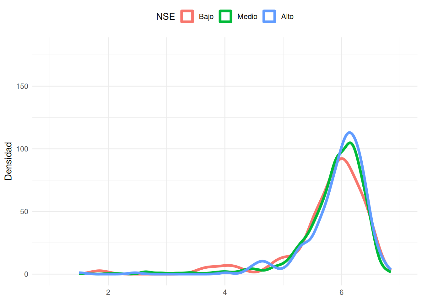
```{r}
#| echo: false
#| label: fig-dens-nse
#| fig-cap: Distribución de notas en FACSO según nivel socioeconómico
#| fig-cap-location: top
ggplot(base_madre %>% filter(!is.na(nse)),
aes(x = promedio_calculado, fill = nse, color = nse)) +
geom_density(aes(y = after_stat(density) * 100),
alpha = 0, linewidth = 1.5) +
coord_cartesian(xlim = c(1,7), ylim = c(0, 180)) +
labs(
x = NULL, y = "Densidad",
fill = "NSE", color = "NSE") +
theme_minimal() +
theme(legend.position = "top")
```
```{r}
#| echo: false
ba <- ggplot(socio %>% filter(!is.na(nse)),
aes(x = promedio_calculado, fill = nse, color = nse)) +
geom_density(aes(y = after_stat(density) * 100),
alpha = 0, linewidth = 1.5) +
coord_cartesian(xlim = c(1,7), ylim = c(0, 180)) +
labs(title = "Sociología",
x = NULL, y = "Densidad",
fill = "NSE", color = "NSE") +
theme_minimal() +
theme(legend.position = "top")
```
```{r}
#| echo: false
bb <- ggplot(psico %>% filter(!is.na(nse)),
aes(x = promedio_calculado, fill = nse, color = nse)) +
geom_density(aes(y = after_stat(density) * 100),
alpha = 0, linewidth = 1.5) +
coord_cartesian(xlim = c(1,7), ylim = c(0, 180)) +
labs(title = "Psicología",
x = NULL, y = "Densidad",
fill = "NSE", color = "NSE") +
theme_minimal() +
theme(legend.position = "top")
```
```{r}
#| echo: false
bc <- ggplot(antropo %>% filter(!is.na(nse)),
aes(x = promedio_calculado, fill = nse, color = nse)) +
geom_density(aes(y = after_stat(density) * 100),
alpha = 0, linewidth = 1.5) +
coord_cartesian(xlim = c(1,7), ylim = c(0, 180)) +
labs(title = "Antropología",
x = NULL, y = "Densidad",
fill = "NSE", color = "NSE") +
theme_minimal() +
theme(legend.position = "top")
```
```{r}
#| echo: false
bd <- ggplot(educa %>% filter(!is.na(nse)),
aes(x = promedio_calculado, fill = nse, color = nse)) +
geom_density(aes(y = after_stat(density) * 100),
alpha = 0, linewidth = 1.5) +
coord_cartesian(xlim = c(1,7), ylim = c(0, 180)) +
labs(title = "Educación Parvularia",
x = NULL, y = "Densidad",
fill = "NSE", color = "NSE") +
theme_minimal() +
theme(legend.position = "top")
```
```{r}
#| echo: false
be <- ggplot(trabajo %>% filter(!is.na(nse)),
aes(x = promedio_calculado, fill = nse, color = nse)) +
geom_density(aes(y = after_stat(density) * 100),
alpha = 0, linewidth = 1.5) +
coord_cartesian(xlim = c(1,7), ylim = c(0, 180)) +
labs(title = "Trabajo Social",
x = NULL, y = "Densidad",
fill = "NSE", color = "NSE") +
theme_minimal() +
theme(legend.position = "top")
```
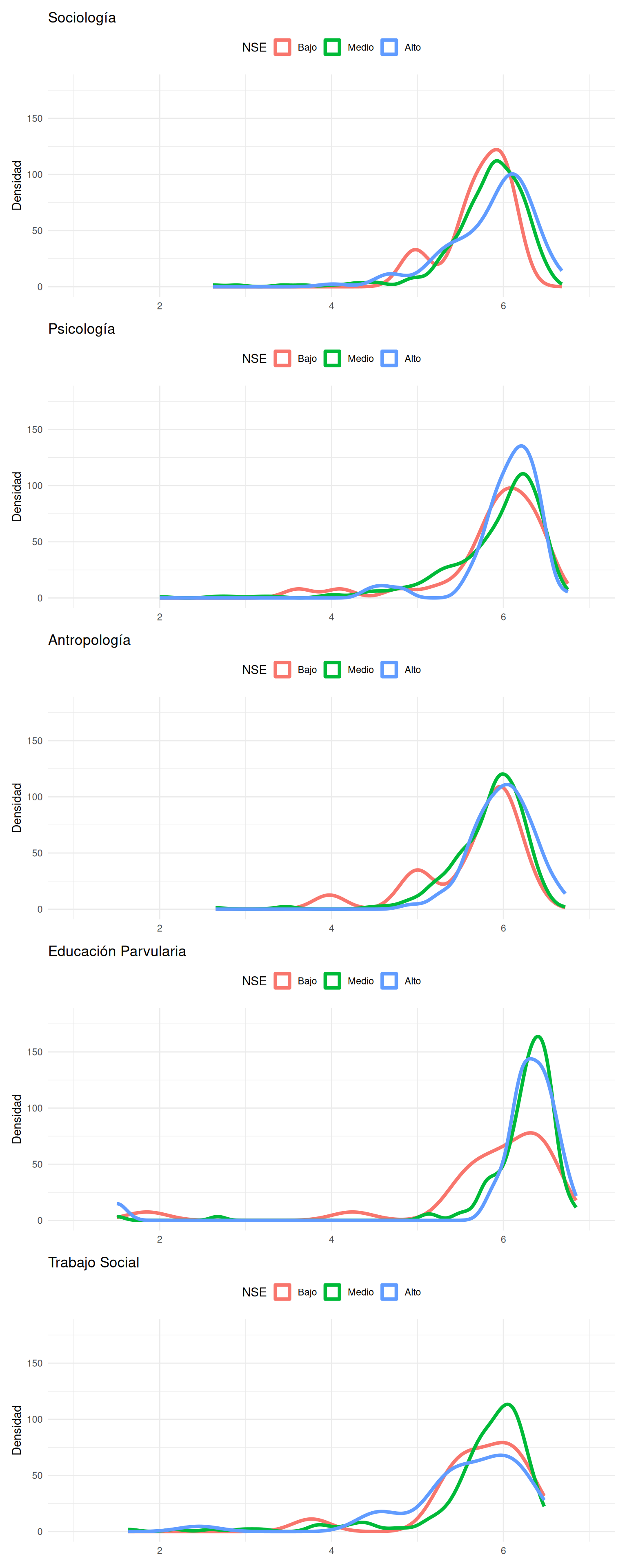
```{r}
#| echo: false
#| label: fig-dens-carreranse
#| fig-cap: Distribución de notas por carrera según nivel socioeconómico
#| fig-cap-location: top
#| fig-height: 20
#| fig-width: 8
ba / bb / bc / bd / be
```
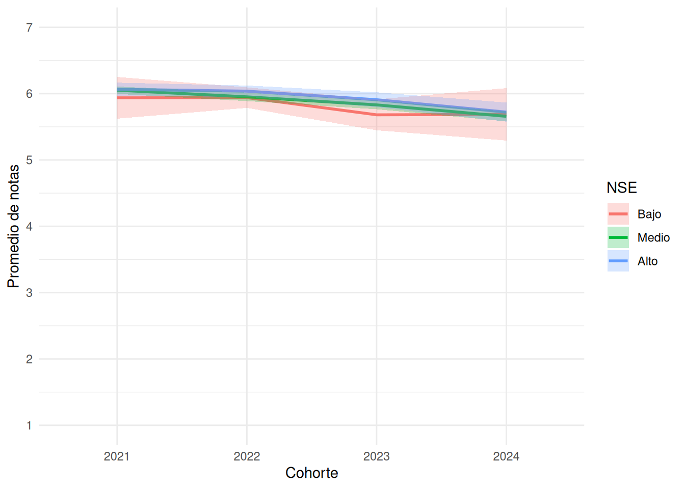
```{r}
promedios_ic_nse <- base_madre %>%
  group_by(cohorte, nse) %>%
  summarise(
    media = mean(promedio_calculado, na.rm = TRUE),
    se = sd(promedio_calculado, na.rm = TRUE) / sqrt(n()),
    .groups = "drop"
  )

nse_break <- ggplot(promedios_ic_nse,
       aes(x = cohorte,
           y = media,
           group = nse,
           color = nse,
           fill = nse)) +
  geom_line(linewidth = 1) +
  geom_ribbon(
    aes(ymin = media - 1.96 * se,
        ymax = media + 1.96 * se),
    alpha = 0.25,
    color = NA
  ) +
  scale_y_continuous(
    limits = c(1, 7),
    breaks = 1:7
  ) +
  scale_color_discrete(
    labels = c("1" = "Bajo", "2" = "Medio", "3" = "Alto")
  ) +
  scale_fill_discrete(
    labels = c("1" = "Bajo", "2" = "Medio", "3" = "Alto")
  ) +
  labs(
    x = "Cohorte",
    y = "Promedio de notas",
    color = "NSE",
    fill = "NSE"
  ) +
  theme_minimal()

nse_break
```
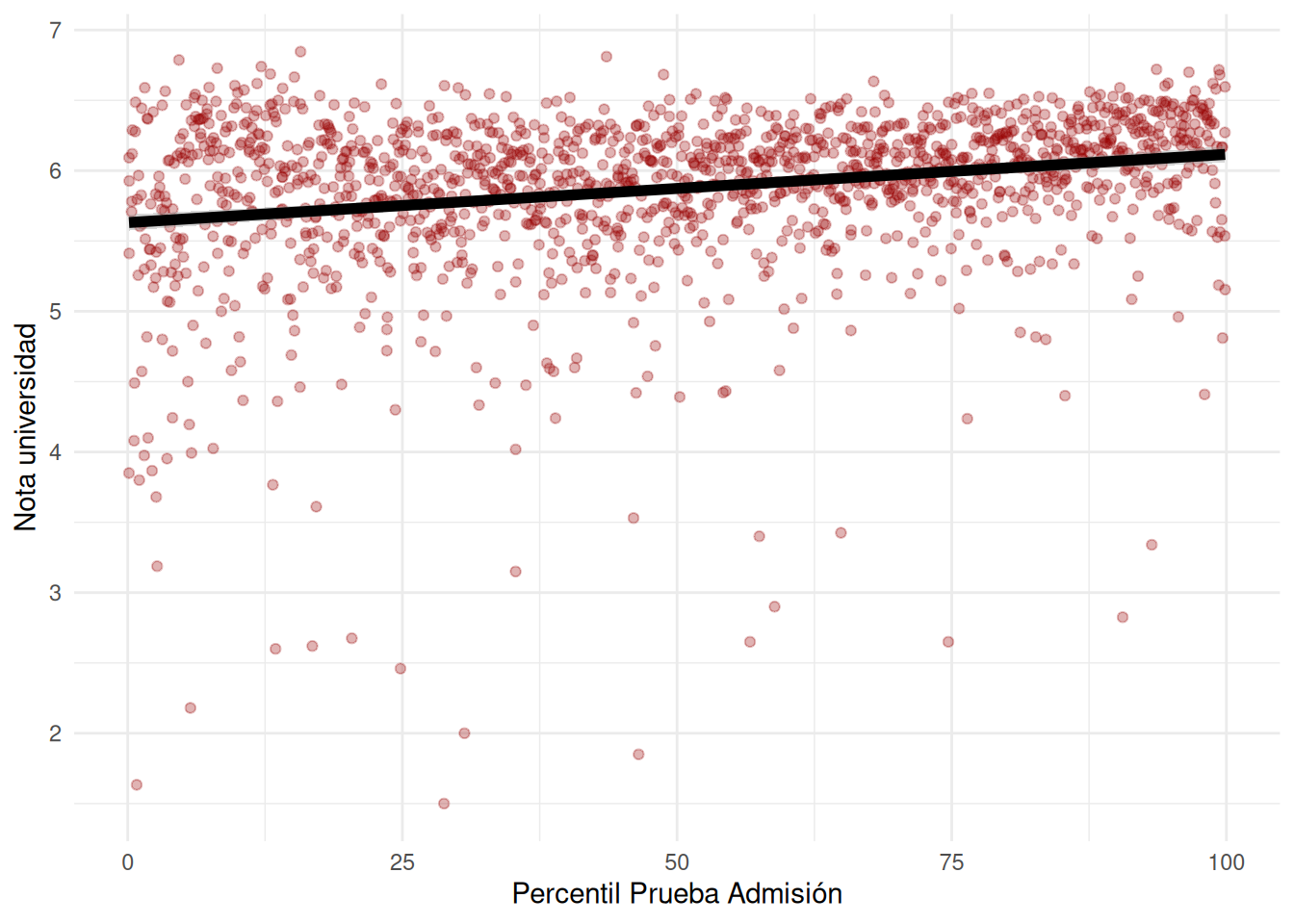
### Asociación de nota y prueba de admisión (PSU/PAES)
```{r}
#| echo: false
#| label: fig-scat-facso
#| fig-cap: Relación Notas universidad y Puntaje Prueba de Admisión en FACSO
#| fig-cap-location: top
base_madre %>%
filter(!is.na(pct_paes_psu)) %>%
ggplot(aes(x = pct_paes_psu, y = promedio_calculado)) +
geom_point(color = "#990000", alpha = 0.3) +
geom_smooth(method = "lm", se = TRUE, color = "black", linewidth = 2) +
labs(
x = "Percentil Prueba Admisión",
y = "Nota universidad"
) +
theme_minimal() +
theme(legend.position = "right")
```
**Faltan los plots x carrera**
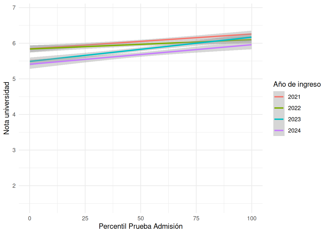
```{r}
#| echo: false
#| label: fig-scat-pct
#| fig-cap: Relación Notas universidad y Puntaje Prueba de Admisión según cohorte
#| fig-cap-location: top
base_madre %>%
filter(!is.na(pct_paes_psu)) %>%
ggplot(aes(x = pct_paes_psu, y = promedio_calculado, color = factor(cohorte))) +
geom_point(alpha = 0) +
geom_smooth(method = "lm", se = TRUE, linewidth = 1) +
labs(
x = "Percentil Prueba Admisión",
y = "Nota universidad",
color = "Año de ingreso"
) +
theme_minimal() +
theme(legend.position = "right")
```
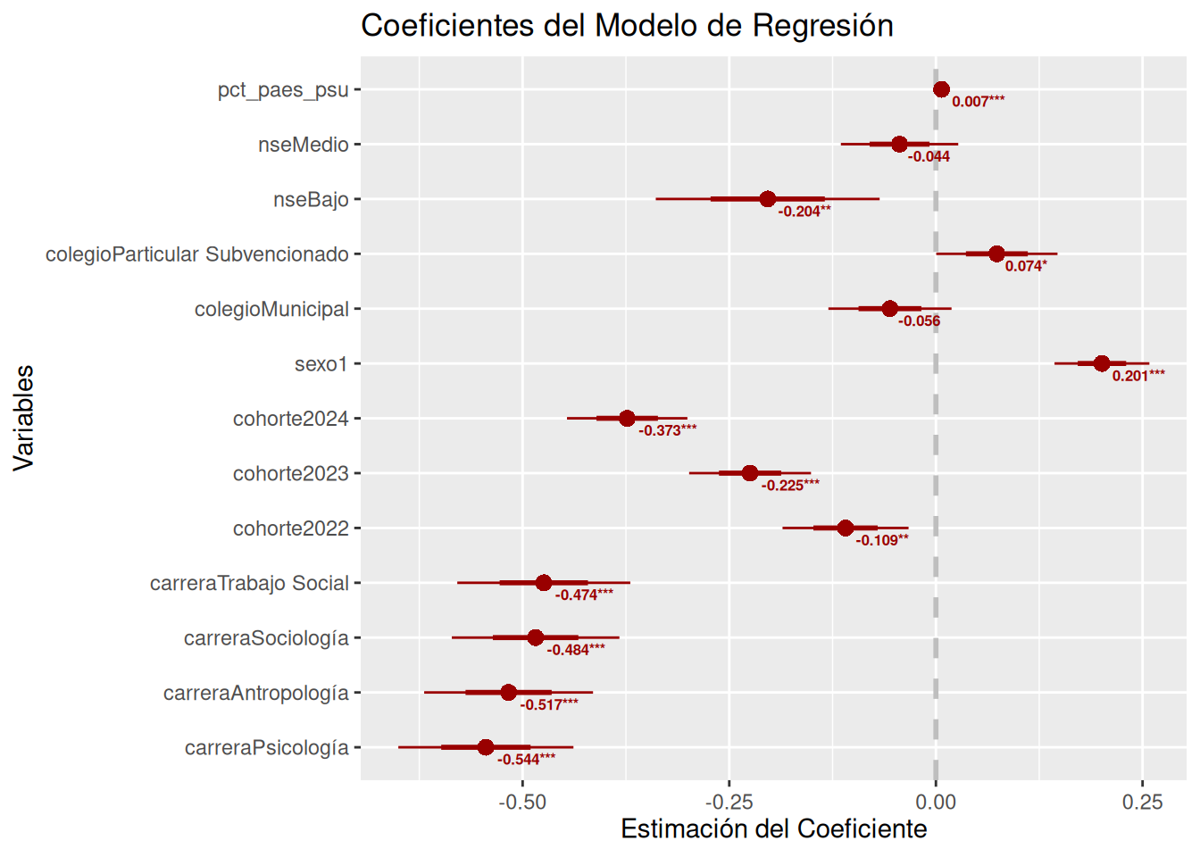
### Modelamiento
```{r}
base_madre_coef <- base_madre %>%
  mutate(
    carrera = forcats::fct_relevel(
      carrera,
      "Educación Parvularia",
      "Psicología",
      "Antropología",
      "Sociología",
      "Trabajo Social"))

base_madre_coef$colegio <- relevel(base_madre_coef$colegio, ref = "Particular Pagado")
base_madre_coef$nse <- relevel(base_madre_coef$nse, ref = "Alto")
```
```{r}
#| echo: false
model = lm(promedio_calculado ~ nse, data = base_madre_coef)
model1 = lm(promedio_calculado ~ carrera + cohorte + sexo + colegio + nse, data = base_madre_coef)
model2 = lm(promedio_calculado ~ carrera + cohorte + sexo + colegio + nse + pct_paes_psu, data = base_madre_coef)
tab_model(model, model1, model2)
```
```{r}
# Extraer coeficientes y p-valores
coef_summary <- summary(model2)$coefficients
coef_df <- data.frame(
  variable = rownames(coef_summary),
  estimate = coef_summary[, "Estimate"],
  pvalue = coef_summary[, "Pr(>|t|)"]
)

# Crear etiquetas de significancia
coef_df$sig <- ifelse(coef_df$pvalue < 0.001, "***",
                      ifelse(coef_df$pvalue < 0.01, "**",
                             ifelse(coef_df$pvalue < 0.05, "*",
                                    ifelse(coef_df$pvalue < 0.1, ".", ""))))

# Crear etiquetas combinadas (valor + significancia)
coef_df$label <- paste0(round(coef_df$estimate, 3), coef_df$sig)

# Remover intercepto si existe
coef_df <- coef_df[coef_df$variable != "(Intercept)", ]

# Crear el gráfico base

p <- coefplot(model2,
              title = "Coeficientes del Modelo de Regresión",
              xlab = "Estimación del Coeficiente",
              ylab = "Variables",
              color = "#990000",
              innerCI = 1,
              outerCI = 1.96,
              intercept = FALSE)

# Agregar las etiquetas con valores y significancia
p + geom_text(data = coef_df,
              aes(x = estimate,
                  y = variable,
                  label = label),
              hjust = -0.2,
              vjust = 1.5,
              size = 2.2,
              color = "#990000",
              fontface = "bold")
```