---
title: "Resultados: Cursos"
code-fold: true
---
Esta sección presenta los resultados del Estudio de notas centrado en cursos. La estructura que sigue la presentación de resultados es la siguiente:
**1) Descriptivos generales**
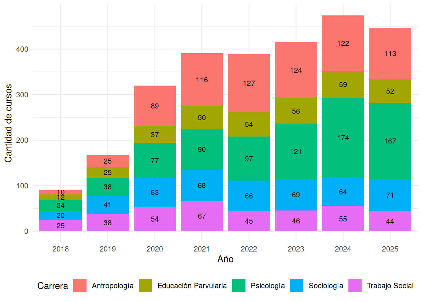
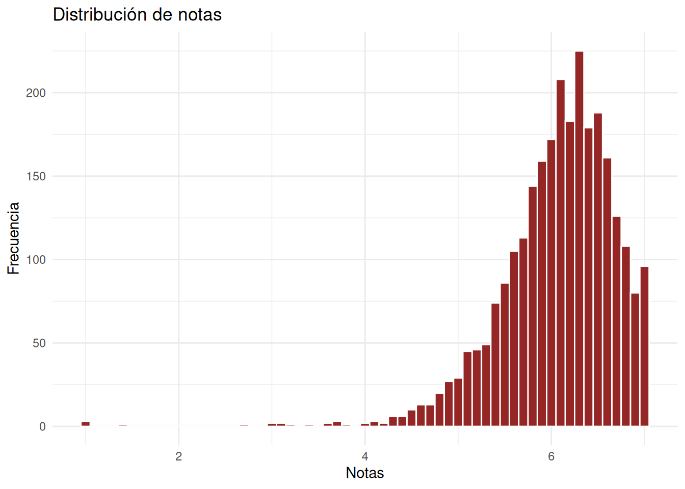
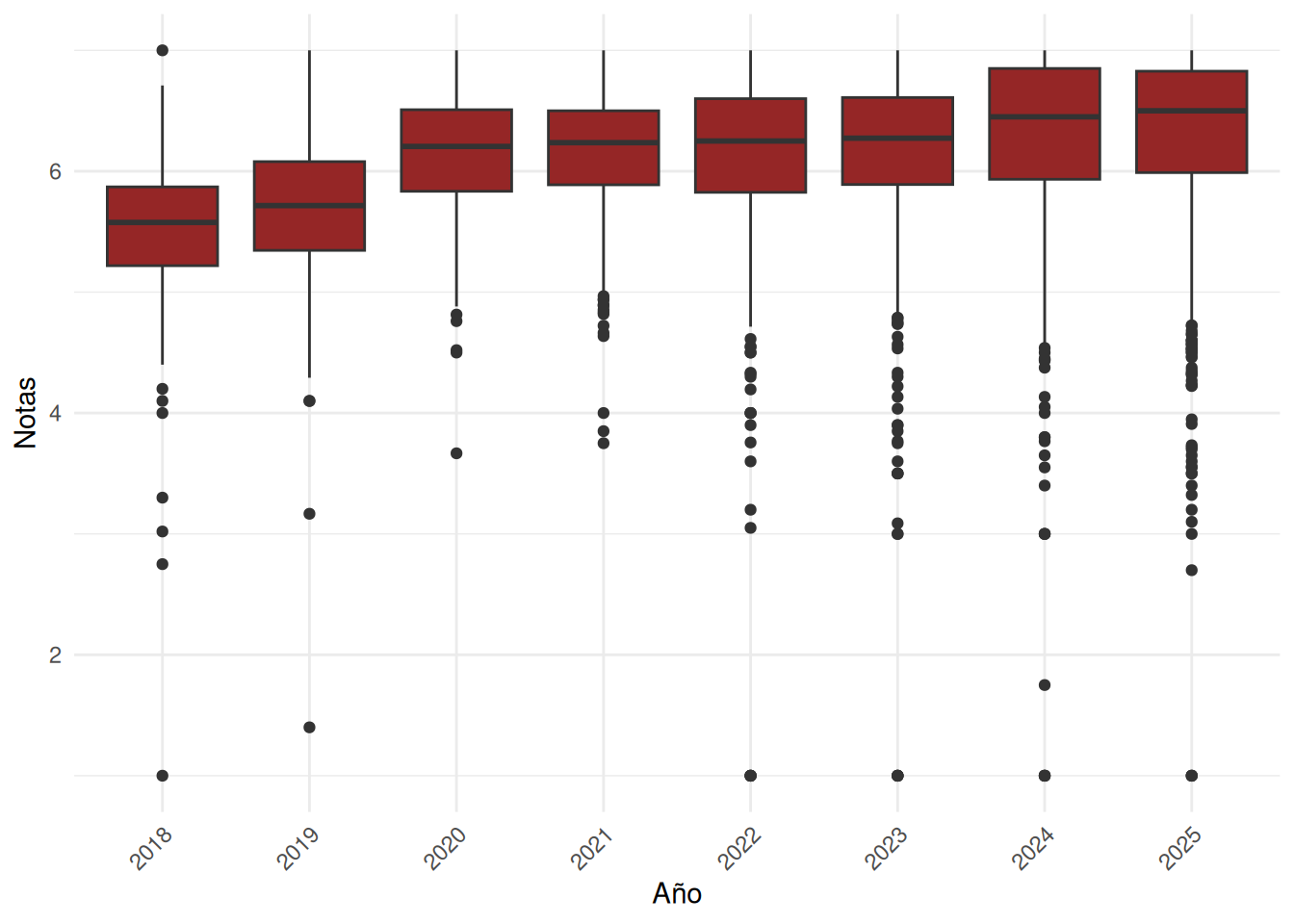
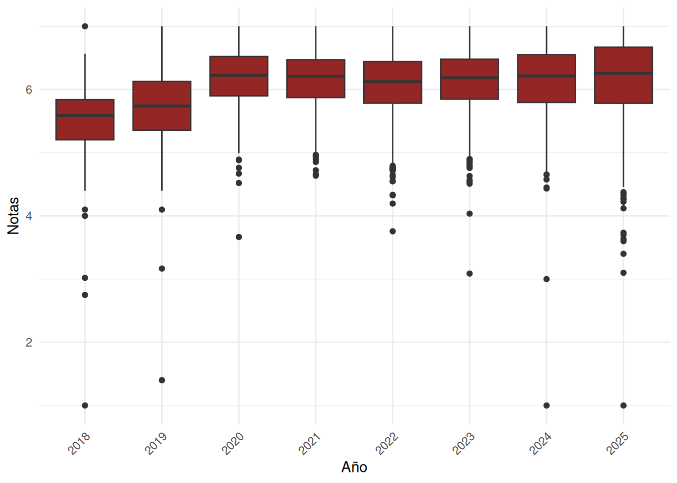
En primer lugar se grafica la cantidad de cursos a nivel facultad y desagregado por carrera. Luego, se presentan las tres variables dependientes que expresan diferentes dimensiones de las notas: la nota promedio, el porcentaje de aprobación y la desviación estándar.
**2) Cruces entre variables**
En esta sección se cruzan las tres variables dependientes con el tipo de curso (obligatorio/electivo), composición del curso en cuanto a género y tamaño del curso.
La visualización de datos sigue el siguiente orden:
a) Facultad a nivel general
b) Facultad en el tiempo
c) Carreras a nivel general
d) Carreras en el tiempo
# Descriptivos generales
```{r}
#| echo: false
pacman::p_load(knitr, digest, stargazer, sjPlot, codebook, summarytools, dplyr, tidyr,
tidyLPA, lme4, ggplot2, ggeffects, skimr, table1, patchwork, here, kableExtra, ggthemes, tidyverse,
ggbreak, texreg, coefplot, plotly, modelsummary)
options(scipen = 999)
```
```{r}
#| echo: false
cc_facso <- readRDS("../../../input/data/proc_data/cc_sec.rds")
cc_nosection <- readRDS("../../../input/data/proc_data/cc_nosec.rds")
```
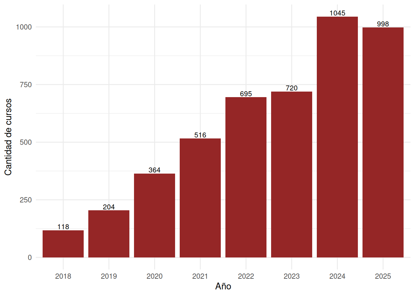
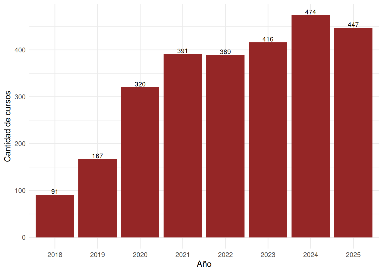
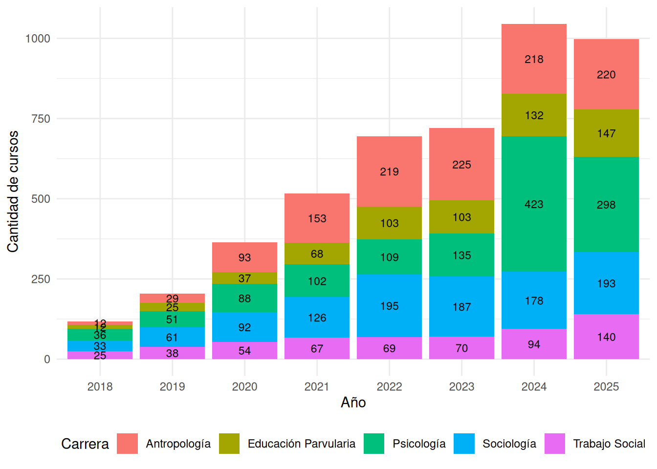
## Cantidad de cursos
```{r}
#| echo: false
cc_facso <- cc_facso %>%
filter(ano != 2026)
cc_resumen <- cc_facso %>%
group_by(ano, carrera) %>%
summarise(n_cursos = n(), .groups = "drop")
cc_resumen_facso <- cc_facso %>%
group_by(ano) %>%
summarise(n_cursos = n(), .groups = "drop")
cc_nosection <- cc_nosection %>%
filter(ano != 2026)
cc_resumen_nos <- cc_nosection %>%
group_by(ano, carrera) %>%
summarise(n_cursos = n(), .groups = "drop")
cc_resumen_facso_nos <- cc_nosection %>%
group_by(ano) %>%
summarise(n_cursos = n(), .groups = "drop")
```
### Nivel facultad
:::panel-tabset
#### Con secciones
```{r}
#| label: fig-cursos-facso
#| fig-cap: Cantidad de cursos por año y por carrera
#| fig-cap-location: bottom
ggplot(cc_resumen_facso, aes(x = factor(ano), y = n_cursos)) +
  geom_col(fill = "#952626", position = position_dodge(width = 0.9)) +
  geom_text(
    aes(label = n_cursos),
    position = position_dodge(width = 0.9),
    vjust = -0.2,
    size = 3
  ) +
  labs(
    x     = "Año",
    y     = "Cantidad de cursos",
  ) +
  theme_minimal() +
  theme(
    plot.title   = element_text(hjust = 0.5, face = "bold"),
    legend.position = "bottom"
  )
```
#### Sin secciones
```{r}
#| label: fig-cursos-facso-nos
#| fig-cap: Cantidad de cursos por año y por carrera
#| fig-cap-location: bottom
ggplot(cc_resumen_facso_nos, aes(x = factor(ano), y = n_cursos)) +
  geom_col(fill = "#952626", position = position_dodge(width = 0.9)) +
  geom_text(
    aes(label = n_cursos),
    position = position_dodge(width = 0.9),
    vjust = -0.2,
    size = 3
  ) +
  labs(
    x     = "Año",
    y     = "Cantidad de cursos",
  ) +
  theme_minimal() +
  theme(
    plot.title   = element_text(hjust = 0.5, face = "bold"),
    legend.position = "bottom"
  )
```
:::
### Nivel carrera
:::panel-tabset
#### Con secciones
```{r}
#| label: fig-cursos
#| fig-cap: Cantidad de cursos por año y por carrera
#| fig-cap-location: bottom
ggplot(cc_resumen, aes(x = factor(ano), y = n_cursos, fill = carrera)) +
  geom_col() +
  geom_text(
    aes(label = n_cursos),
    position = position_stack(vjust = 0.5),
    size = 3
  ) +
  labs(
    x     = "Año",
    y     = "Cantidad de cursos",
    fill  = "Carrera"
  ) +
  theme_minimal() +
  theme(
    plot.title = element_text(hjust = 0.5, face = "bold"),
    legend.position = "bottom"
  )
```
#### Sin secciones
```{r}
#| label: fig-cursos-nos
#| fig-cap: Cantidad de cursos por año y por carrera
#| fig-cap-location: bottom
ggplot(cc_resumen_nos, aes(x = factor(ano), y = n_cursos, fill = carrera)) +
  geom_col() +
  geom_text(
    aes(label = n_cursos),
    position = position_stack(vjust = 0.5),
    size = 3
  ) +
  labs(
    x     = "Año",
    y     = "Cantidad de cursos",
    fill  = "Carrera"
  ) +
  theme_minimal() +
  theme(
    plot.title = element_text(hjust = 0.5, face = "bold"),
    legend.position = "bottom"
  )
```
:::
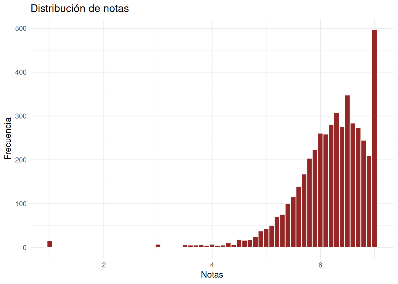
## Notas
### Nivel facultad
:::panel-tabset
#### Con secciones
```{r}
ggplot(cc_facso, aes(x = nota_promedio)) +
  geom_histogram(
    binwidth = 0.1,
    fill = "#952626",
    color = "white"
  ) +
  labs(
    x = "Notas",
    y = "Frecuencia",
    title = "Distribución de notas"
  ) +
  theme_minimal()
```
#### Sin secciones
```{r}
ggplot(cc_nosection, aes(x = nota_promedio)) +
  geom_histogram(
    binwidth = 0.1,
    fill = "#952626",
    color = "white"
  ) +
  labs(
    x = "Notas",
    y = "Frecuencia",
    title = "Distribución de notas"
  ) +
  theme_minimal()
```
:::
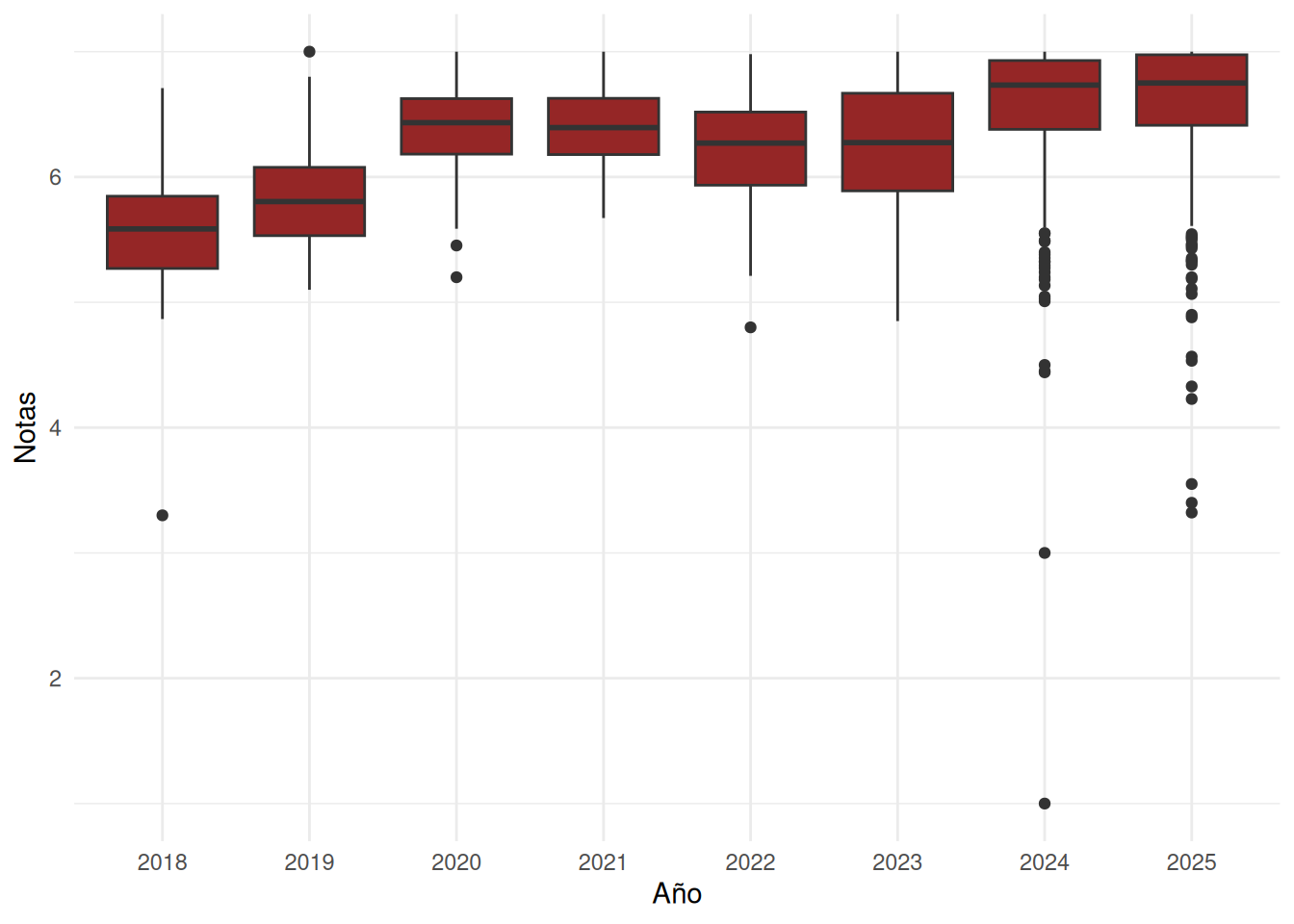
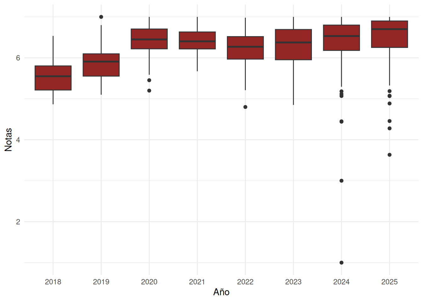
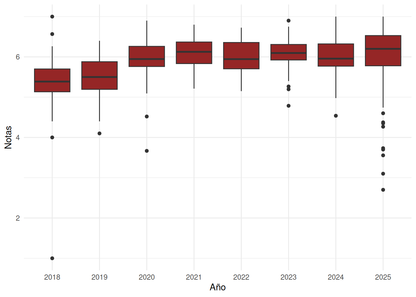
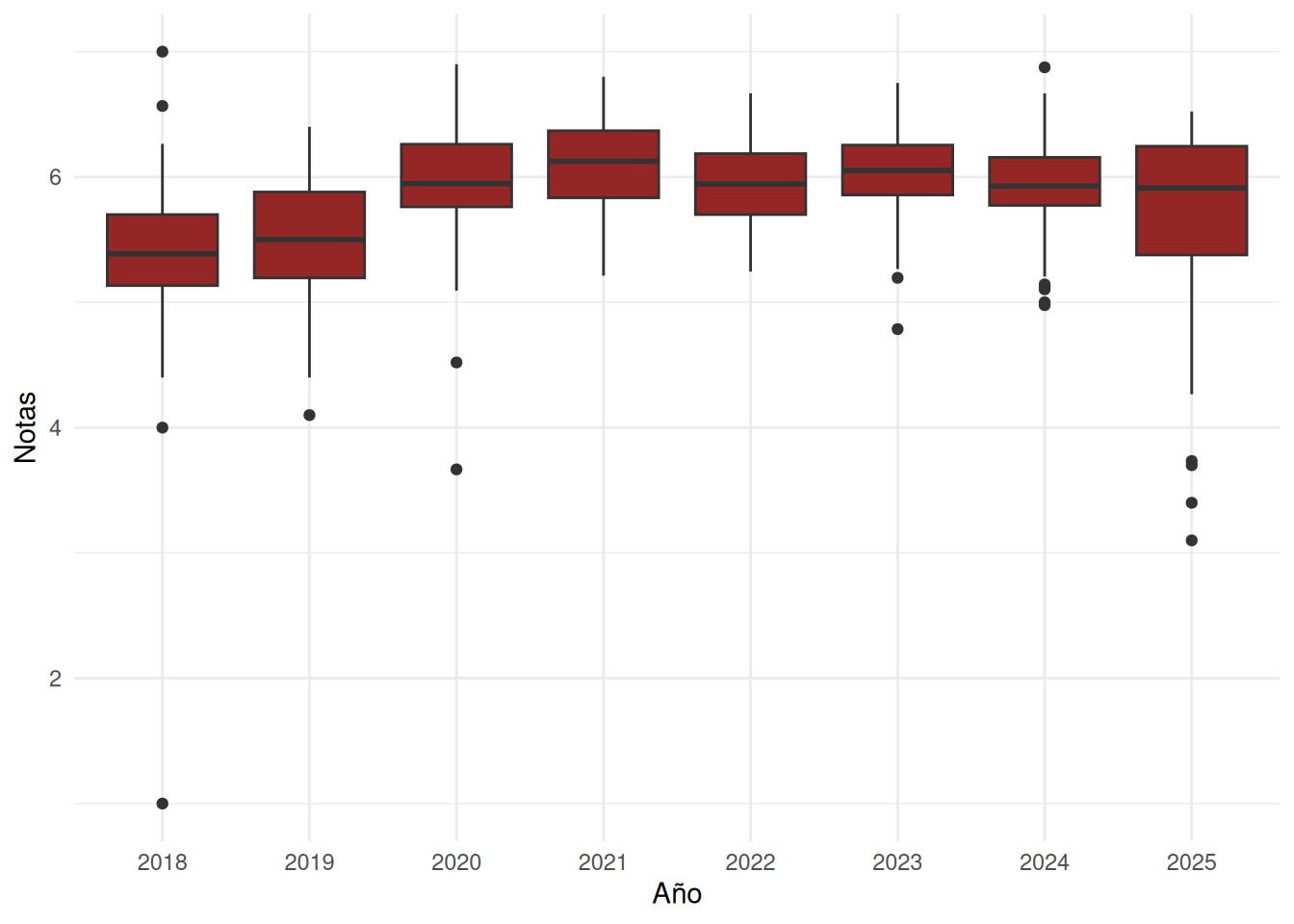
### Facultad en el tiempo
:::panel-tabset
#### Con secciones
```{r}
ggplot(cc_facso, aes(x = factor(ano), y = nota_promedio)) +
  geom_boxplot(fill = "#952626") +
  labs(
    x = "Año",
    y = "Notas"
  ) +
  theme_minimal() +
  theme(
    axis.text.x = element_text(angle = 45, hjust = 1)
  )
```
#### Sin secciones
```{r}
ggplot(cc_nosection, aes(x = factor(ano), y = nota_promedio)) +
  geom_boxplot(fill = "#952626") +
  labs(
    x = "Año",
    y = "Notas"
  ) +
  theme_minimal() +
  theme(
    axis.text.x = element_text(angle = 45, hjust = 1)
  )
```
:::
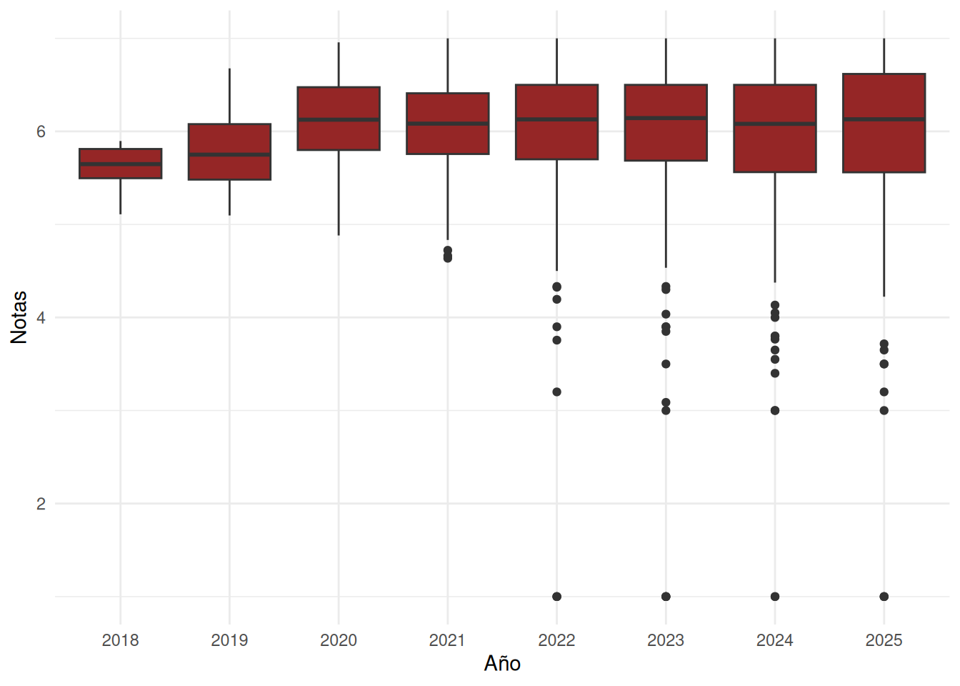
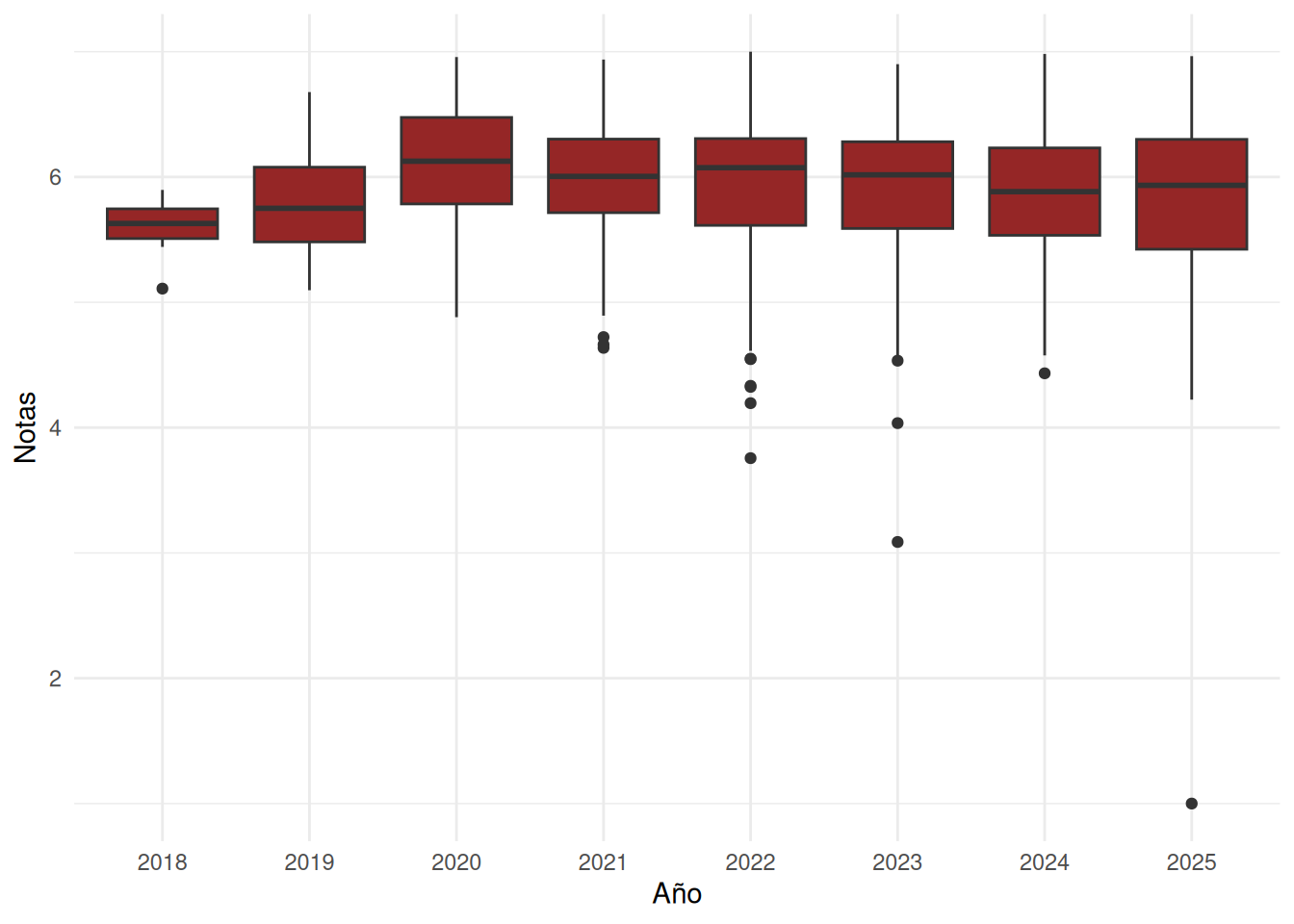
### Nivel carreras
:::panel-tabset
#### Con secciones
```{r}
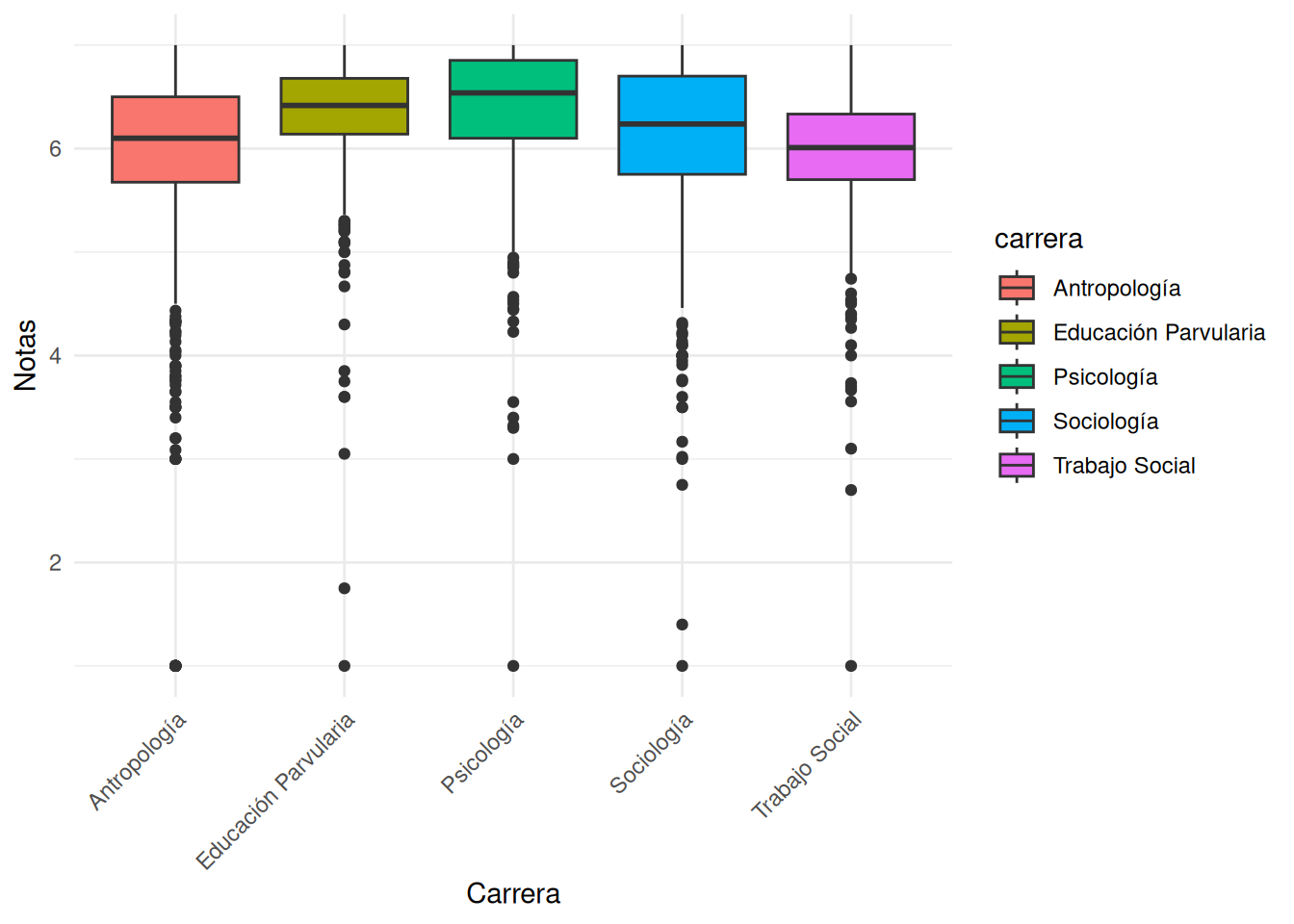
#| label: fig-boxplot
#| fig-cap: Distribución de notas de cursos por carrera
#| fig-cap-location: bottom
ggplot(cc_facso, aes(x = carrera, y = nota_promedio, fill = carrera)) +
  geom_boxplot() +
  labs(
    x = "Carrera",
    y = "Notas",
  ) +
  theme_minimal() +
  theme(axis.text.x = element_text(angle = 45, hjust = 1))
```
#### Sin secciones
```{r}
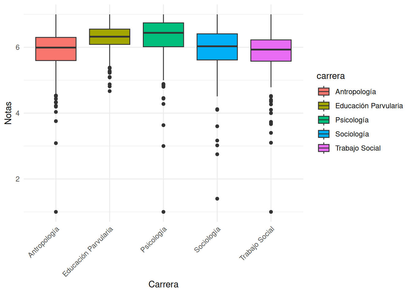
#| label: fig-boxplot-nos
#| fig-cap: Distribución de notas de cursos por carrera
#| fig-cap-location: bottom
ggplot(cc_nosection, aes(x = carrera, y = nota_promedio, fill = carrera)) +
  geom_boxplot() +
  labs(
    x = "Carrera",
    y = "Notas",
  ) +
  theme_minimal() +
  theme(axis.text.x = element_text(angle = 45, hjust = 1))
```
:::
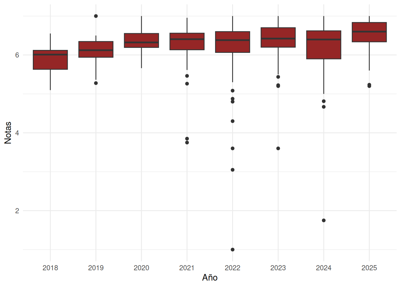
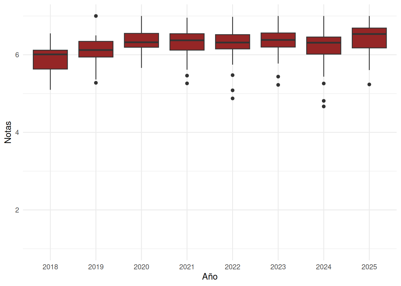
### Carreras en el tiempo
::: panel-tabset
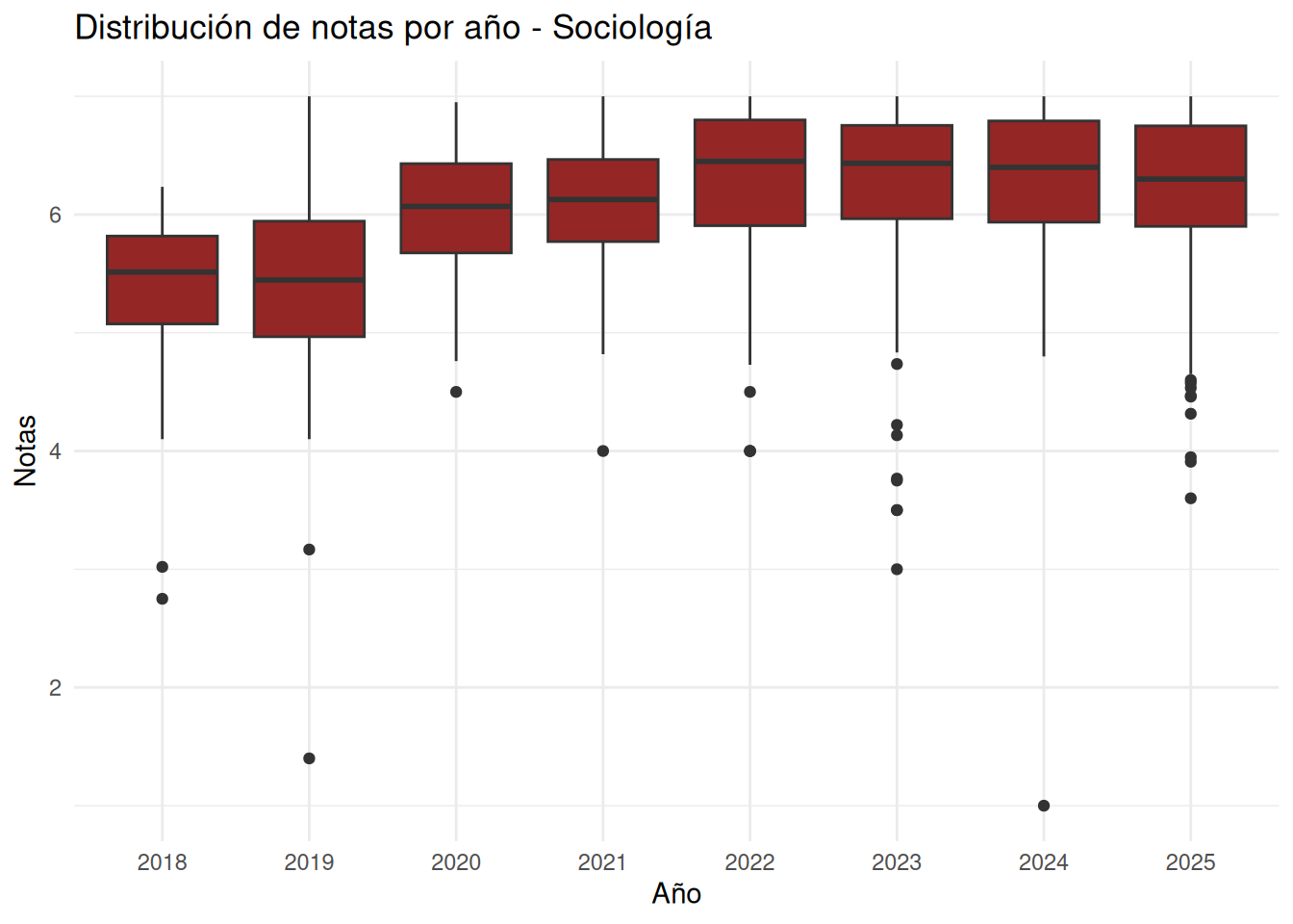
#### Sociología
```{r}
#| echo: false
cc_facso %>%
filter(carrera == "Sociología") %>%
ggplot(aes(x = factor(ano), y = nota_promedio)) +
geom_boxplot(fill = "#952626") +
coord_cartesian(ylim = c(1, 7)) +
labs(
x = "Año",
y = "Notas",
title = "Distribución de notas por año - Sociología"
) +
theme_minimal()
```
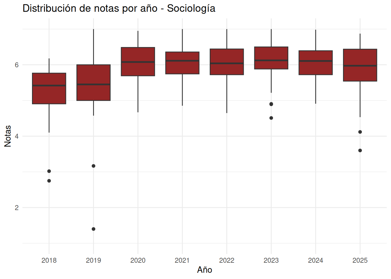
#### Sociología sin secciones
```{r}
#| echo: false
cc_nosection %>%
filter(carrera == "Sociología") %>%
ggplot(aes(x = factor(ano), y = nota_promedio)) +
geom_boxplot(fill = "#952626") +
coord_cartesian(ylim = c(1, 7)) +
labs(
x = "Año",
y = "Notas",
title = "Distribución de notas por año - Sociología"
) +
theme_minimal()
```
#### Psicología
```{r}
#| echo: false
cc_facso %>%
filter(carrera == "Psicología") %>%
ggplot(aes(x = factor(ano), y = nota_promedio)) +
geom_boxplot(fill = "#952626") +
coord_cartesian(ylim = c(1, 7)) +
labs(
x = "Año",
y = "Notas",
) +
theme_minimal()
```
#### Psicología sin secciones
```{r}
#| echo: false
cc_nosection %>%
filter(carrera == "Psicología") %>%
ggplot(aes(x = factor(ano), y = nota_promedio)) +
geom_boxplot(fill = "#952626") +
coord_cartesian(ylim = c(1, 7)) +
labs(
x = "Año",
y = "Notas",
) +
theme_minimal()
```
#### Antropología
```{r}
#| echo: false
cc_facso %>%
filter(carrera == "Antropología") %>%
ggplot(aes(x = factor(ano), y = nota_promedio)) +
geom_boxplot(fill = "#952626") +
coord_cartesian(ylim = c(1, 7)) +
labs(
x = "Año",
y = "Notas",
) +
theme_minimal()
```
#### Antropología sin secciones
```{r}
#| echo: false
cc_nosection %>%
filter(carrera == "Antropología") %>%
ggplot(aes(x = factor(ano), y = nota_promedio)) +
geom_boxplot(fill = "#952626") +
coord_cartesian(ylim = c(1, 7)) +
labs(
x = "Año",
y = "Notas",
) +
theme_minimal()
```
#### Trabajo Social
```{r}
#| echo: false
cc_facso %>%
filter(carrera == "Trabajo Social") %>%
ggplot(aes(x = factor(ano), y = nota_promedio)) +
geom_boxplot(fill = "#952626") +
coord_cartesian(ylim = c(1, 7)) +
labs(
x = "Año",
y = "Notas",
) +
theme_minimal()
```
#### Trabajo Social sin secciones
```{r}
#| echo: false
cc_nosection %>%
filter(carrera == "Trabajo Social") %>%
ggplot(aes(x = factor(ano), y = nota_promedio)) +
geom_boxplot(fill = "#952626") +
coord_cartesian(ylim = c(1, 7)) +
labs(
x = "Año",
y = "Notas",
) +
theme_minimal()
```
#### Educación Parvularia
```{r}
#| echo: false
cc_facso %>%
filter(carrera == "Educación Parvularia") %>%
ggplot(aes(x = factor(ano), y = nota_promedio)) +
geom_boxplot(fill = "#952626") +
coord_cartesian(ylim = c(1, 7)) +
labs(
x = "Año",
y = "Notas",
) +
theme_minimal()
```
#### Educación Parvularia sin secciones
```{r}
#| echo: false
cc_nosection %>%
filter(carrera == "Educación Parvularia") %>%
ggplot(aes(x = factor(ano), y = nota_promedio)) +
geom_boxplot(fill = "#952626") +
coord_cartesian(ylim = c(1, 7)) +
labs(
x = "Año",
y = "Notas",
) +
theme_minimal()
```
:::
## % Aprobación
### Facultad en el tiempo - con secciones
```{r}
#| label: fig-aprobacion
#| fig-cap: Porcentaje de aprobación de la facultad por año
#| fig-cap-location: bottom
#| echo: false
tabla_aprobacion <- cc_facso %>%
group_by(ano) %>%
summarise(
aprobacion_promedio =
round(mean(porcentaje_aprobacion, na.rm = TRUE), 2),
n_cursos = n()
) %>%
bind_rows(
tibble(
ano = "Total",
aprobacion_promedio = round(
mean(.$aprobacion_promedio, na.rm = TRUE), 2
),
n_cursos = sum(.$n_cursos, na.rm = TRUE)
)
)
tabla_aprobacion %>%
kable(
col.names = c(
"Año",
"Aprobación promedio (%)",
"N cursos"
)
) %>%
kable_styling(
bootstrap_options = c(
"striped",
"hover",
"condensed",
"responsive"
),
full_width = FALSE,
position = "center"
) %>%
row_spec(0, bold = TRUE, color = "white", background = "#952626") %>%
row_spec(nrow(tabla_aprobacion),
bold = TRUE,
background = "#f2f2f2")
```
### Facultad en el tiempo - sin secciones
```{r}
#| label: fig-aprobacion-nos
#| fig-cap: Porcentaje de aprobación de la facultad por año
#| fig-cap-location: bottom
#| echo: false
tabla_aprobacion <- cc_nosection %>%
group_by(ano) %>%
summarise(
aprobacion_promedio =
round(mean(porcentaje_aprobacion, na.rm = TRUE), 2),
n_cursos = n()
) %>%
bind_rows(
tibble(
ano = "Total",
aprobacion_promedio = round(
mean(.$aprobacion_promedio, na.rm = TRUE), 2
),
n_cursos = sum(.$n_cursos, na.rm = TRUE)
)
)
tabla_aprobacion %>%
kable(
col.names = c(
"Año",
"Aprobación promedio (%)",
"N cursos"
)
) %>%
kable_styling(
bootstrap_options = c(
"striped",
"hover",
"condensed",
"responsive"
),
full_width = FALSE,
position = "center"
) %>%
row_spec(0, bold = TRUE, color = "white", background = "#952626") %>%
row_spec(nrow(tabla_aprobacion),
bold = TRUE,
background = "#f2f2f2")
```
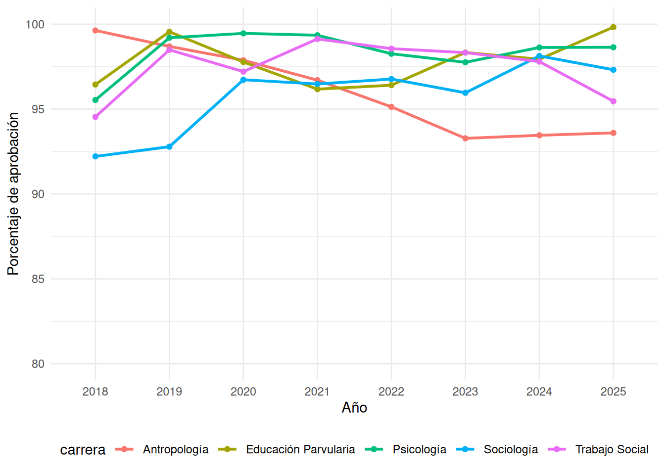
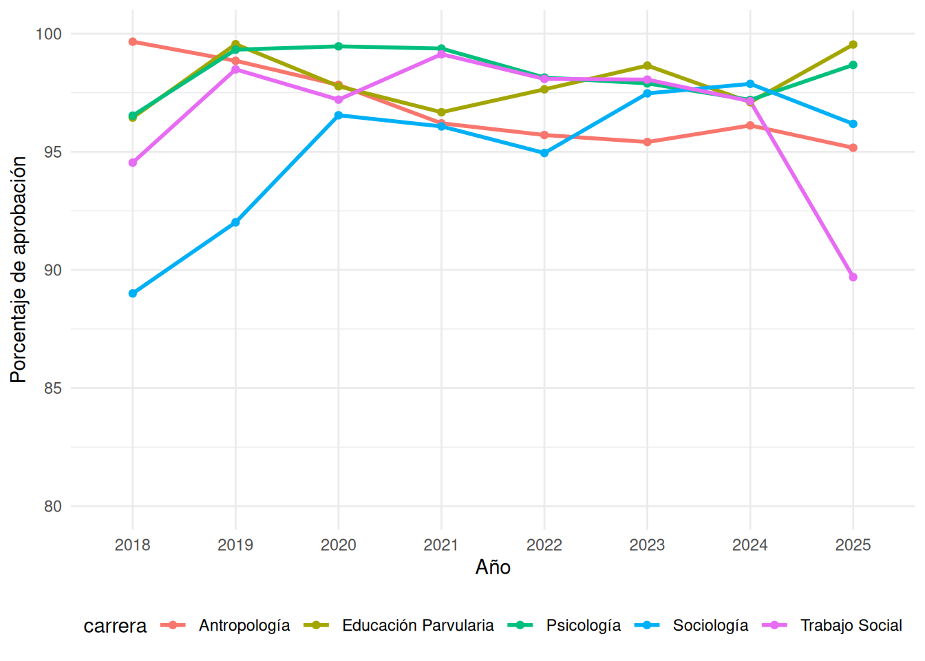
### Carreras en el tiempo
:::panel-tabset
#### Con secciones
```{r}
#| echo: false
cc_aprob <- cc_facso %>%
group_by(ano, carrera) %>%
summarise(
porcentaje_aprobacion = mean(porcentaje_aprobacion, na.rm = TRUE),
.groups = "drop"
)
ggplot(cc_aprob, aes(x = ano, y = porcentaje_aprobacion, group = carrera, color = carrera)) +
geom_line(linewidth = 1) +
geom_point() +
scale_x_discrete(limits = as.character(2018:2025)) +
scale_y_continuous(limits = c(80, 100)) +
labs(
x = "Año",
y = "Porcentaje de aprobación"
) +
theme_minimal() +
theme(legend.position = "bottom")
```
#### Sin secciones
```{r}
#| echo: false
cc_aprob <- cc_nosection %>%
group_by(ano, carrera) %>%
summarise(
porcentaje_aprobacion = mean(porcentaje_aprobacion, na.rm = TRUE),
.groups = "drop"
)
ggplot(cc_aprob, aes(x = ano, y = porcentaje_aprobacion, group = carrera, color = carrera)) +
geom_line(linewidth = 1) +
geom_point() +
scale_x_discrete(limits = as.character(2018:2025)) +
scale_y_continuous(limits = c(80, 100)) +
labs(
x = "Año",
y = "Porcentaje de aprobación"
) +
theme_minimal() +
theme(legend.position = "bottom")
```
:::
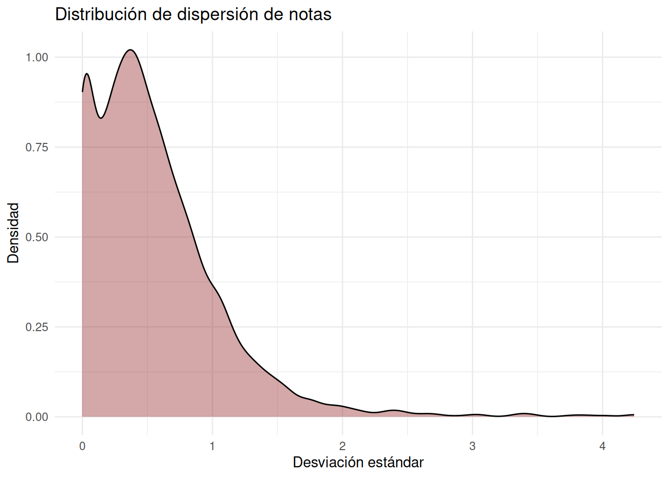
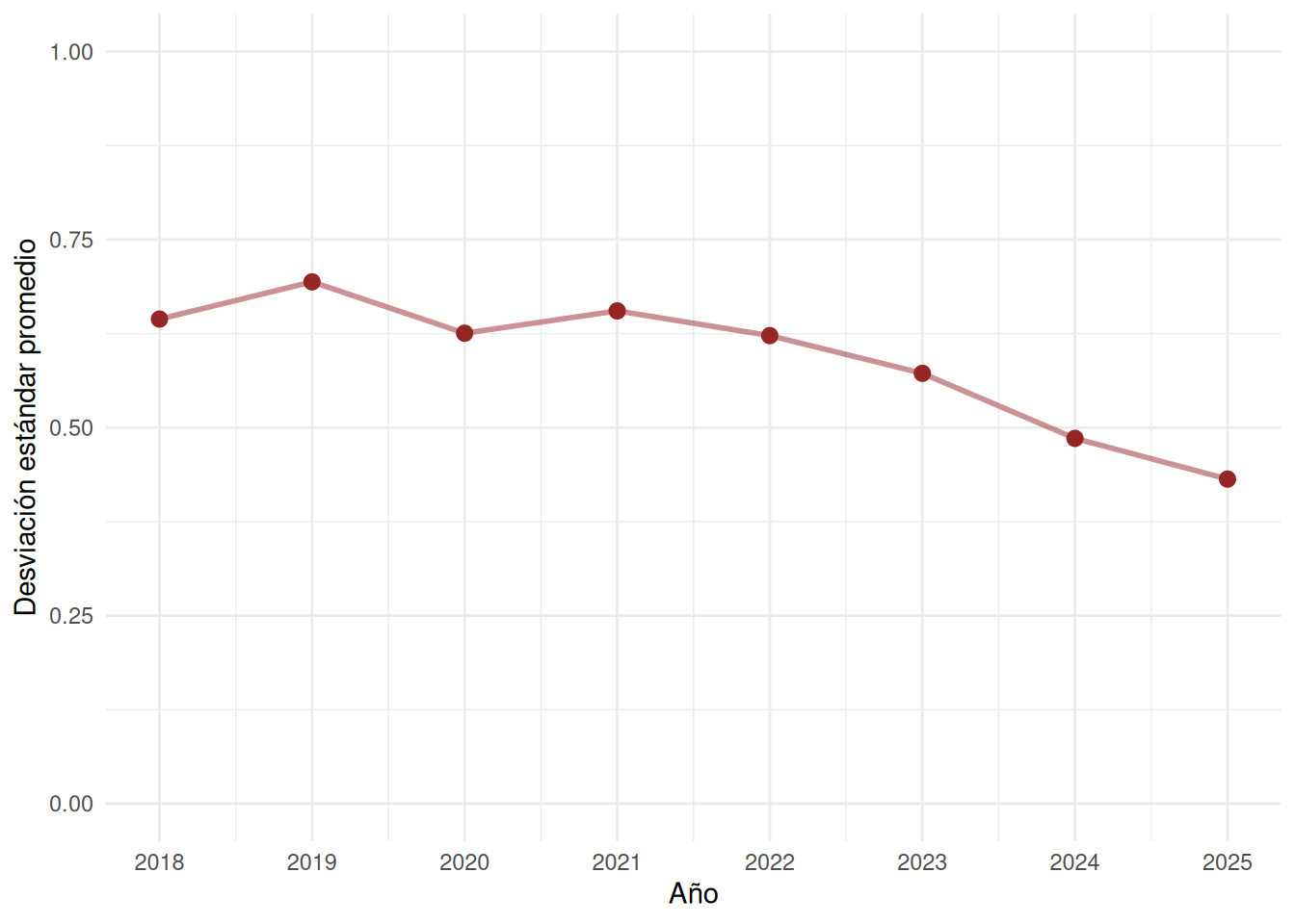
## Desviación estándar
::: panel-tabset
### Facultad pooled density
```{r}
#| echo: false
ggplot(cc_facso, aes(x = desv_std)) +
geom_density(
fill = "#952626",
alpha = 0.4
) +
labs(
x = "Desviación estándar",
y = "Densidad",
title = "Distribución de dispersión de notas"
) +
theme_minimal()
```
### Facultad por año
```{r}
#| label: fig-desviacion-facso
#| fig-cap: Desviación estándar promedio por año en la facultad
#| fig-cap-location: bottom
sd_anual <- cc_facso %>%
  group_by(ano) %>%
  summarise(
    sd_promedio =
      mean(desv_std, na.rm = TRUE)
  )

sd_anual <- sd_anual %>%
  mutate(ano = as.numeric(ano))

ggplot(sd_anual,
       aes(x = ano, y = sd_promedio)) +

  geom_line(
    color = "#952626",
    linewidth = 1,
    alpha = 0.5
  ) +

  geom_point(
    color = "#952626",
    size = 2.5
  ) +

  scale_x_continuous(
    breaks = sd_anual$ano
  ) +

  coord_cartesian(ylim = c(0, 1)) +

  labs(
    x = "Año",
    y = "Desviación estándar promedio"
  ) +

  theme_minimal()
```
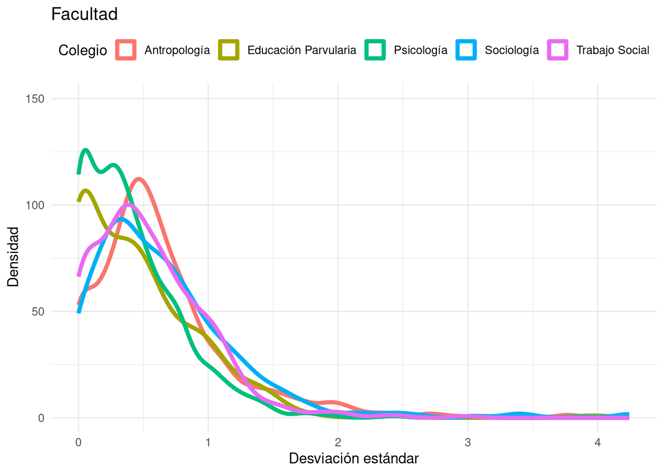
### Carreras densidad
```{r}
#| echo: false
ggplot(cc_facso,
aes(x = desv_std, fill = carrera, color = carrera)) +
geom_density(aes(y = after_stat(density) * 100),
alpha = 0,
linewidth = 1.5) +
coord_cartesian(ylim = c(1, 150)) +
labs(
title = "Facultad",
x = "Desviación estándar",
y = "Densidad",
fill = "Colegio",
color = "Colegio"
) +
theme_minimal() +
theme(legend.position = "top")
```
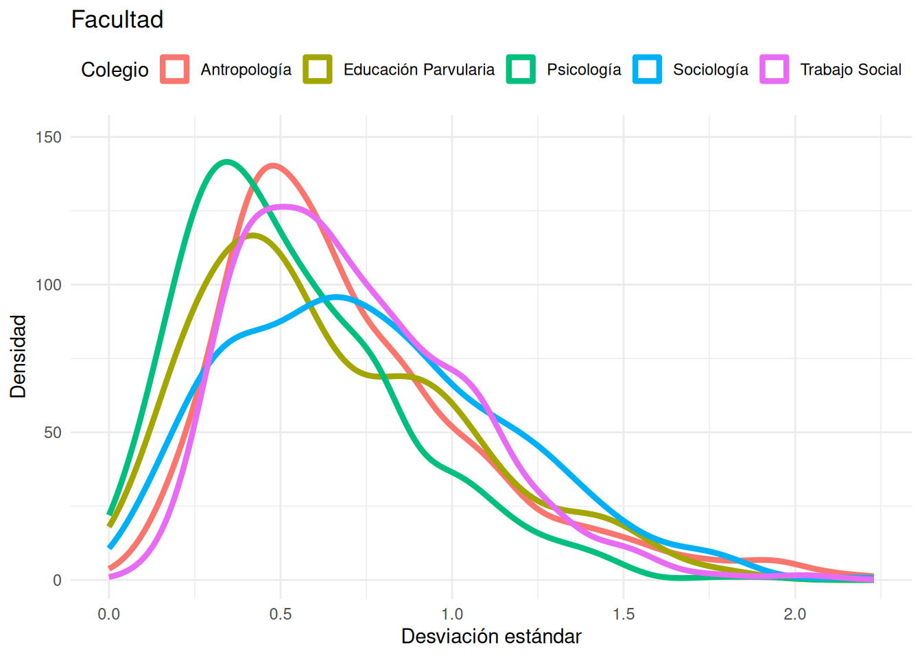
### Carreras densidad post filtro
```{r}
#| echo: false
ggplot((cc_facso %>% filter(n_estudiantes > 10)),
aes(x = desv_std, fill = carrera, color = carrera)) +
geom_density(aes(y = after_stat(density) * 100),
alpha = 0,
linewidth = 1.5) +
coord_cartesian(ylim = c(1, 150)) +
labs(
title = "Facultad",
x = "Desviación estándar",
y = "Densidad",
fill = "Colegio",
color = "Colegio"
) +
theme_minimal() +
theme(legend.position = "top")
```
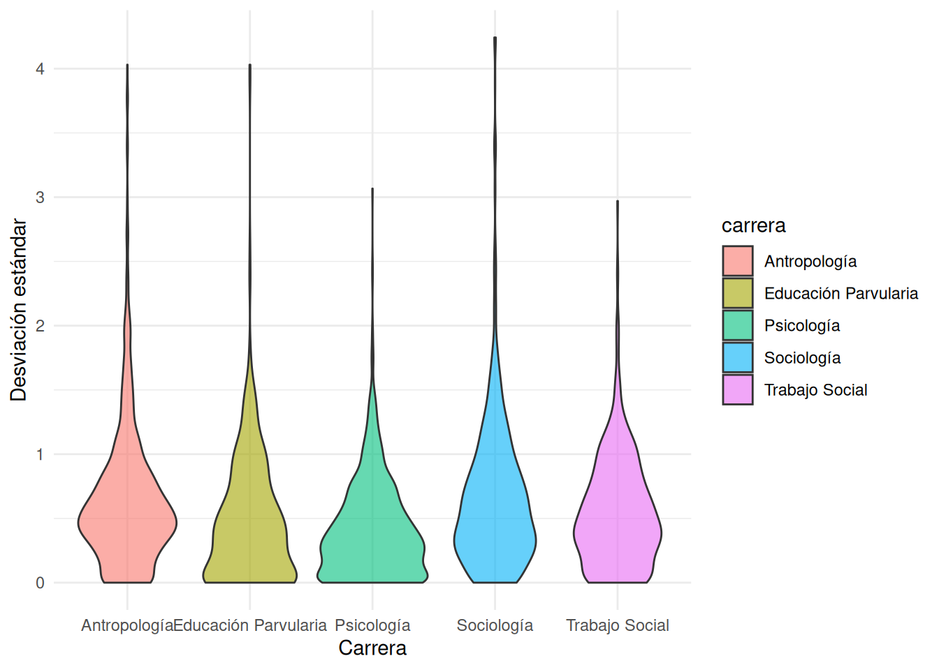
### Carreras violin
```{r}
#| echo: false
ggplot(cc_facso,
aes(x = carrera,
y = desv_std,
fill = carrera)) +
geom_violin(alpha = 0.6) +
labs(
x = "Carrera",
y = "Desviación estándar"
) +
theme_minimal()
```
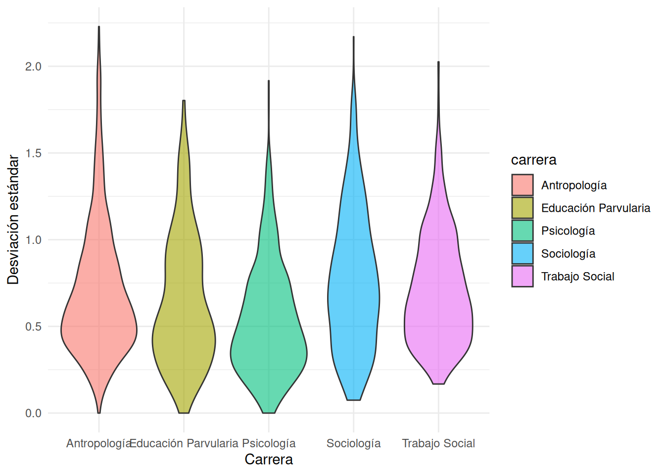
### Carreras violin post filtro
```{r}
#| echo: false
ggplot((cc_facso %>% filter(n_estudiantes > 10)),
aes(x = carrera,
y = desv_std,
fill = carrera)) +
geom_violin(alpha = 0.6) +
labs(
x = "Carrera",
y = "Desviación estándar"
) +
theme_minimal()
```
:::
Para la visualización de las desviaciones estándar a nivel carrera se presentan dos maneras de visualizarlas: 1) gráfico de densidad y 2) gráfico de violín. En ambos casos se presentan dos versiones: una con todos los cursos y otra filtrando aquellos cursos con menos de 10 estudiantes, para evitar el entorpecimiento de la visualización. Propongo quedarnos con el gráfico de violín debido a que es más atractivo a nivel visual y facilita la interpretación.
# Cruces
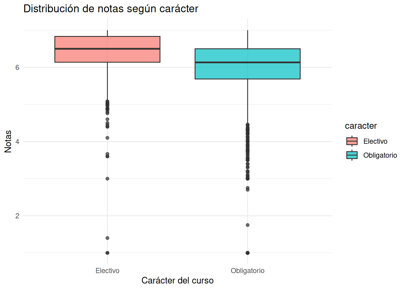
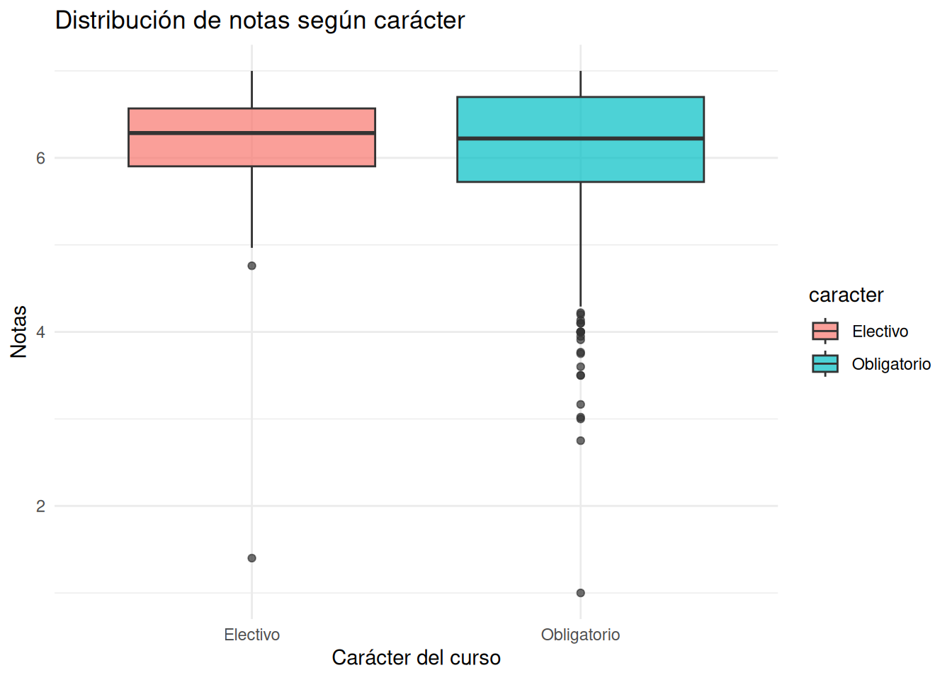
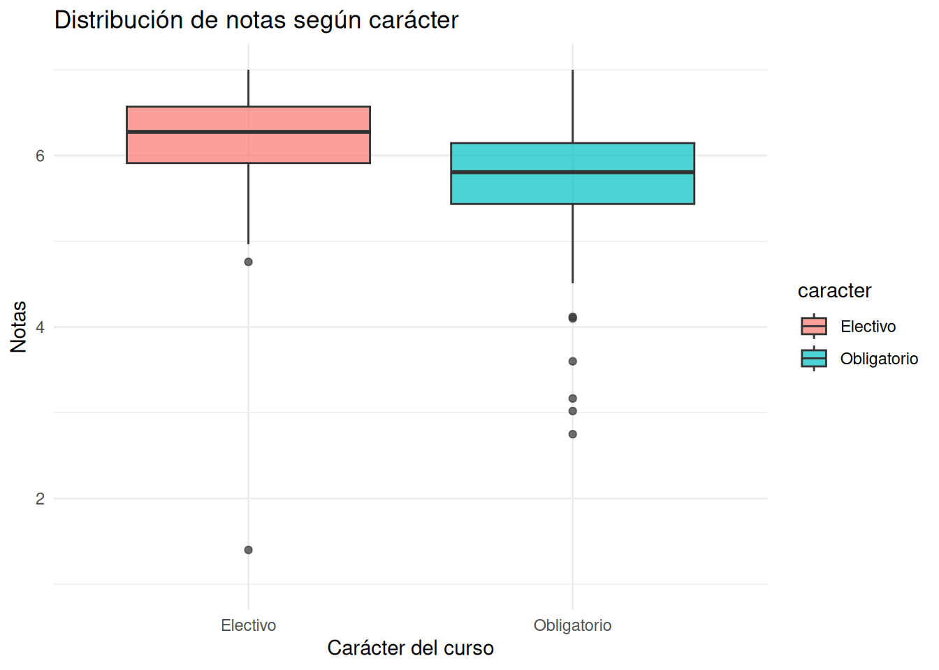
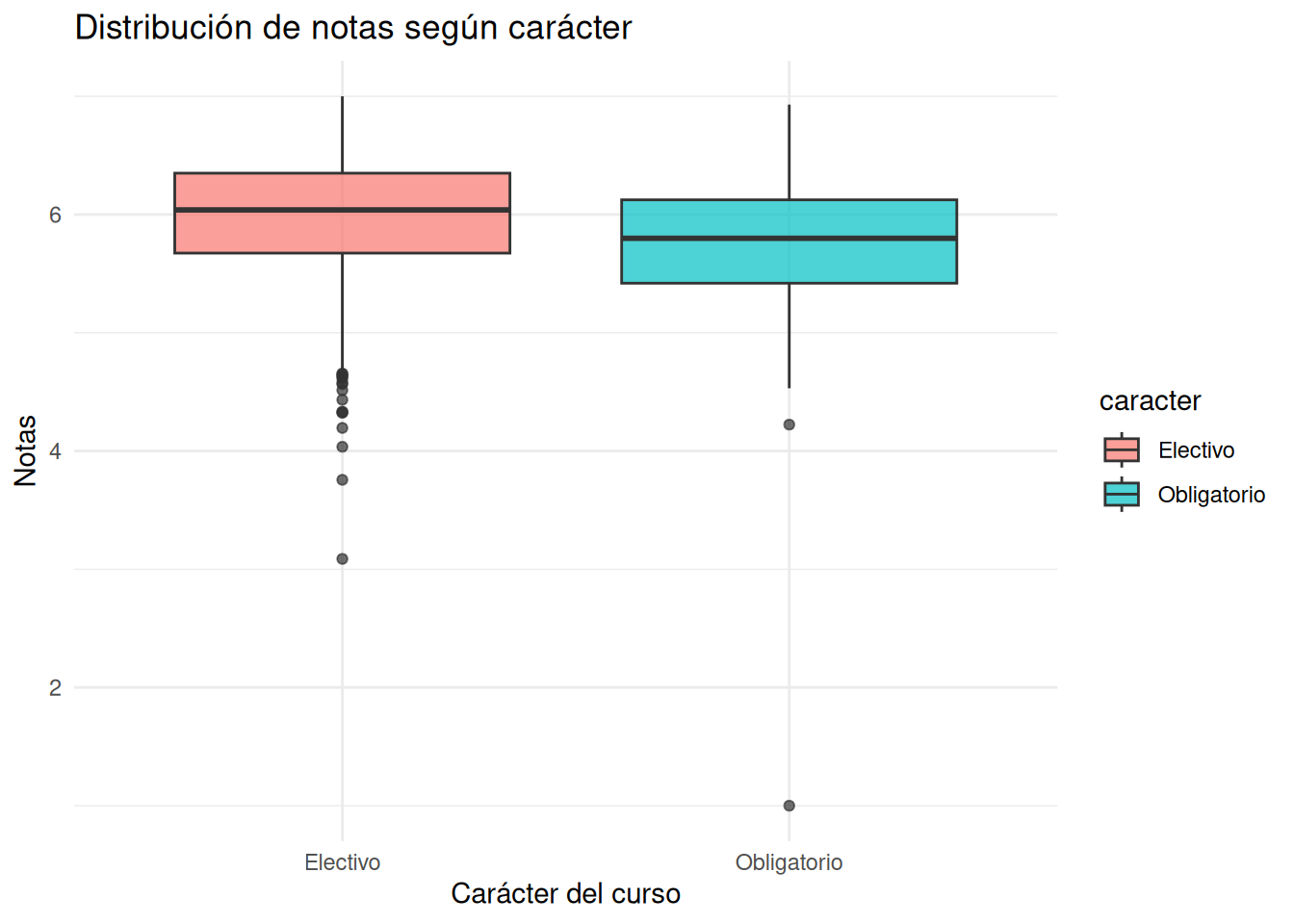
## Tipo de curso
### Facultad pooled
:::panel-tabset
#### Con secciones
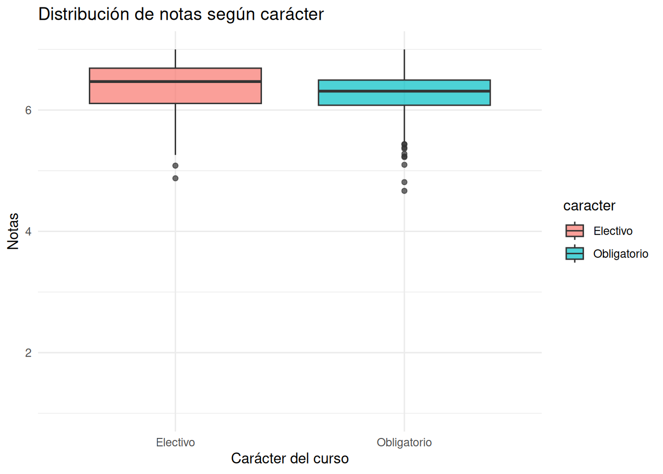
```{r}
#| echo: false
ggplot((cc_facso),
aes(x = caracter,
y = nota_promedio,
fill = caracter)) +
geom_boxplot(alpha = 0.7) +
labs(
x = "Carácter del curso",
y = "Notas",
title = "Distribución de notas según carácter"
) +
theme_minimal()
```
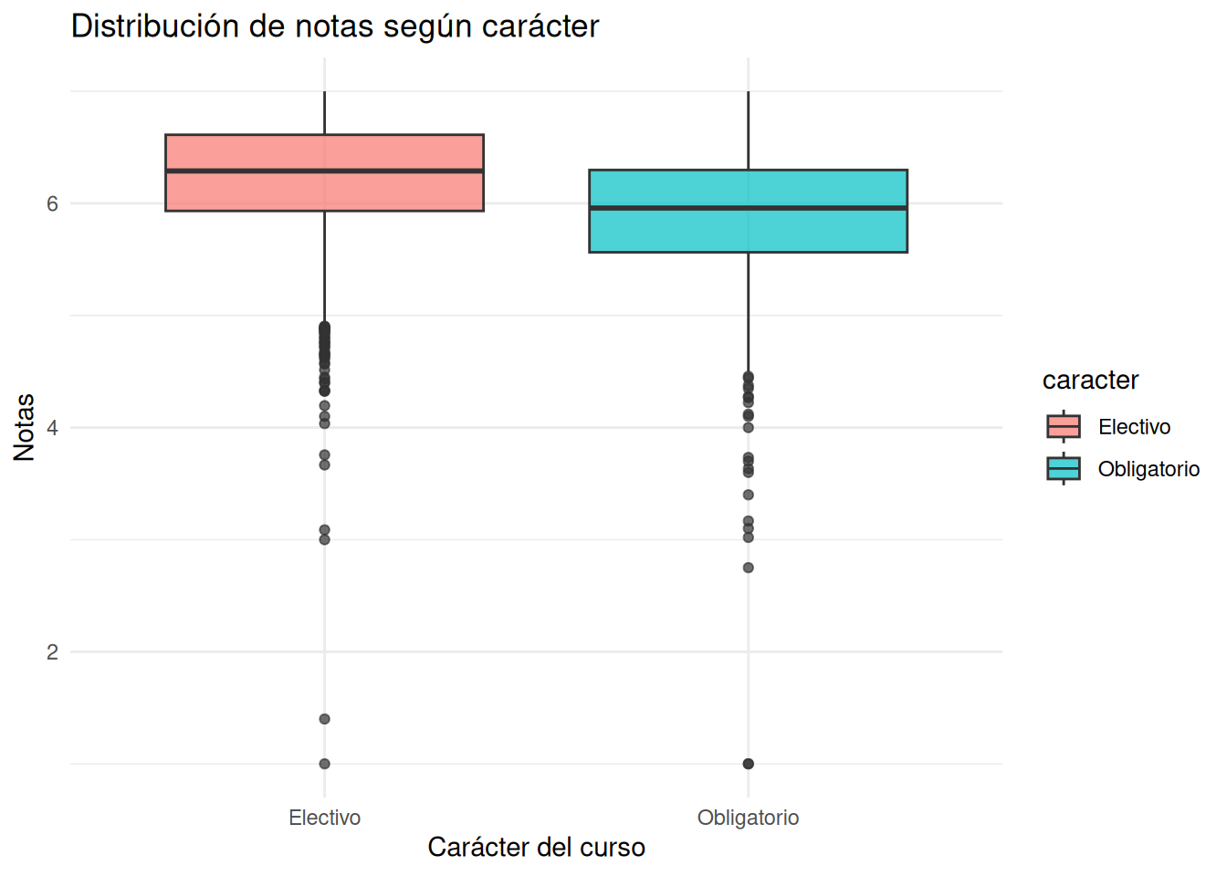
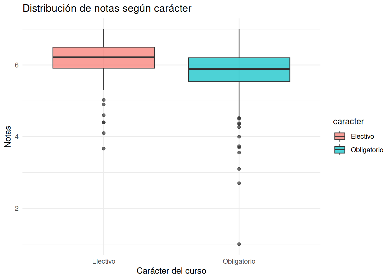
#### Sin secciones
```{r}
#| echo: false
ggplot((cc_nosection),
aes(x = caracter,
y = nota_promedio,
fill = caracter)) +
geom_boxplot(alpha = 0.7) +
labs(
x = "Carácter del curso",
y = "Notas",
title = "Distribución de notas según carácter"
) +
theme_minimal()
```
:::
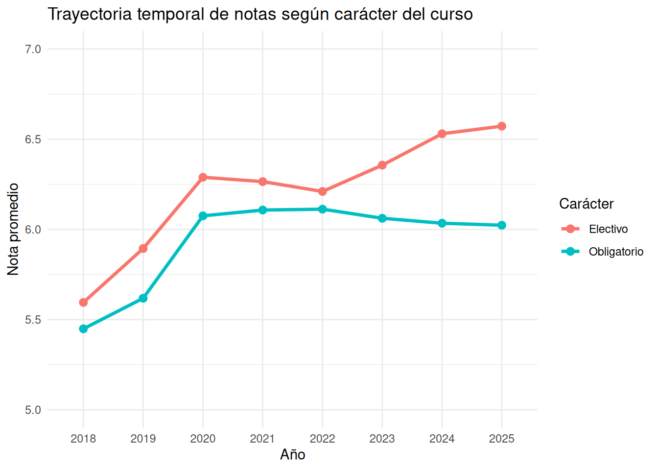
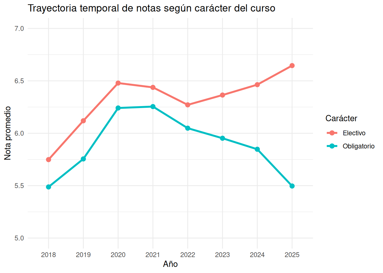
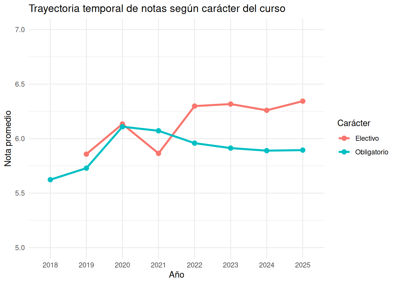
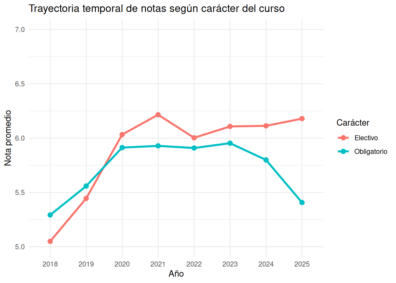
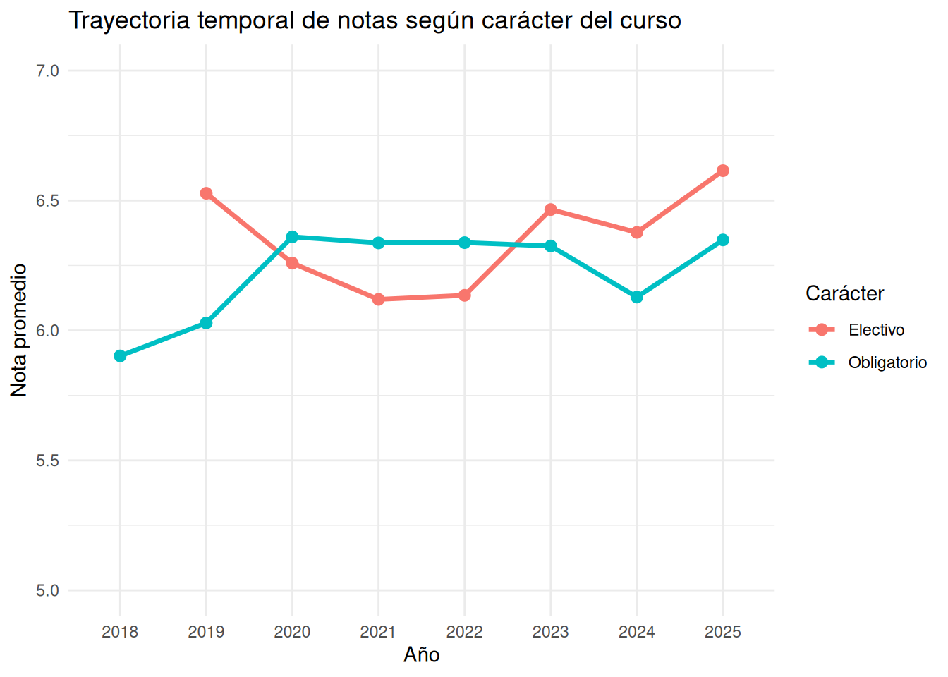
### Trayectoria nivel facultad
```{r}
#| echo: false
trayectoria_caracter <- cc_facso %>%
group_by(ano, caracter) %>%
summarise(
nota_promedio = mean(nota_promedio, na.rm = TRUE),
.groups = "drop"
)
trayectoria_carrera <- cc_facso %>%
group_by(ano, caracter, carrera) %>%
summarise(
nota_promedio = mean(nota_promedio, na.rm = TRUE),
.groups = "drop"
)
trayectoria_caracter_nos <- cc_nosection %>%
group_by(ano, caracter) %>%
summarise(
nota_promedio = mean(nota_promedio, na.rm = TRUE),
.groups = "drop"
)
trayectoria_carrera_nos <- cc_nosection %>%
group_by(ano, caracter, carrera) %>%
summarise(
nota_promedio = mean(nota_promedio, na.rm = TRUE),
.groups = "drop"
)
```
:::panel-tabset
#### Con secciones
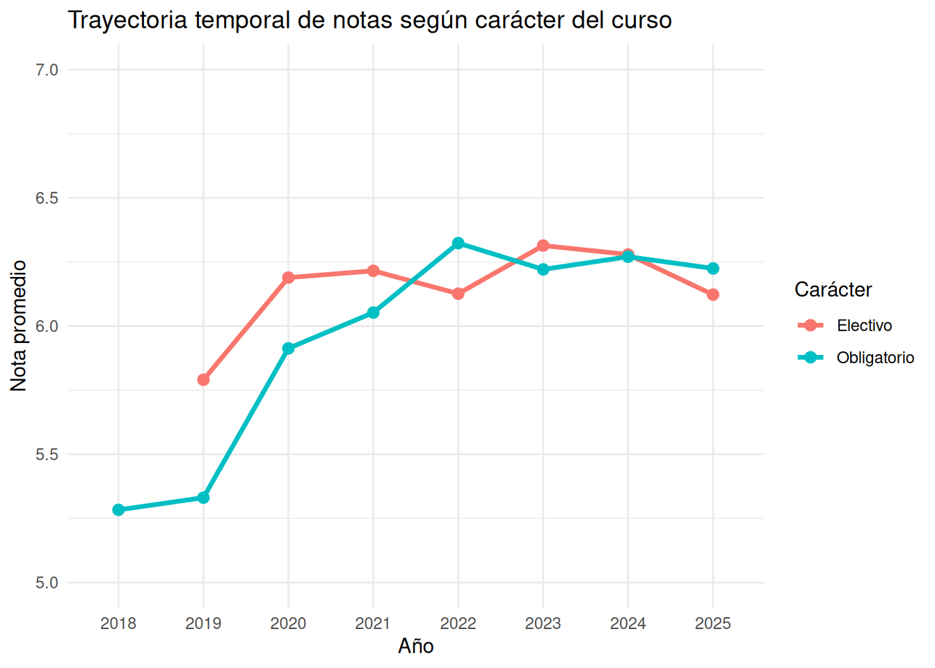
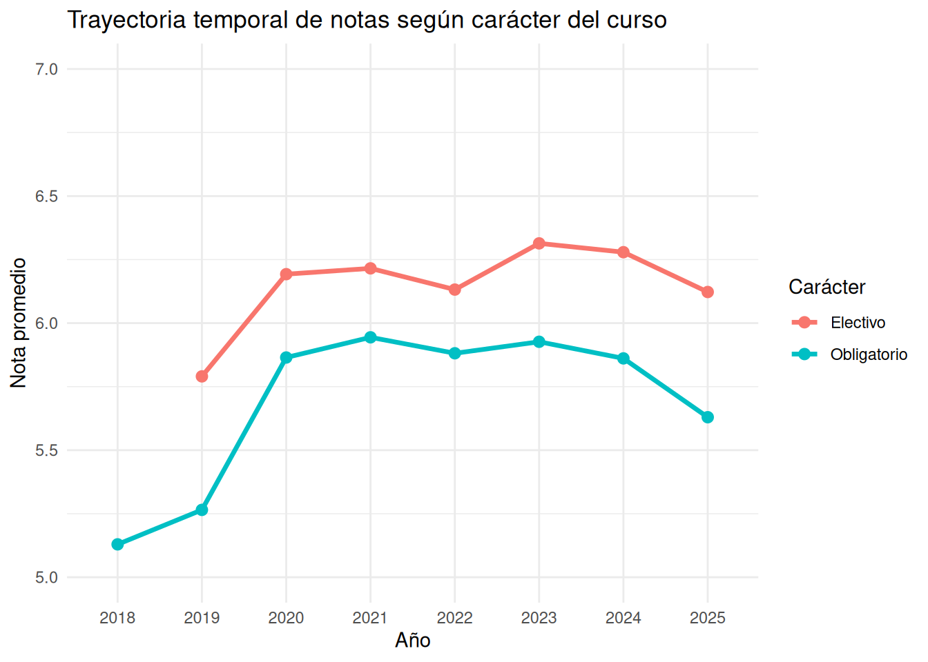
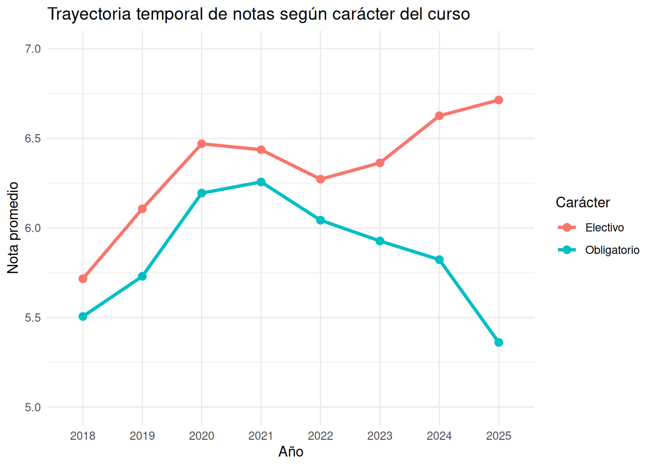
```{r}
#| echo: false
ggplot(trayectoria_caracter,
aes(x = ano,
y = nota_promedio,
color = caracter,
group = caracter)) +
geom_line(linewidth = 1.2) +
geom_point(size = 2.5) +
coord_cartesian(ylim = c(5, 7)) +
labs(
x = "Año",
y = "Nota promedio",
color = "Carácter",
title = "Trayectoria temporal de notas según carácter del curso"
) +
theme_minimal()
```
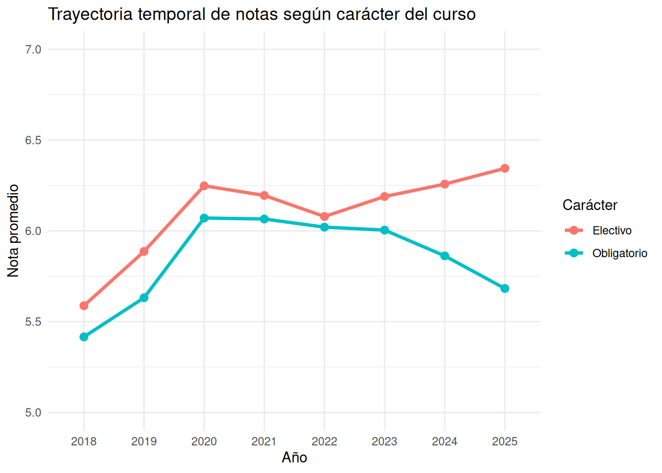
#### Sin secciones
```{r}
#| echo: false
ggplot(trayectoria_caracter_nos,
aes(x = ano,
y = nota_promedio,
color = caracter,
group = caracter)) +
geom_line(linewidth = 1.2) +
geom_point(size = 2.5) +
coord_cartesian(ylim = c(5, 7)) +
labs(
x = "Año",
y = "Nota promedio",
color = "Carácter",
title = "Trayectoria temporal de notas según carácter del curso"
) +
theme_minimal()
```
:::
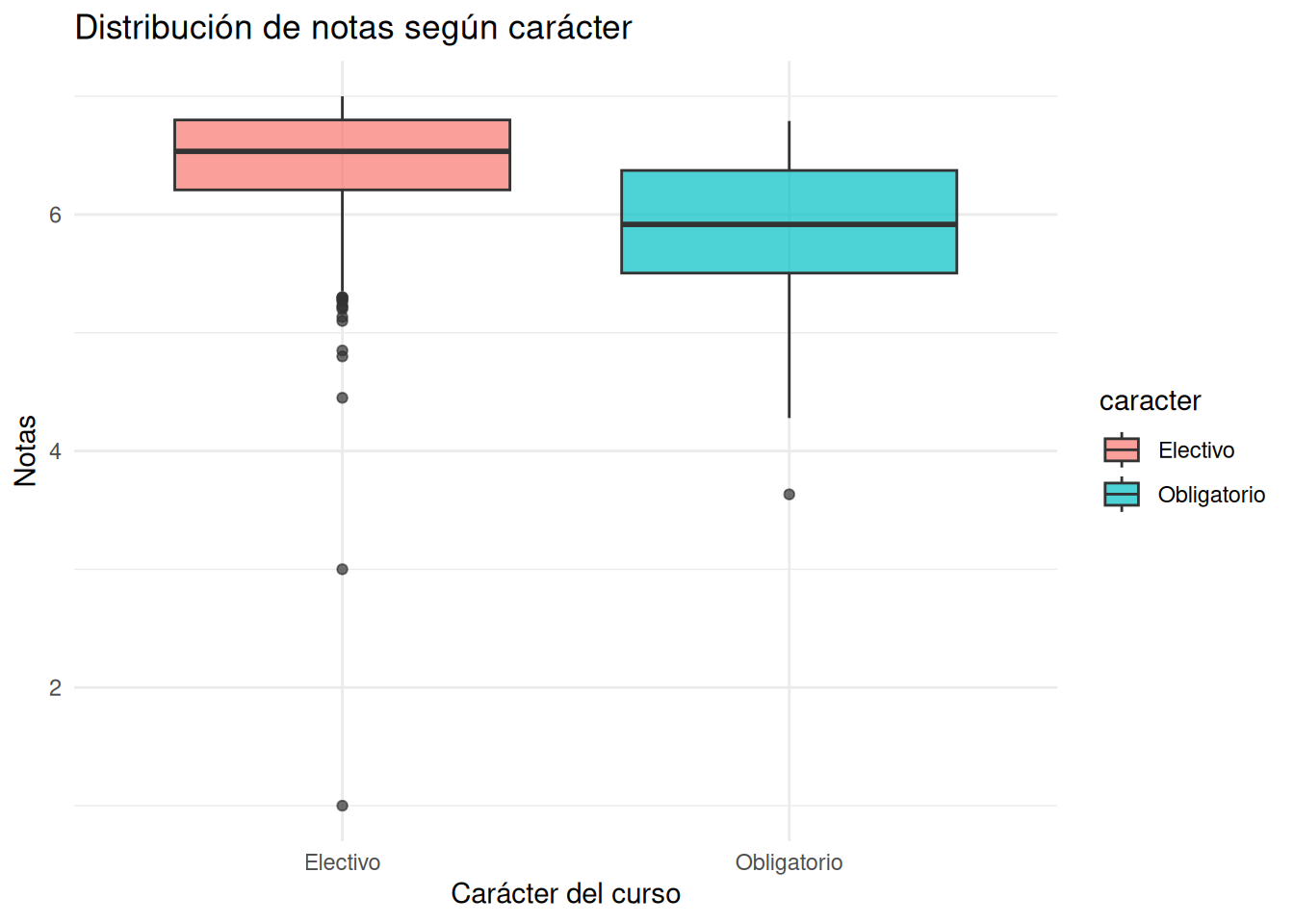
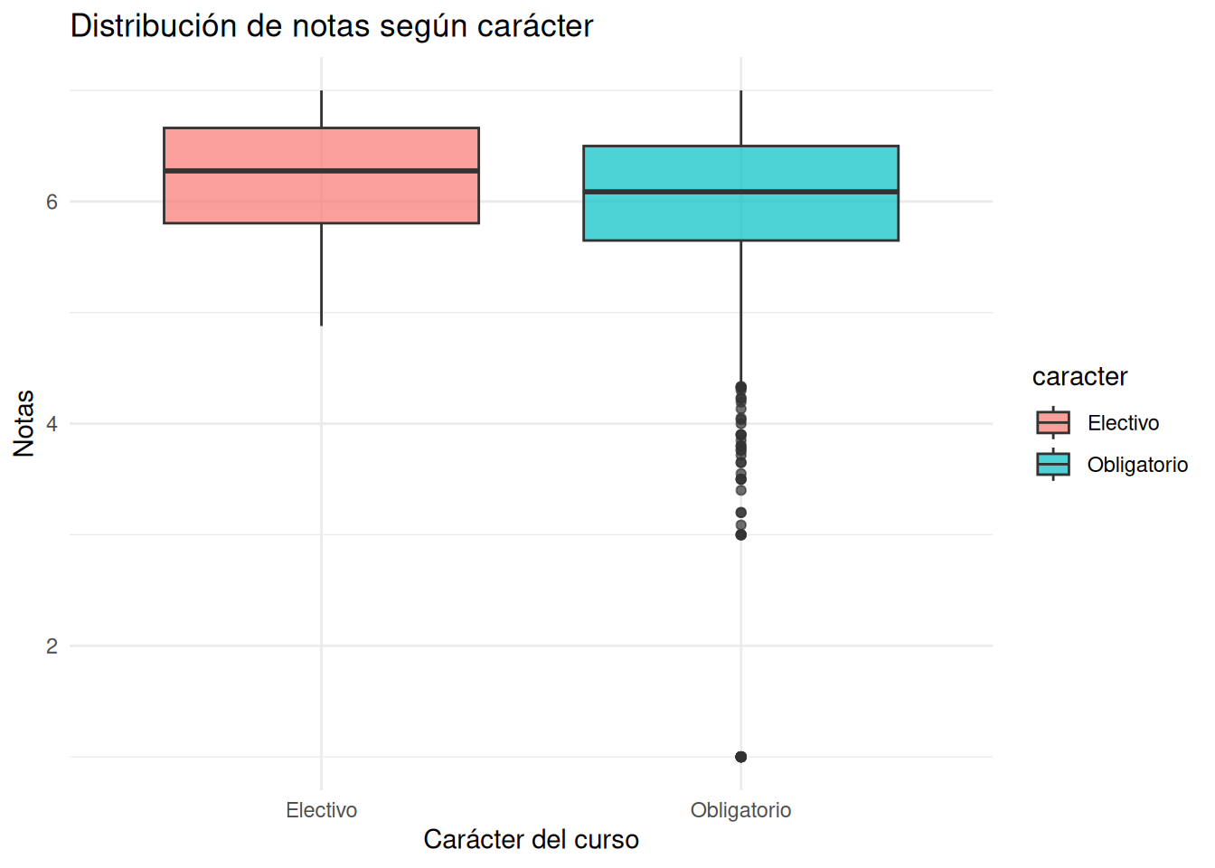
### Carrera pooled
::: panel-tabset
#### Sociología con secciones
```{r}
#| echo: false
ggplot((cc_facso %>% filter(carrera == "Sociología")),
aes(x = caracter,
y = nota_promedio,
fill = caracter)) +
geom_boxplot(alpha = 0.7) +
coord_cartesian(ylim = c(1, 7)) +
labs(
x = "Carácter del curso",
y = "Notas",
title = "Distribución de notas según carácter"
) +
theme_minimal()
```
#### Sociología sin secciones
```{r}
#| echo: false
ggplot((cc_nosection %>% filter(carrera == "Sociología")),
aes(x = caracter,
y = nota_promedio,
fill = caracter)) +
geom_boxplot(alpha = 0.7) +
coord_cartesian(ylim = c(1, 7)) +
labs(
x = "Carácter del curso",
y = "Notas",
title = "Distribución de notas según carácter"
) +
theme_minimal()
```
#### Psicología con secciones
```{r}
#| echo: false
ggplot((cc_facso %>% filter(carrera == "Psicología")),
aes(x = caracter,
y = nota_promedio,
fill = caracter)) +
geom_boxplot(alpha = 0.7) +
coord_cartesian(ylim = c(1, 7)) +
labs(
x = "Carácter del curso",
y = "Notas",
title = "Distribución de notas según carácter"
) +
theme_minimal()
```
#### Psicología sin secciones
```{r}
#| echo: false
ggplot((cc_nosection %>% filter(carrera == "Psicología")),
aes(x = caracter,
y = nota_promedio,
fill = caracter)) +
geom_boxplot(alpha = 0.7) +
coord_cartesian(ylim = c(1, 7)) +
labs(
x = "Carácter del curso",
y = "Notas",
title = "Distribución de notas según carácter"
) +
theme_minimal()
```
#### Antropología con secciones
```{r}
#| echo: false
ggplot((cc_facso %>% filter(carrera == "Antropología")),
aes(x = caracter,
y = nota_promedio,
fill = caracter)) +
geom_boxplot(alpha = 0.7) +
coord_cartesian(ylim = c(1, 7)) +
labs(
x = "Carácter del curso",
y = "Notas",
title = "Distribución de notas según carácter"
) +
theme_minimal()
```
#### Antropología sin secciones
```{r}
#| echo: false
ggplot((cc_nosection %>% filter(carrera == "Antropología")),
aes(x = caracter,
y = nota_promedio,
fill = caracter)) +
geom_boxplot(alpha = 0.7) +
coord_cartesian(ylim = c(1, 7)) +
labs(
x = "Carácter del curso",
y = "Notas",
title = "Distribución de notas según carácter"
) +
theme_minimal()
```
#### Trabajo Social con secciones
```{r}
#| echo: false
ggplot((cc_facso %>% filter(carrera == "Trabajo Social")),
aes(x = caracter,
y = nota_promedio,
fill = caracter)) +
geom_boxplot(alpha = 0.7) +
coord_cartesian(ylim = c(1, 7)) +
labs(
x = "Carácter del curso",
y = "Notas",
title = "Distribución de notas según carácter"
) +
theme_minimal()
```
#### Trabajo Social sin secciones
```{r}
#| echo: false
ggplot((cc_nosection %>% filter(carrera == "Trabajo Social")),
aes(x = caracter,
y = nota_promedio,
fill = caracter)) +
geom_boxplot(alpha = 0.7) +
coord_cartesian(ylim = c(1, 7)) +
labs(
x = "Carácter del curso",
y = "Notas",
title = "Distribución de notas según carácter"
) +
theme_minimal()
```
#### Educación Parvularia con secciones
```{r}
#| echo: false
ggplot((cc_facso %>% filter(carrera == "Educación Parvularia")),
aes(x = caracter,
y = nota_promedio,
fill = caracter)) +
geom_boxplot(alpha = 0.7) +
coord_cartesian(ylim = c(1, 7)) +
labs(
x = "Carácter del curso",
y = "Notas",
title = "Distribución de notas según carácter"
) +
theme_minimal()
```
#### Educación Parvularia sin secciones
```{r}
#| echo: false
ggplot((cc_nosection %>% filter(carrera == "Educación Parvularia")),
aes(x = caracter,
y = nota_promedio,
fill = caracter)) +
geom_boxplot(alpha = 0.7) +
coord_cartesian(ylim = c(1, 7)) +
labs(
x = "Carácter del curso",
y = "Notas",
title = "Distribución de notas según carácter"
) +
theme_minimal()
```
:::
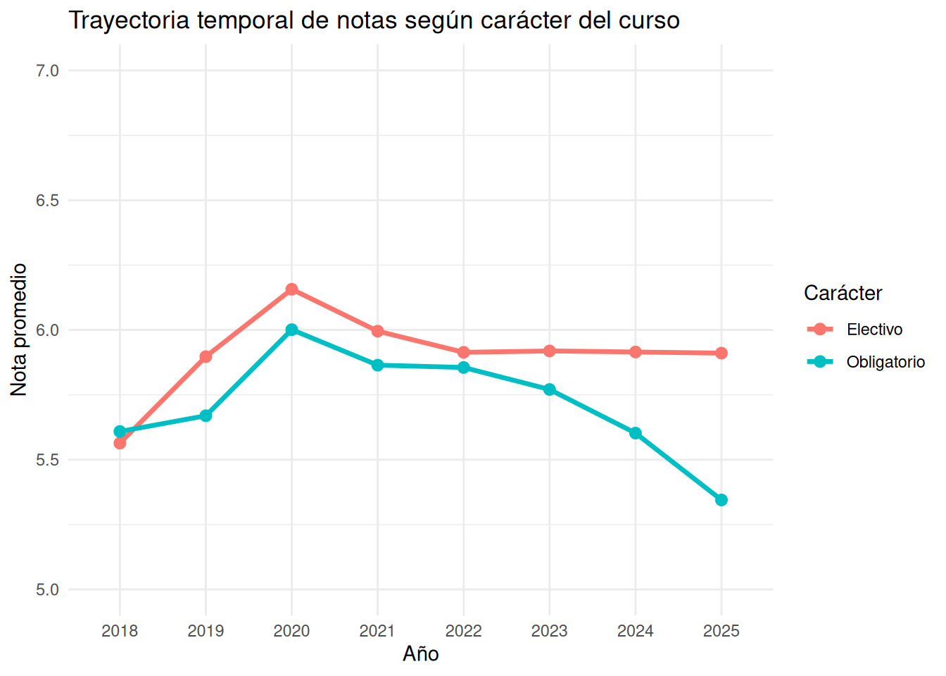
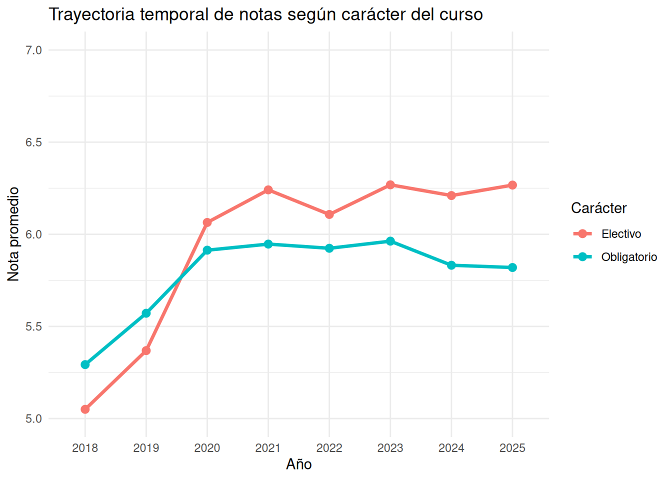
### Trayectorias por carrera
:::panel-tabset
#### Sociología con secciones
```{r}
#| echo: false
ggplot((trayectoria_carrera %>% filter(carrera == "Sociología")),
aes(x = ano,
y = nota_promedio,
color = caracter,
group = caracter)) +
geom_line(linewidth = 1.2) +
geom_point(size = 2.5) +
coord_cartesian(ylim = c(5, 7)) +
labs(
x = "Año",
y = "Nota promedio",
color = "Carácter",
title = "Trayectoria temporal de notas según carácter del curso"
) +
theme_minimal()
```
#### Sociología sin secciones
```{r}
#| echo: false
ggplot((trayectoria_carrera_nos %>% filter(carrera == "Sociología")),
aes(x = ano,
y = nota_promedio,
color = caracter,
group = caracter)) +
geom_line(linewidth = 1.2) +
geom_point(size = 2.5) +
coord_cartesian(ylim = c(5, 7)) +
labs(
x = "Año",
y = "Nota promedio",
color = "Carácter",
title = "Trayectoria temporal de notas según carácter del curso"
) +
theme_minimal()
```
#### Psicología con secciones
```{r}
#| echo: false
ggplot((trayectoria_carrera %>% filter(carrera == "Psicología")),
aes(x = ano,
y = nota_promedio,
color = caracter,
group = caracter)) +
geom_line(linewidth = 1.2) +
geom_point(size = 2.5) +
coord_cartesian(ylim = c(5, 7)) +
labs(
x = "Año",
y = "Nota promedio",
color = "Carácter",
title = "Trayectoria temporal de notas según carácter del curso"
) +
theme_minimal()
```
#### Psicología sin secciones
```{r}
#| echo: false
ggplot((trayectoria_carrera_nos %>% filter(carrera == "Psicología")),
aes(x = ano,
y = nota_promedio,
color = caracter,
group = caracter)) +
geom_line(linewidth = 1.2) +
geom_point(size = 2.5) +
coord_cartesian(ylim = c(5, 7)) +
labs(
x = "Año",
y = "Nota promedio",
color = "Carácter",
title = "Trayectoria temporal de notas según carácter del curso"
) +
theme_minimal()
```
#### Antropología con secciones
```{r}
#| echo: false
ggplot((trayectoria_carrera %>% filter(carrera == "Antropología")),
aes(x = ano,
y = nota_promedio,
color = caracter,
group = caracter)) +
geom_line(linewidth = 1.2) +
geom_point(size = 2.5) +
coord_cartesian(ylim = c(5, 7)) +
labs(
x = "Año",
y = "Nota promedio",
color = "Carácter",
title = "Trayectoria temporal de notas según carácter del curso"
) +
theme_minimal()
```
#### Antropología sin secciones
```{r}
#| echo: false
ggplot((trayectoria_carrera_nos %>% filter(carrera == "Antropología")),
aes(x = ano,
y = nota_promedio,
color = caracter,
group = caracter)) +
geom_line(linewidth = 1.2) +
geom_point(size = 2.5) +
coord_cartesian(ylim = c(5, 7)) +
labs(
x = "Año",
y = "Nota promedio",
color = "Carácter",
title = "Trayectoria temporal de notas según carácter del curso"
) +
theme_minimal()
```
#### Trabajo Social con secciones
```{r}
#| echo: false
ggplot((trayectoria_carrera %>% filter(carrera == "Trabajo Social")),
aes(x = ano,
y = nota_promedio,
color = caracter,
group = caracter)) +
geom_line(linewidth = 1.2) +
geom_point(size = 2.5) +
coord_cartesian(ylim = c(5, 7)) +
labs(
x = "Año",
y = "Nota promedio",
color = "Carácter",
title = "Trayectoria temporal de notas según carácter del curso"
) +
theme_minimal()
```
#### Trabajo Social sin secciones
```{r}
#| echo: false
ggplot((trayectoria_carrera_nos %>% filter(carrera == "Trabajo Social")),
aes(x = ano,
y = nota_promedio,
color = caracter,
group = caracter)) +
geom_line(linewidth = 1.2) +
geom_point(size = 2.5) +
coord_cartesian(ylim = c(5, 7)) +
labs(
x = "Año",
y = "Nota promedio",
color = "Carácter",
title = "Trayectoria temporal de notas según carácter del curso"
) +
theme_minimal()
```
#### Educación Parvularia con secciones
```{r}
#| echo: false
ggplot((trayectoria_carrera %>% filter(carrera == "Educación Parvularia")),
aes(x = ano,
y = nota_promedio,
color = caracter,
group = caracter)) +
geom_line(linewidth = 1.2) +
geom_point(size = 2.5) +
coord_cartesian(ylim = c(5, 7)) +
labs(
x = "Año",
y = "Nota promedio",
color = "Carácter",
title = "Trayectoria temporal de notas según carácter del curso"
) +
theme_minimal()
```
#### Educación Parvularia sin secciones
```{r}
#| echo: false
ggplot((trayectoria_carrera_nos %>% filter(carrera == "Educación Parvularia")),
aes(x = ano,
y = nota_promedio,
color = caracter,
group = caracter)) +
geom_line(linewidth = 1.2) +
geom_point(size = 2.5) +
coord_cartesian(ylim = c(5, 7)) +
labs(
x = "Año",
y = "Nota promedio",
color = "Carácter",
title = "Trayectoria temporal de notas según carácter del curso"
) +
theme_minimal()
```
:::
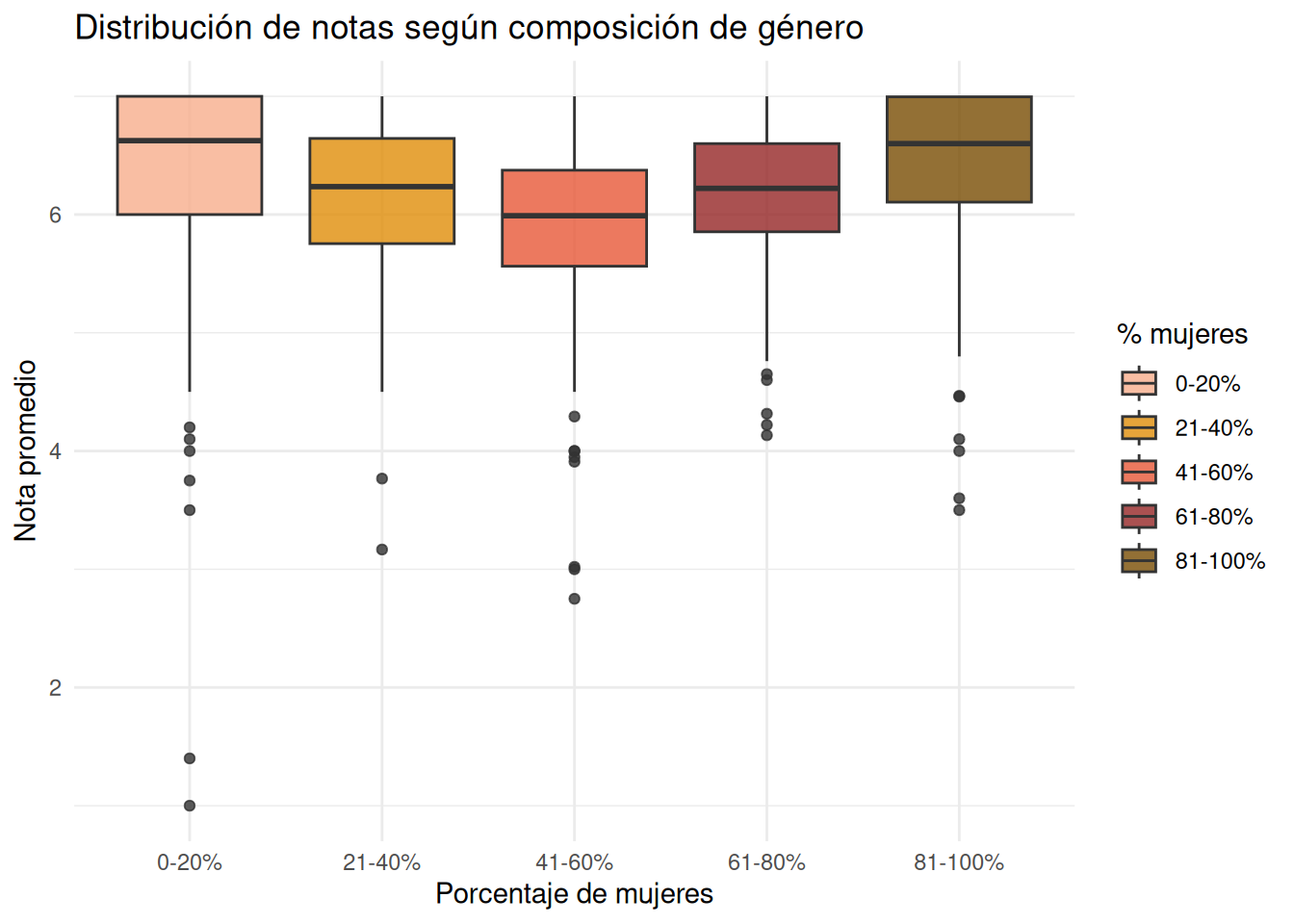
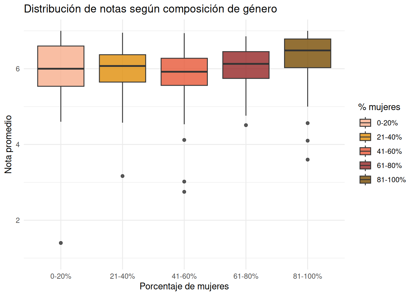
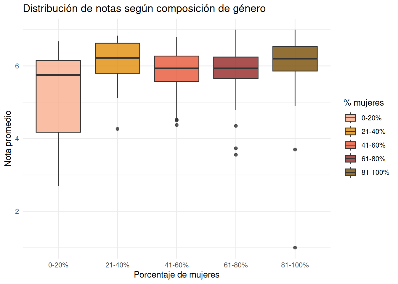
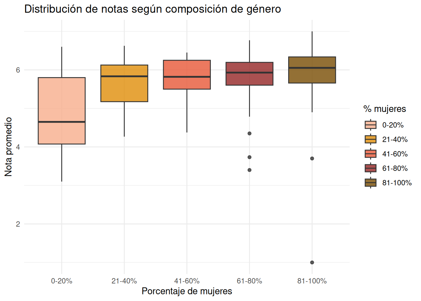
## Género
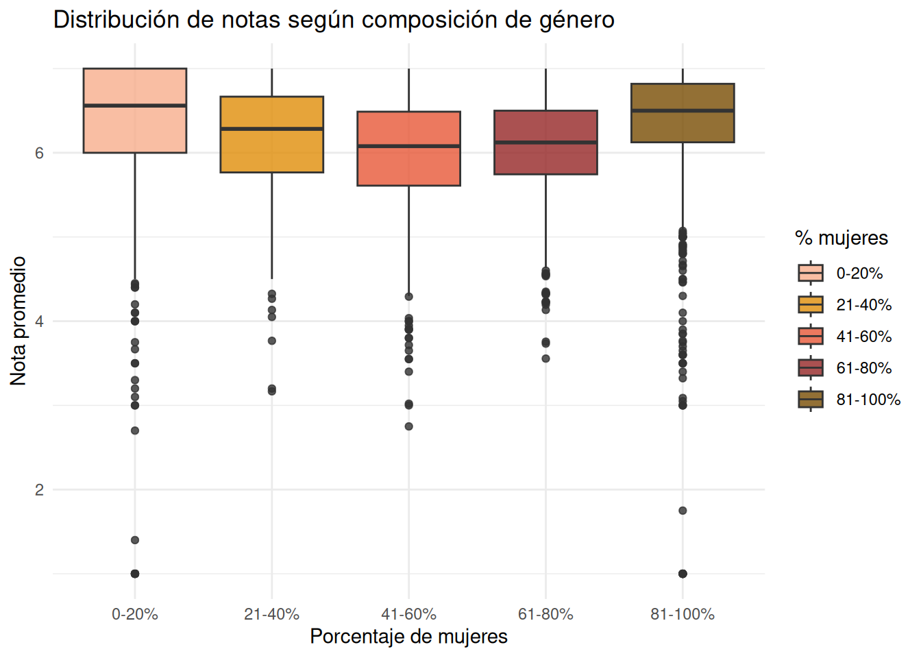
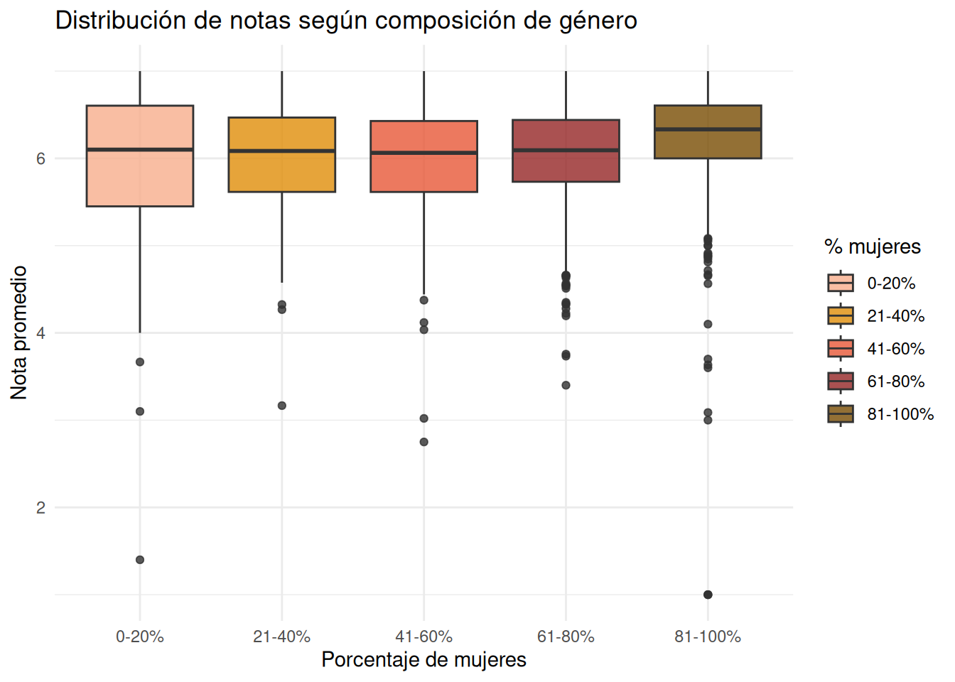
### Facultad pooled
```{r}
base_genero <- cc_facso %>%
  mutate(
    pct_mujeres = (n_mujeres / n_estudiantes) * 100,

    tramo_mujeres = case_when(
      pct_mujeres <= 20 ~ "0-20%",
      pct_mujeres <= 40 ~ "21-40%",
      pct_mujeres <= 60 ~ "41-60%",
      pct_mujeres <= 80 ~ "61-80%",
      TRUE ~ "81-100%"
    )
  )

base_genero_nos <- cc_nosection %>%
  mutate(
    pct_mujeres = (n_mujeres / n_estudiantes) * 100,

    tramo_mujeres = case_when(
      pct_mujeres <= 20 ~ "0-20%",
      pct_mujeres <= 40 ~ "21-40%",
      pct_mujeres <= 60 ~ "41-60%",
      pct_mujeres <= 80 ~ "61-80%",
      TRUE ~ "81-100%"
    )
  )
```
:::panel-tabset
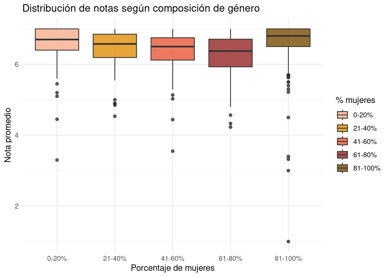
#### Con secciones
```{r}
#| echo: false
ggplot(base_genero,
aes(x = tramo_mujeres,
y = nota_promedio,
fill = tramo_mujeres)) +
geom_boxplot(alpha = 0.8) +
coord_cartesian(ylim = c(1, 7)) +
scale_fill_manual(
values = c(
"0-20%" = "#f7ae8c",
"21-40%" = "#df8d09",
"41-60%" = "#e75838",
"61-80%" = "#952626",
"81-100%" = "#784c03"
)
) +
labs(
x = "Porcentaje de mujeres",
y = "Nota promedio",
fill = "% mujeres",
title = "Distribución de notas según composición de género"
) +
theme_minimal()
```
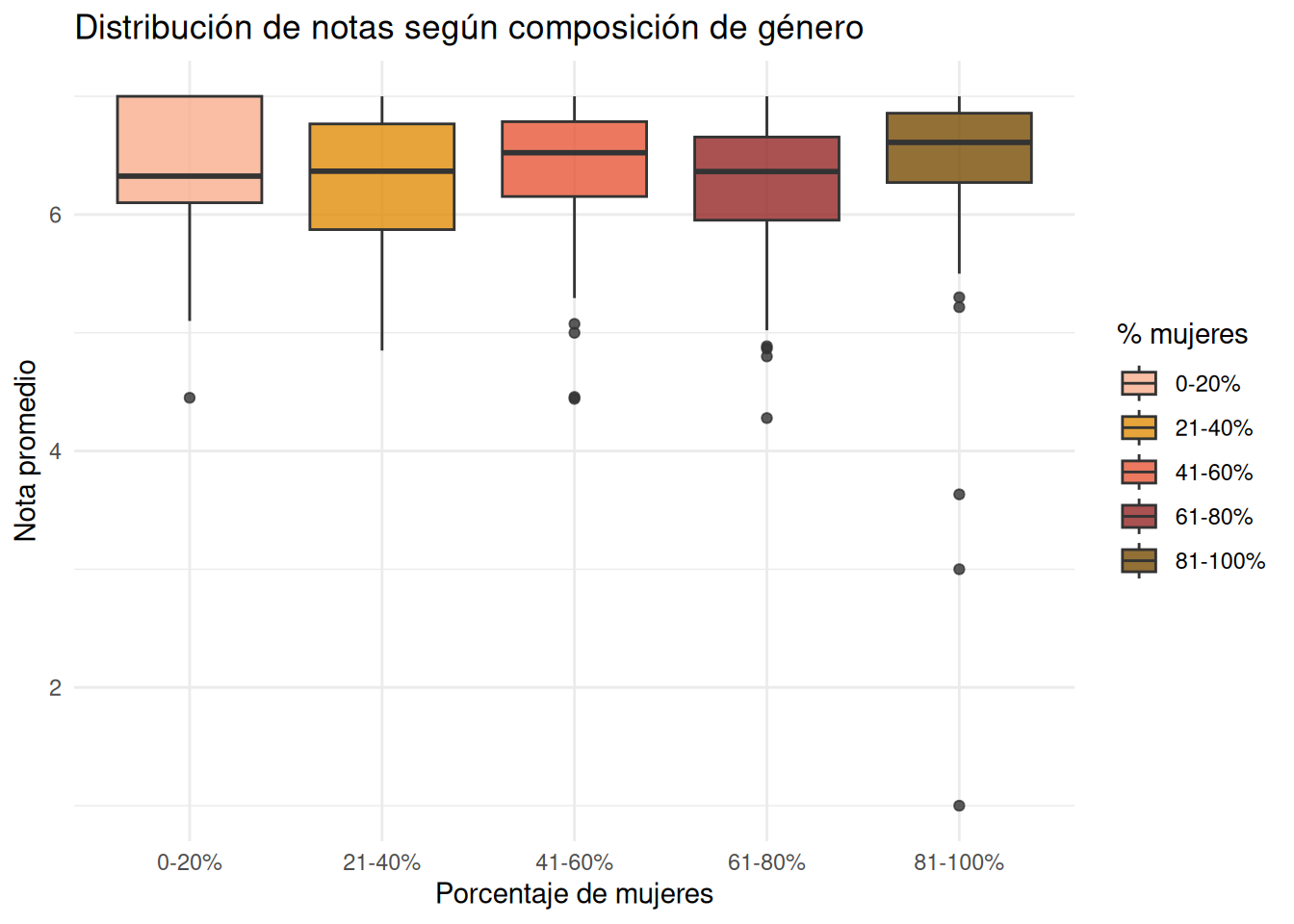
#### Sin secciones
```{r}
#| echo: false
ggplot(base_genero_nos,
aes(x = tramo_mujeres,
y = nota_promedio,
fill = tramo_mujeres)) +
geom_boxplot(alpha = 0.8) +
coord_cartesian(ylim = c(1, 7)) +
scale_fill_manual(
values = c(
"0-20%" = "#f7ae8c",
"21-40%" = "#df8d09",
"41-60%" = "#e75838",
"61-80%" = "#952626",
"81-100%" = "#784c03"
)
) +
labs(
x = "Porcentaje de mujeres",
y = "Nota promedio",
fill = "% mujeres",
title = "Distribución de notas según composición de género"
) +
theme_minimal()
```
::::
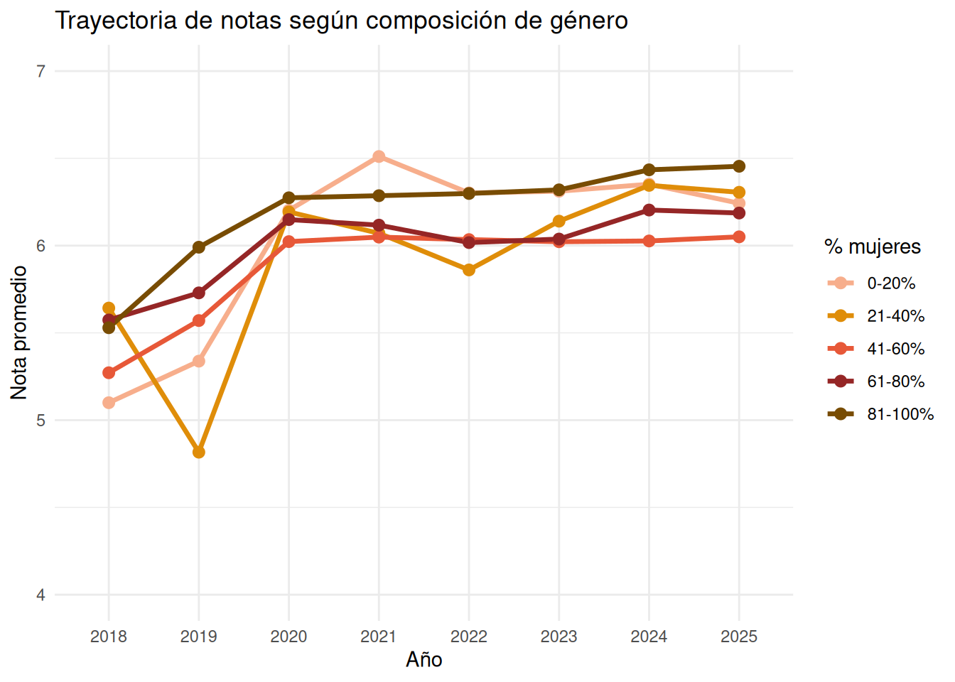
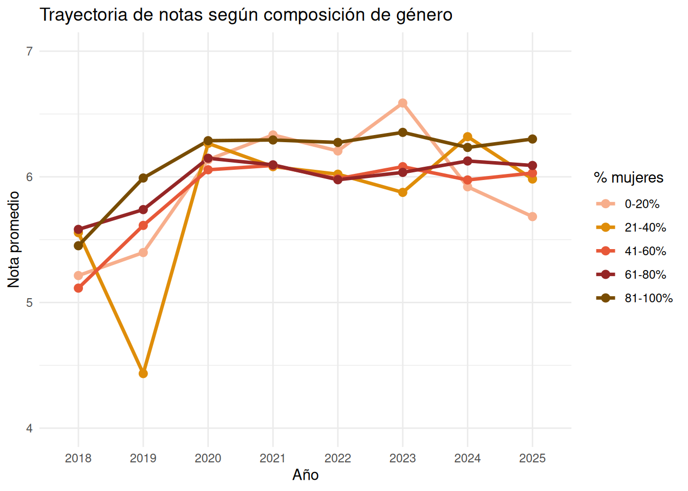
### Facultad en el tiempo
```{r}
#| echo: false
genero_tiempo <- cc_facso %>%
mutate(
pct_mujeres = (n_mujeres / n_estudiantes) * 100,
tramo_mujeres = case_when(
pct_mujeres <= 20 ~ "0-20%",
pct_mujeres <= 40 ~ "21-40%",
pct_mujeres <= 60 ~ "41-60%",
pct_mujeres <= 80 ~ "61-80%",
TRUE ~ "81-100%"
)
) %>%
group_by(ano, tramo_mujeres) %>%
summarise(
nota_promedio = mean(nota_promedio, na.rm = TRUE),
.groups = "drop"
)
genero_tiempo_nos <- cc_nosection %>%
mutate(
pct_mujeres = (n_mujeres / n_estudiantes) * 100,
tramo_mujeres = case_when(
pct_mujeres <= 20 ~ "0-20%",
pct_mujeres <= 40 ~ "21-40%",
pct_mujeres <= 60 ~ "41-60%",
pct_mujeres <= 80 ~ "61-80%",
TRUE ~ "81-100%"
)
) %>%
group_by(ano, tramo_mujeres) %>%
summarise(
nota_promedio = mean(nota_promedio, na.rm = TRUE),
.groups = "drop"
)
```
:::panel-tabset
#### Con secciones
```{r}
#| echo: false
ggplot(genero_tiempo,
aes(x = ano,
y = nota_promedio,
color = tramo_mujeres,
group = tramo_mujeres)) +
geom_line(linewidth = 1.2) +
coord_cartesian(ylim = c(4, 7)) +
geom_point(size = 2.5) +
scale_color_manual(
values = c(
"0-20%" = "#f7ae8c",
"21-40%" = "#df8d09",
"41-60%" = "#e75838",
"61-80%" = "#952626",
"81-100%" = "#784c03"
)
) +
labs(
x = "Año",
y = "Nota promedio",
color = "% mujeres",
title = "Trayectoria de notas según composición de género"
) +
theme_minimal()
```
#### Sin secciones
```{r}
#| echo: false
ggplot(genero_tiempo_nos,
aes(x = ano,
y = nota_promedio,
color = tramo_mujeres,
group = tramo_mujeres)) +
geom_line(linewidth = 1.2) +
coord_cartesian(ylim = c(4, 7)) +
geom_point(size = 2.5) +
scale_color_manual(
values = c(
"0-20%" = "#f7ae8c",
"21-40%" = "#df8d09",
"41-60%" = "#e75838",
"61-80%" = "#952626",
"81-100%" = "#784c03"
)
) +
labs(
x = "Año",
y = "Nota promedio",
color = "% mujeres",
title = "Trayectoria de notas según composición de género"
) +
theme_minimal()
```
:::
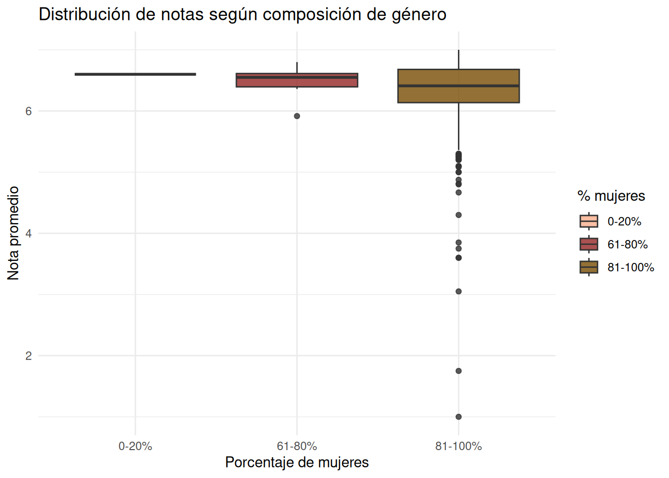
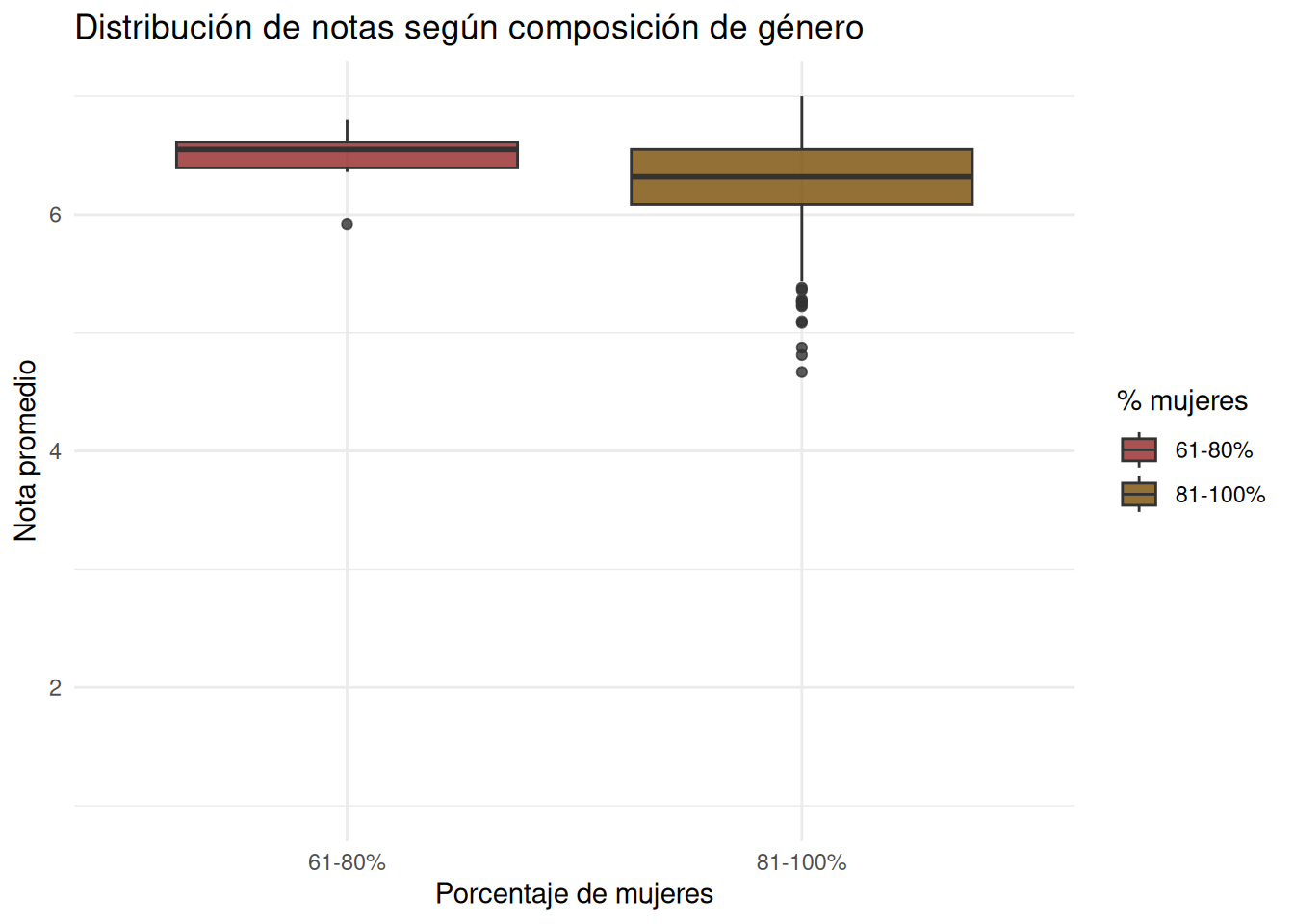
### Nivel carrera
:::panel-tabset
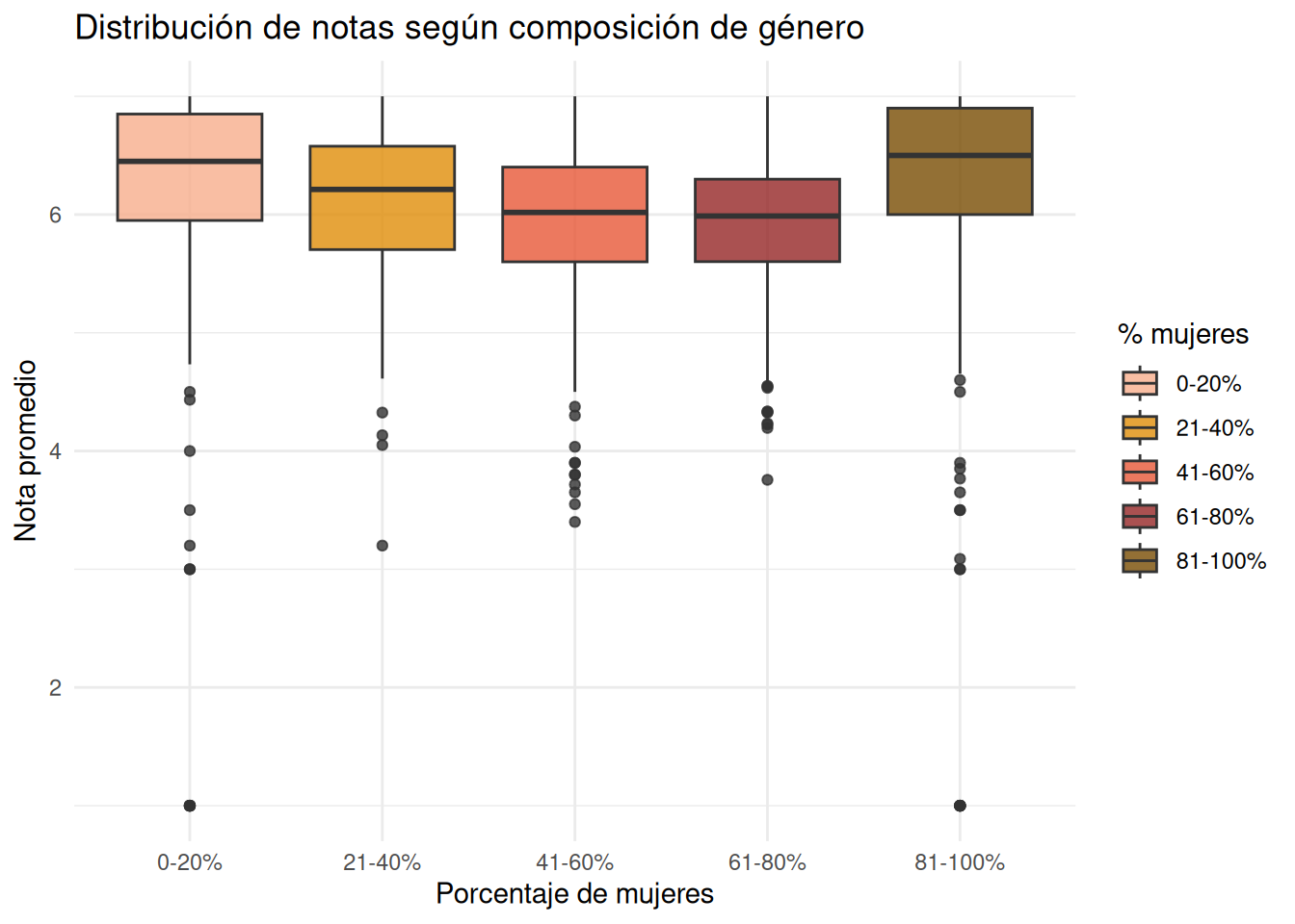
#### Sociología con secciones
```{r}
#| echo: false
ggplot((base_genero) %>% filter(carrera == "Sociología"),
aes(x = tramo_mujeres,
y = nota_promedio,
fill = tramo_mujeres)) +
geom_boxplot(alpha = 0.8) +
coord_cartesian(ylim = c(1, 7)) +
scale_fill_manual(
values = c(
"0-20%" = "#f7ae8c",
"21-40%" = "#df8d09",
"41-60%" = "#e75838",
"61-80%" = "#952626",
"81-100%" = "#784c03"
)
) +
labs(
x = "Porcentaje de mujeres",
y = "Nota promedio",
fill = "% mujeres",
title = "Distribución de notas según composición de género"
) +
theme_minimal()
```
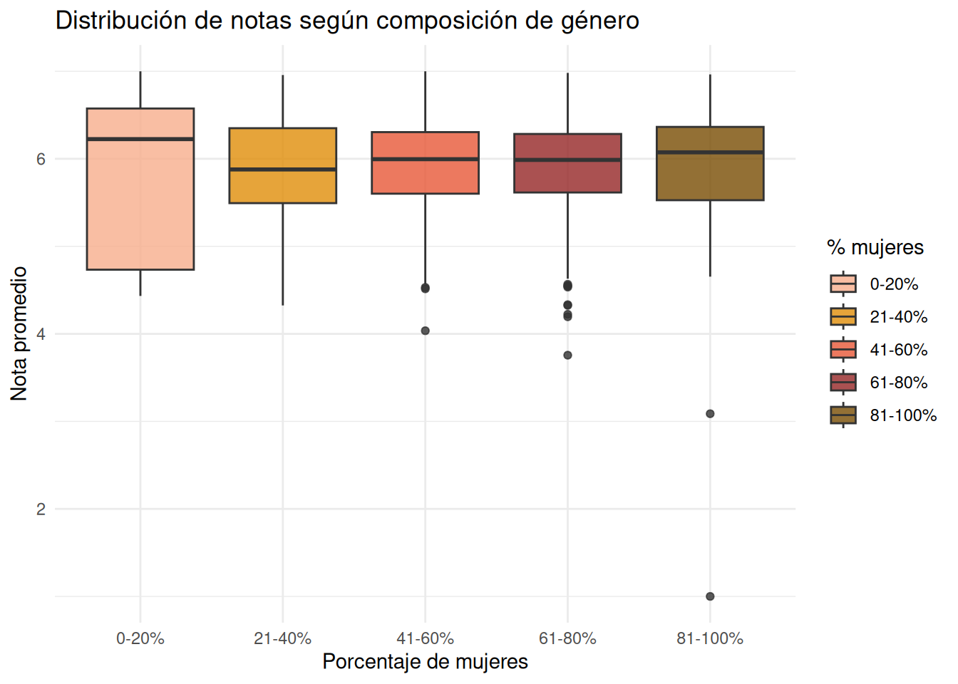
#### Sociología sin secciones
```{r}
#| echo: false
ggplot((base_genero_nos) %>% filter(carrera == "Sociología"),
aes(x = tramo_mujeres,
y = nota_promedio,
fill = tramo_mujeres)) +
geom_boxplot(alpha = 0.8) +
coord_cartesian(ylim = c(1, 7)) +
scale_fill_manual(
values = c(
"0-20%" = "#f7ae8c",
"21-40%" = "#df8d09",
"41-60%" = "#e75838",
"61-80%" = "#952626",
"81-100%" = "#784c03"
)
) +
labs(
x = "Porcentaje de mujeres",
y = "Nota promedio",
fill = "% mujeres",
title = "Distribución de notas según composición de género"
) +
theme_minimal()
```
#### Psicología con secciones
```{r}
#| echo: false
ggplot((base_genero) %>% filter(carrera == "Psicología"),
aes(x = tramo_mujeres,
y = nota_promedio,
fill = tramo_mujeres)) +
geom_boxplot(alpha = 0.8) +
coord_cartesian(ylim = c(1, 7)) +
scale_fill_manual(
values = c(
"0-20%" = "#f7ae8c",
"21-40%" = "#df8d09",
"41-60%" = "#e75838",
"61-80%" = "#952626",
"81-100%" = "#784c03"
)
) +
labs(
x = "Porcentaje de mujeres",
y = "Nota promedio",
fill = "% mujeres",
title = "Distribución de notas según composición de género"
) +
theme_minimal()
```
#### Psicología sin secciones
```{r}
#| echo: false
ggplot((base_genero_nos) %>% filter(carrera == "Psicología"),
aes(x = tramo_mujeres,
y = nota_promedio,
fill = tramo_mujeres)) +
geom_boxplot(alpha = 0.8) +
coord_cartesian(ylim = c(1, 7)) +
scale_fill_manual(
values = c(
"0-20%" = "#f7ae8c",
"21-40%" = "#df8d09",
"41-60%" = "#e75838",
"61-80%" = "#952626",
"81-100%" = "#784c03"
)
) +
labs(
x = "Porcentaje de mujeres",
y = "Nota promedio",
fill = "% mujeres",
title = "Distribución de notas según composición de género"
) +
theme_minimal()
```
#### Antropología con secciones
```{r}
#| echo: false
ggplot((base_genero) %>% filter(carrera == "Antropología"),
aes(x = tramo_mujeres,
y = nota_promedio,
fill = tramo_mujeres)) +
geom_boxplot(alpha = 0.8) +
coord_cartesian(ylim = c(1, 7)) +
scale_fill_manual(
values = c(
"0-20%" = "#f7ae8c",
"21-40%" = "#df8d09",
"41-60%" = "#e75838",
"61-80%" = "#952626",
"81-100%" = "#784c03"
)
) +
labs(
x = "Porcentaje de mujeres",
y = "Nota promedio",
fill = "% mujeres",
title = "Distribución de notas según composición de género"
) +
theme_minimal()
```
#### Antropología sin secciones
```{r}
#| echo: false
ggplot((base_genero_nos) %>% filter(carrera == "Antropología"),
aes(x = tramo_mujeres,
y = nota_promedio,
fill = tramo_mujeres)) +
geom_boxplot(alpha = 0.8) +
coord_cartesian(ylim = c(1, 7)) +
scale_fill_manual(
values = c(
"0-20%" = "#f7ae8c",
"21-40%" = "#df8d09",
"41-60%" = "#e75838",
"61-80%" = "#952626",
"81-100%" = "#784c03"
)
) +
labs(
x = "Porcentaje de mujeres",
y = "Nota promedio",
fill = "% mujeres",
title = "Distribución de notas según composición de género"
) +
theme_minimal()
```
#### Trabajo Social con secciones
```{r}
#| echo: false
ggplot((base_genero) %>% filter(carrera == "Trabajo Social"),
aes(x = tramo_mujeres,
y = nota_promedio,
fill = tramo_mujeres)) +
geom_boxplot(alpha = 0.8) +
coord_cartesian(ylim = c(1, 7)) +
scale_fill_manual(
values = c(
"0-20%" = "#f7ae8c",
"21-40%" = "#df8d09",
"41-60%" = "#e75838",
"61-80%" = "#952626",
"81-100%" = "#784c03"
)
) +
labs(
x = "Porcentaje de mujeres",
y = "Nota promedio",
fill = "% mujeres",
title = "Distribución de notas según composición de género"
) +
theme_minimal()
```
#### Trabajo Social sin secciones
```{r}
#| echo: false
ggplot((base_genero_nos) %>% filter(carrera == "Trabajo Social"),
aes(x = tramo_mujeres,
y = nota_promedio,
fill = tramo_mujeres)) +
geom_boxplot(alpha = 0.8) +
coord_cartesian(ylim = c(1, 7)) +
scale_fill_manual(
values = c(
"0-20%" = "#f7ae8c",
"21-40%" = "#df8d09",
"41-60%" = "#e75838",
"61-80%" = "#952626",
"81-100%" = "#784c03"
)
) +
labs(
x = "Porcentaje de mujeres",
y = "Nota promedio",
fill = "% mujeres",
title = "Distribución de notas según composición de género"
) +
theme_minimal()
```
#### Educación Parvularia con secciones
```{r}
#| echo: false
ggplot((base_genero) %>% filter(carrera == "Educación Parvularia"),
aes(x = tramo_mujeres,
y = nota_promedio,
fill = tramo_mujeres)) +
geom_boxplot(alpha = 0.8) +
coord_cartesian(ylim = c(1, 7)) +
scale_fill_manual(
values = c(
"0-20%" = "#f7ae8c",
"21-40%" = "#df8d09",
"41-60%" = "#e75838",
"61-80%" = "#952626",
"81-100%" = "#784c03"
)
) +
labs(
x = "Porcentaje de mujeres",
y = "Nota promedio",
fill = "% mujeres",
title = "Distribución de notas según composición de género"
) +
theme_minimal()
```
#### Educación Parvularia sin secciones
```{r}
#| echo: false
ggplot((base_genero_nos) %>% filter(carrera == "Educación Parvularia"),
aes(x = tramo_mujeres,
y = nota_promedio,
fill = tramo_mujeres)) +
geom_boxplot(alpha = 0.8) +
coord_cartesian(ylim = c(1, 7)) +
scale_fill_manual(
values = c(
"0-20%" = "#f7ae8c",
"21-40%" = "#df8d09",
"41-60%" = "#e75838",
"61-80%" = "#952626",
"81-100%" = "#784c03"
)
) +
labs(
x = "Porcentaje de mujeres",
y = "Nota promedio",
fill = "% mujeres",
title = "Distribución de notas según composición de género"
) +
theme_minimal()
```
:::
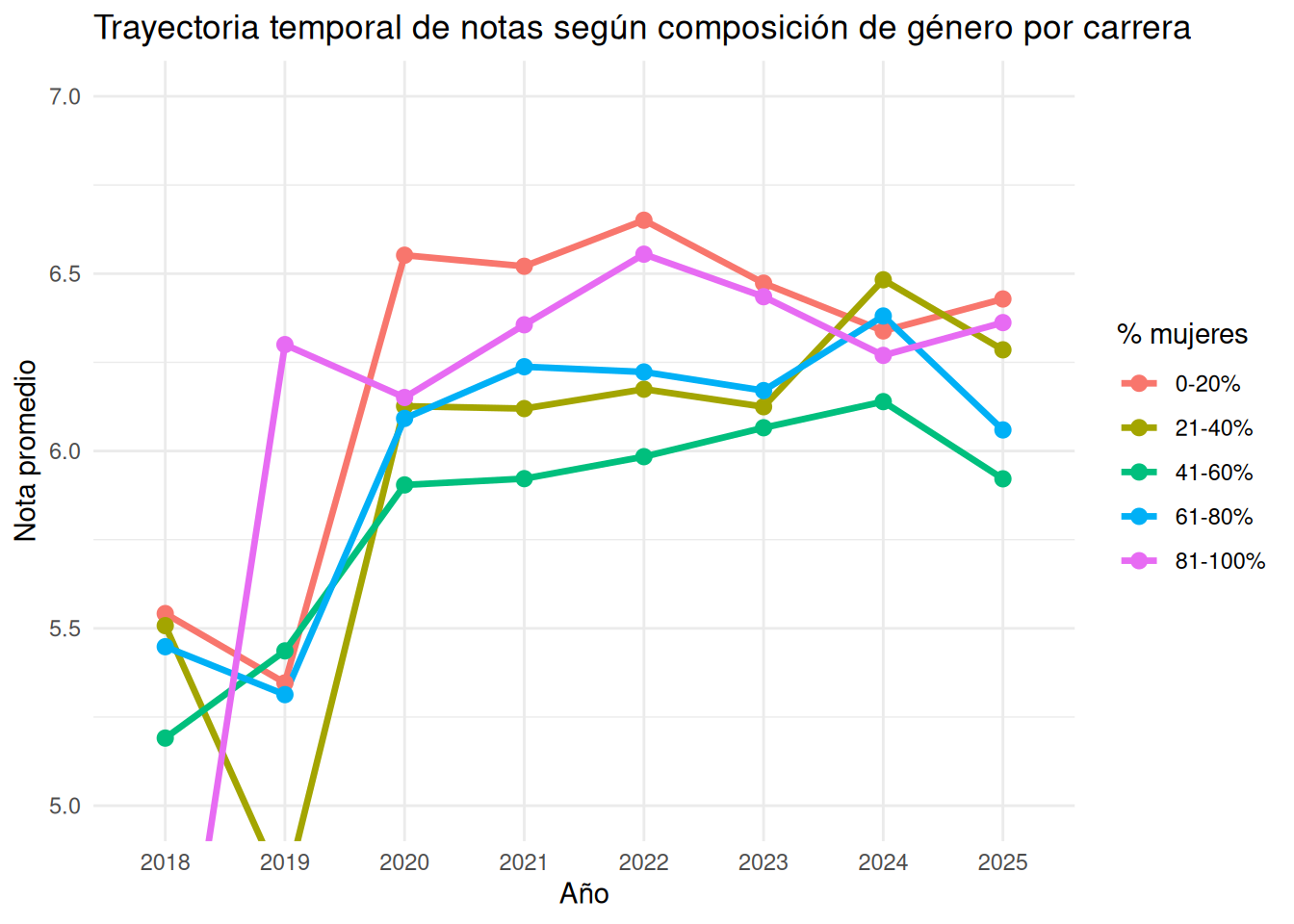
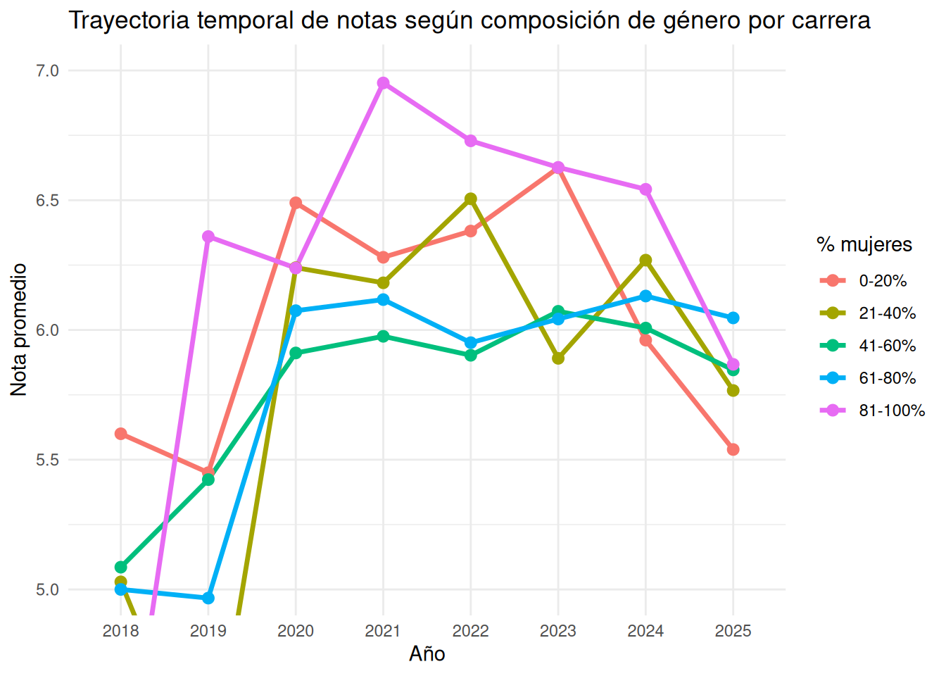
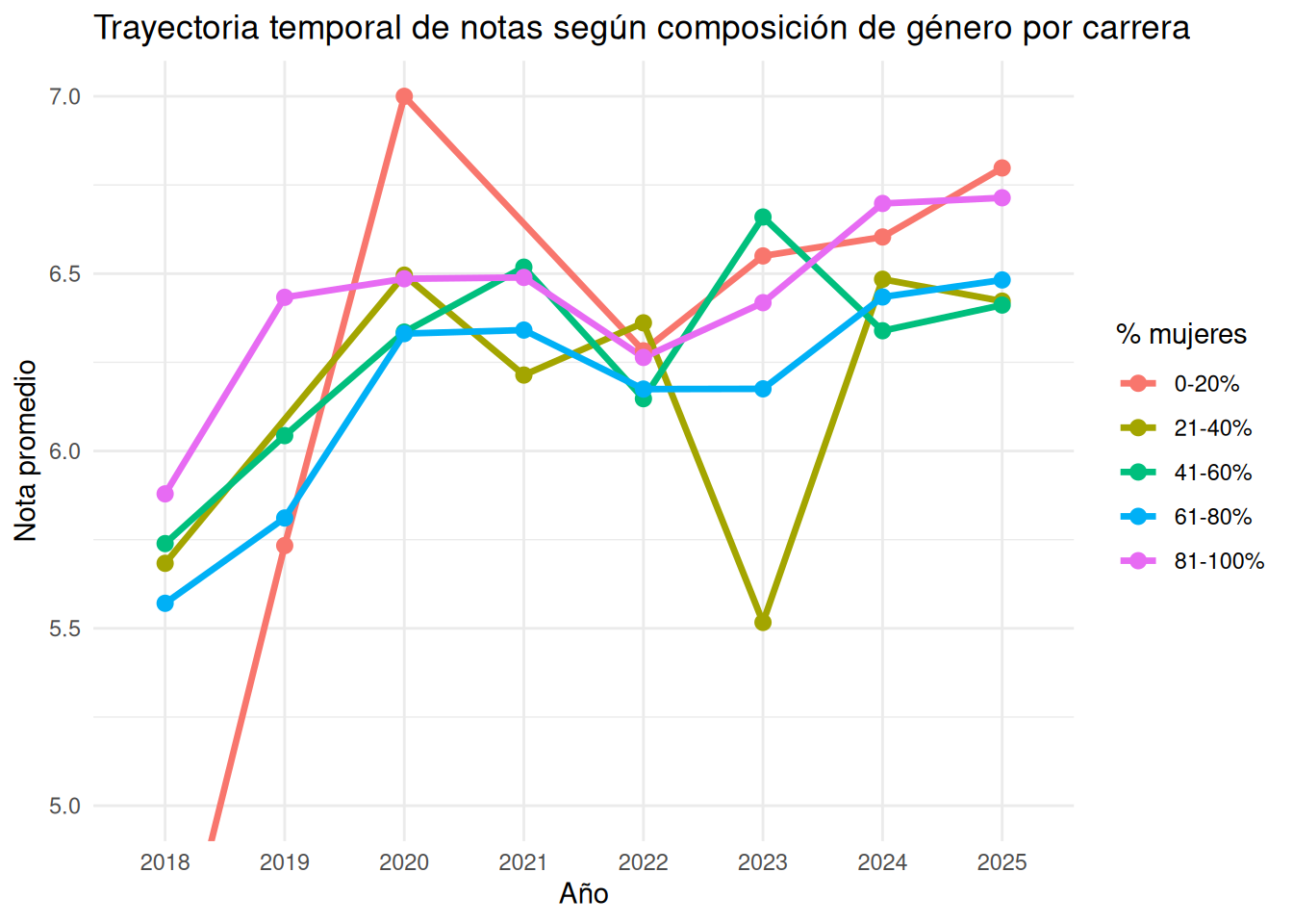
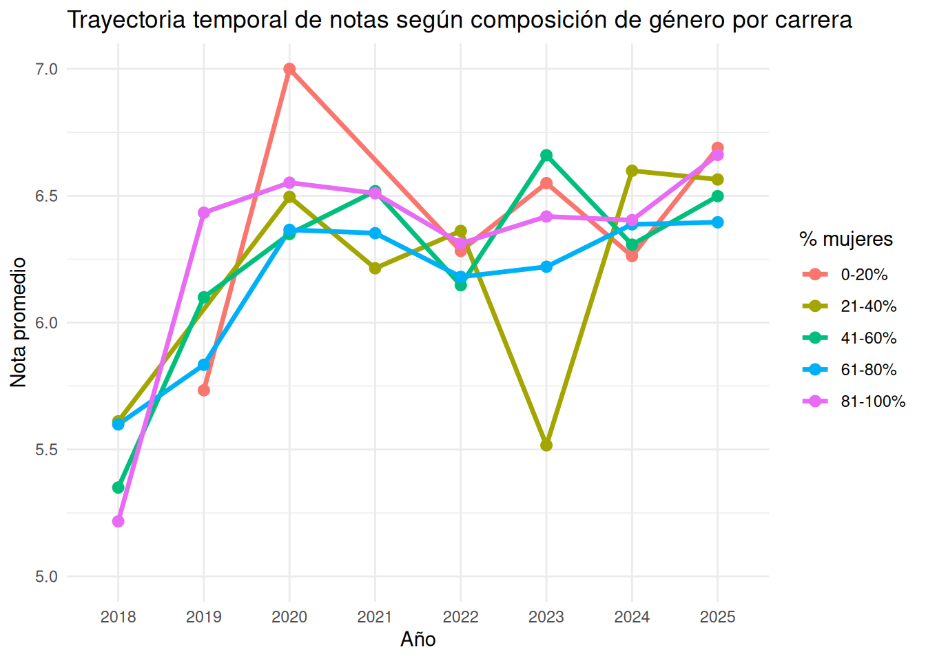
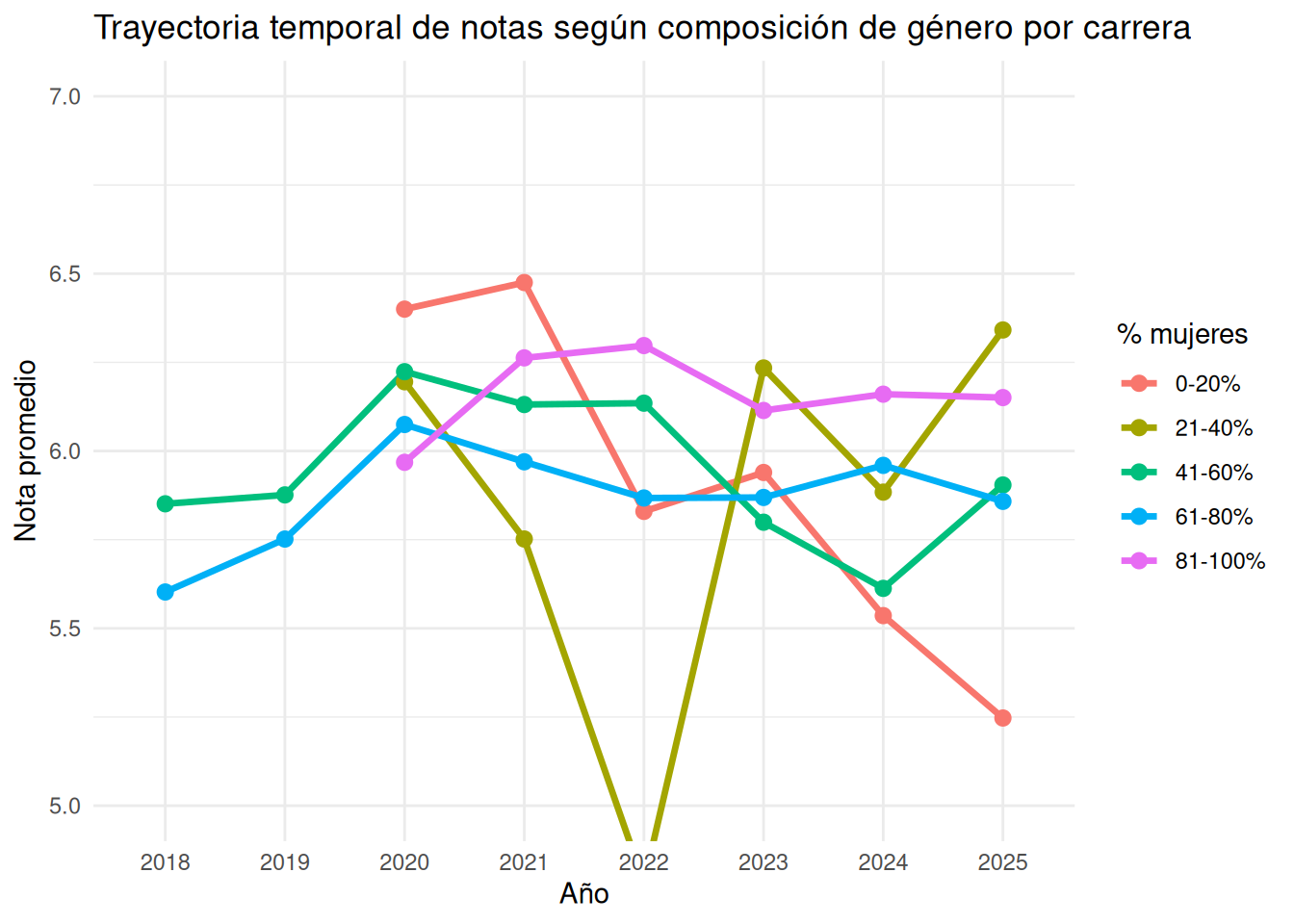
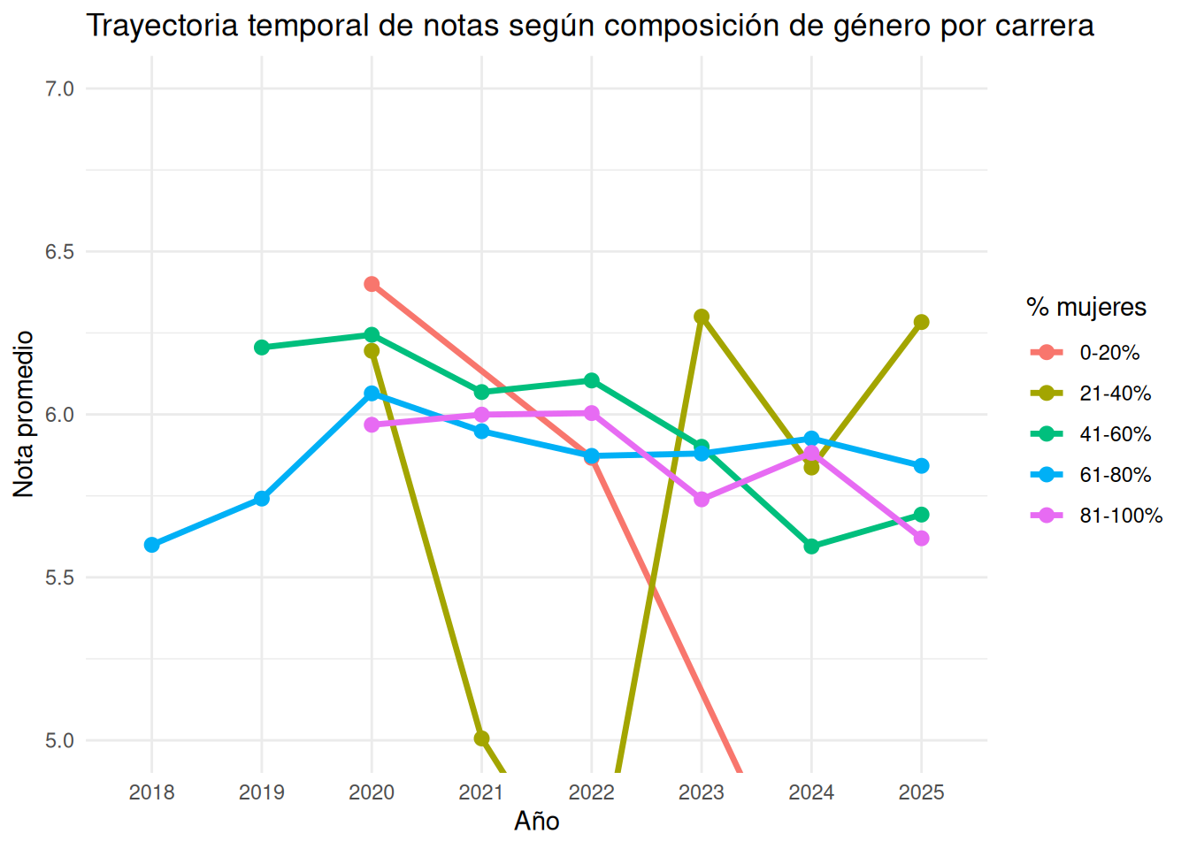
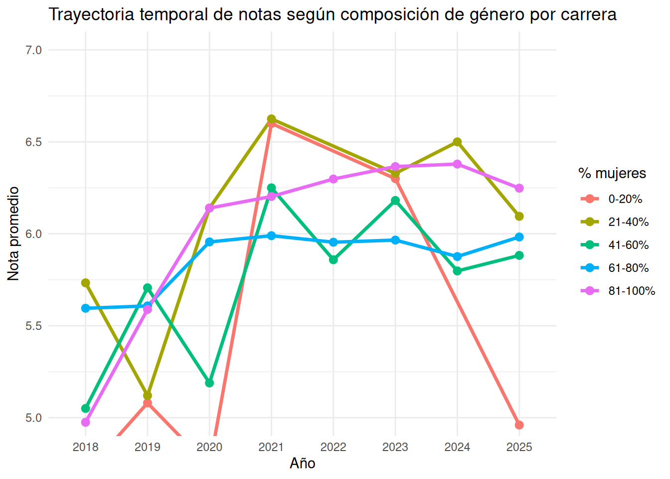
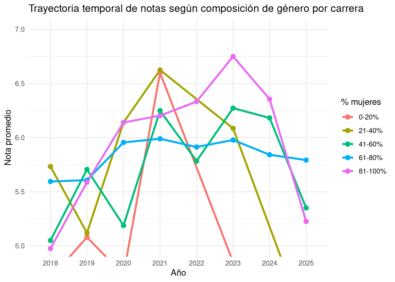
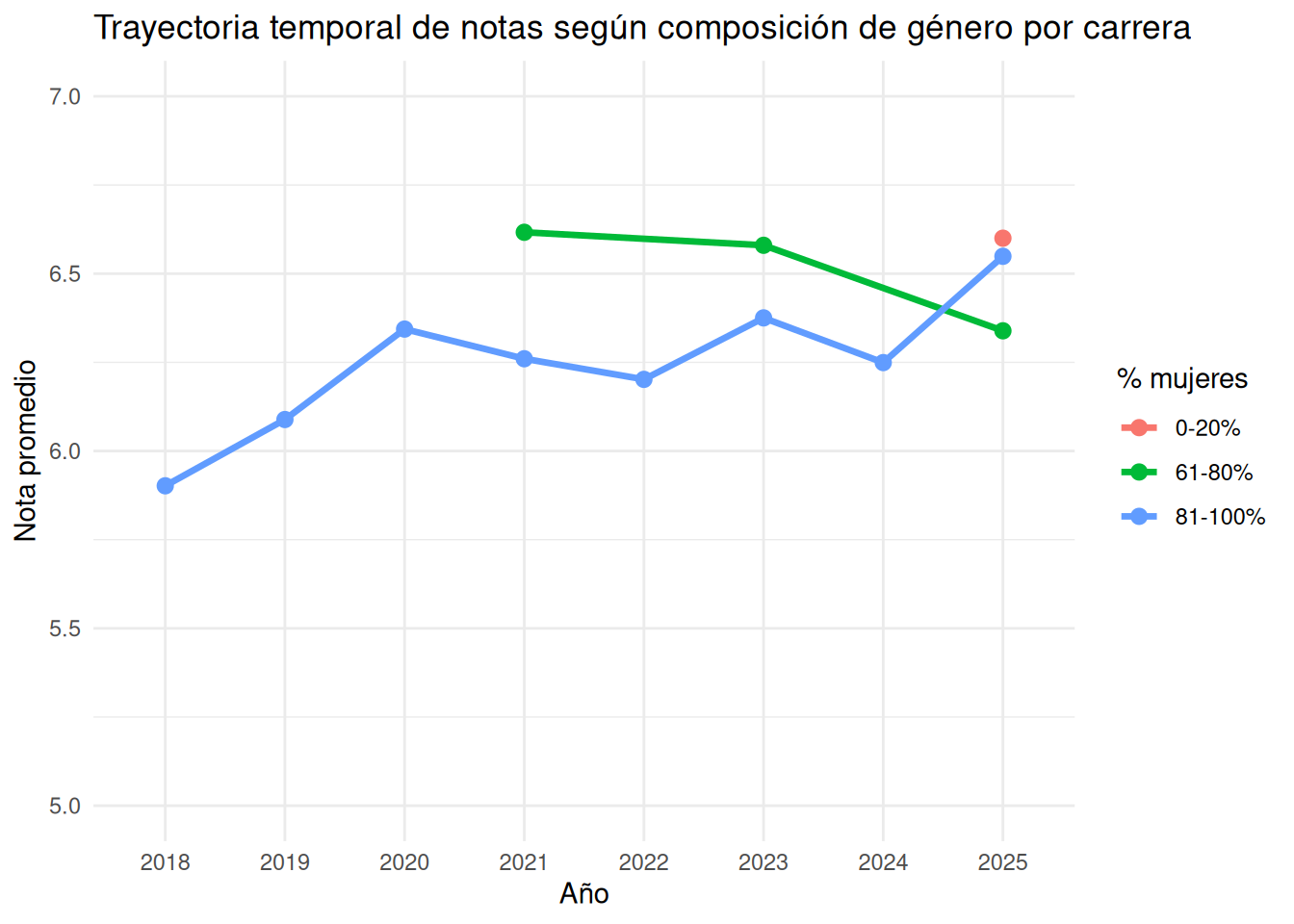
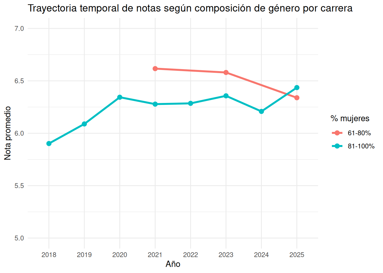
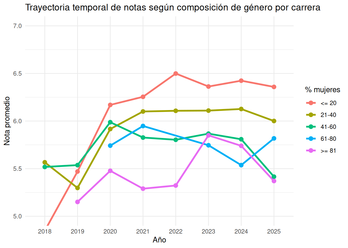
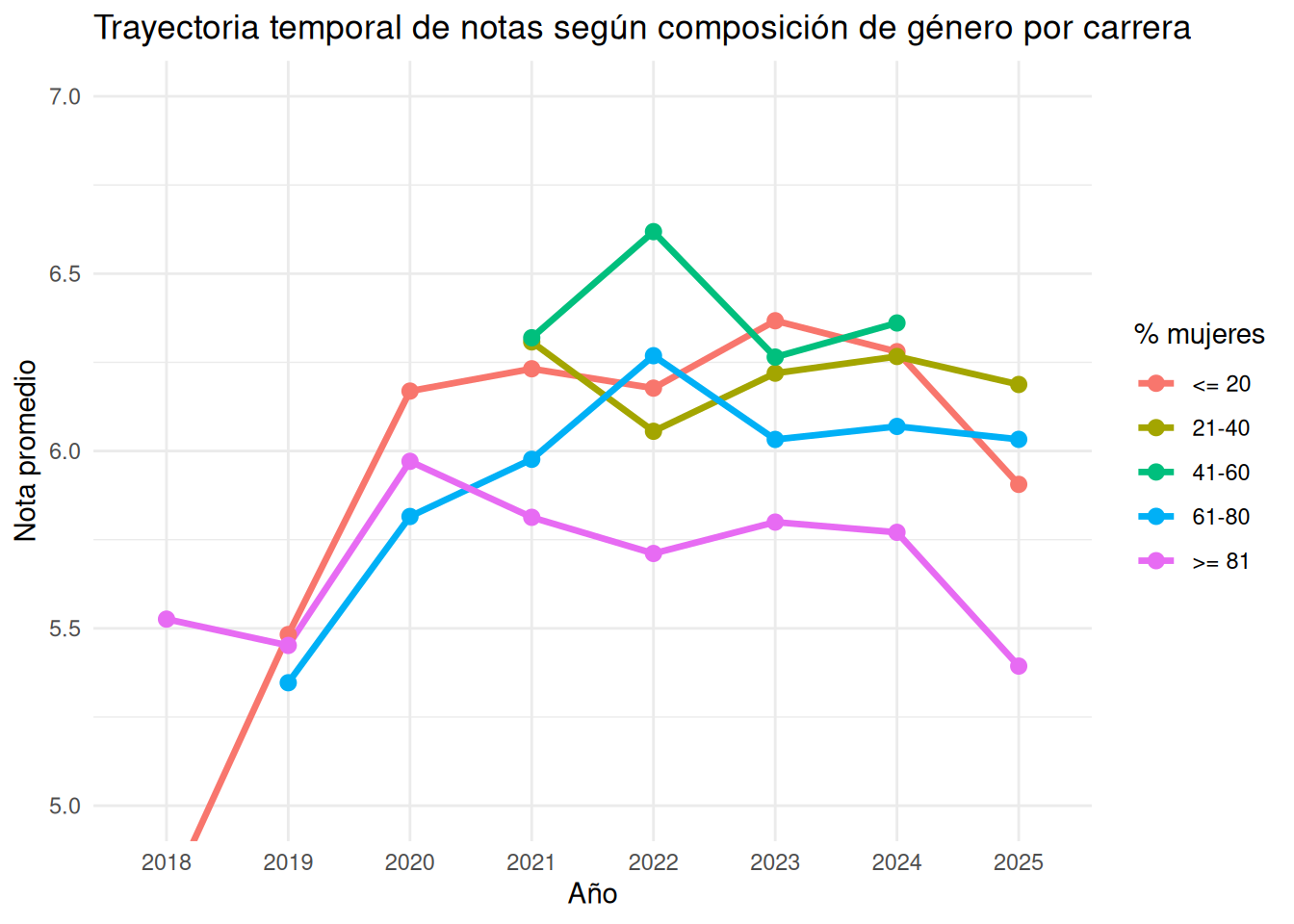
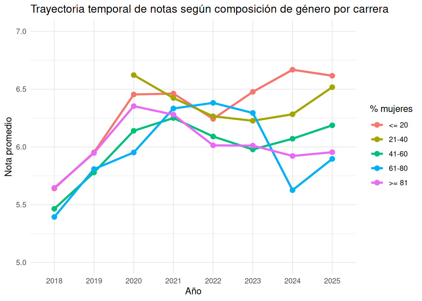
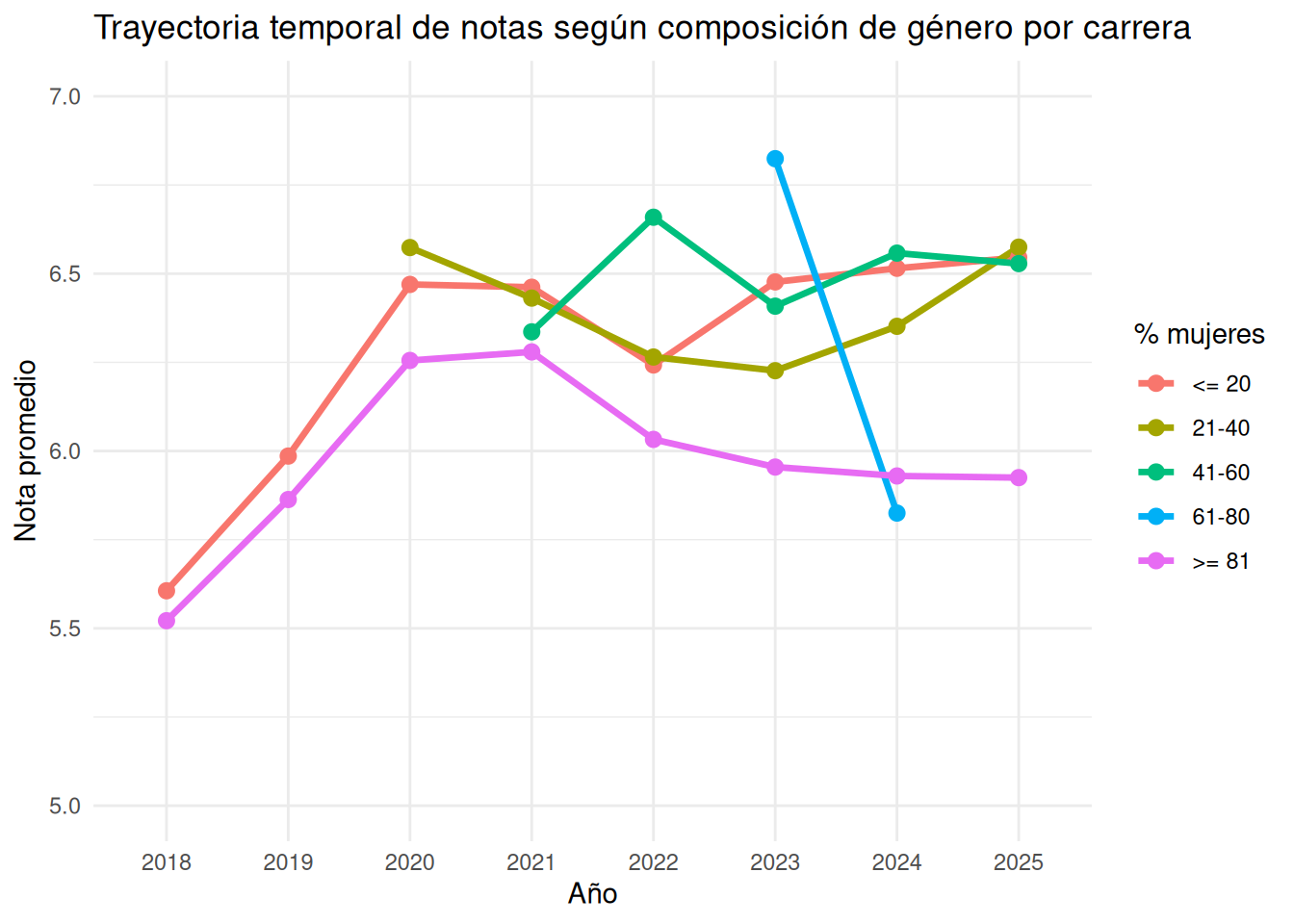
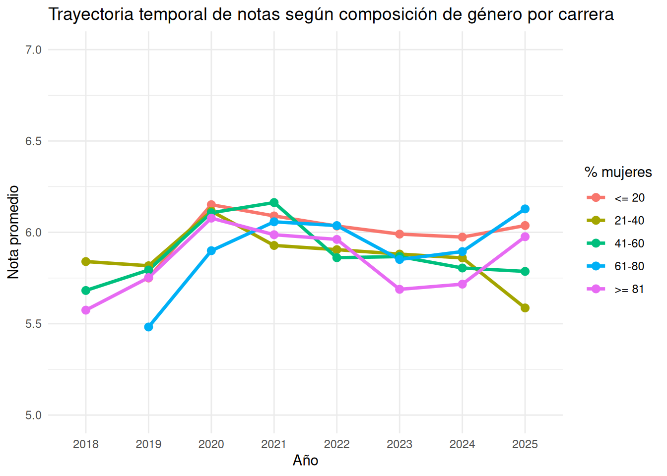
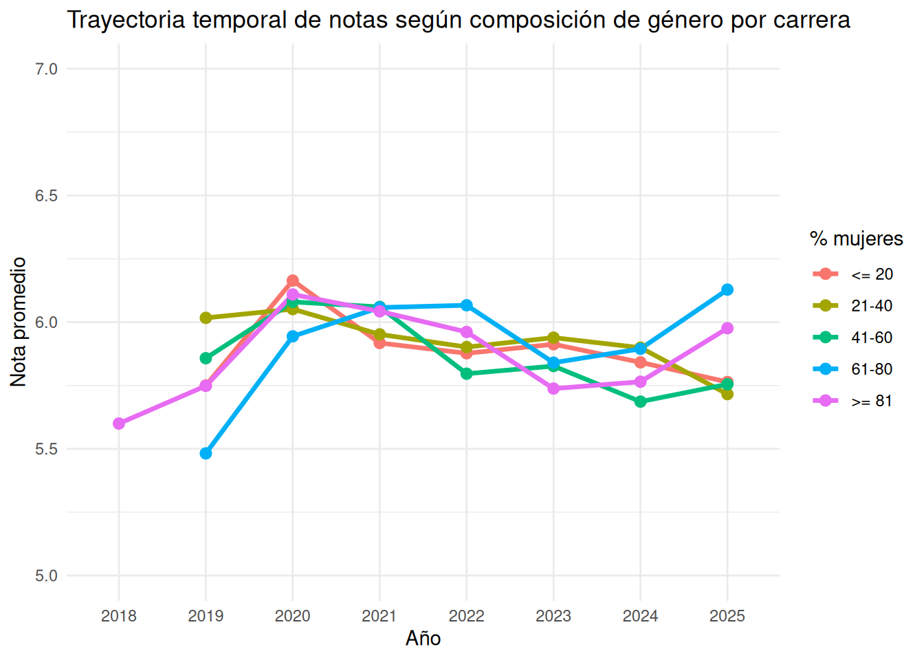
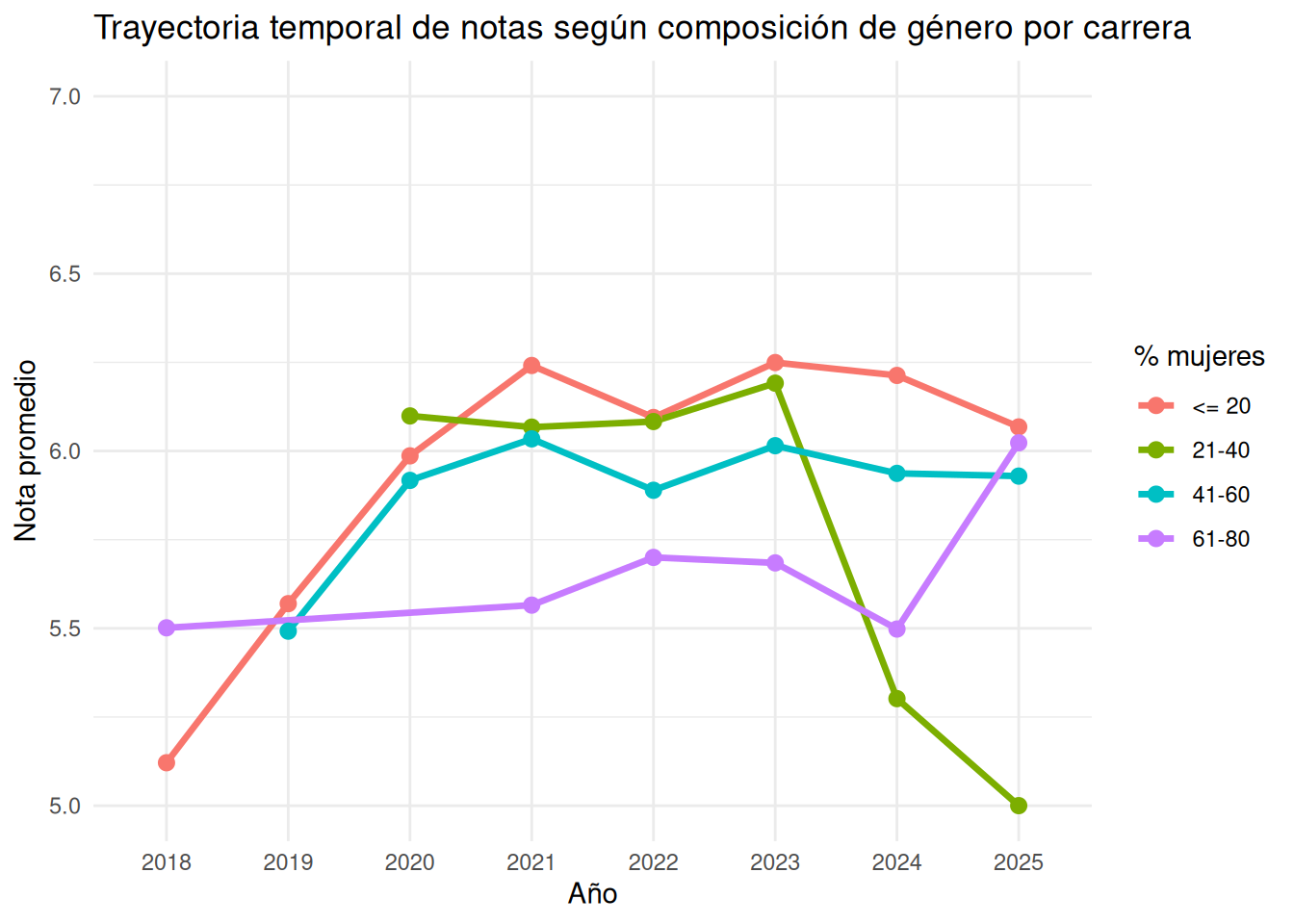
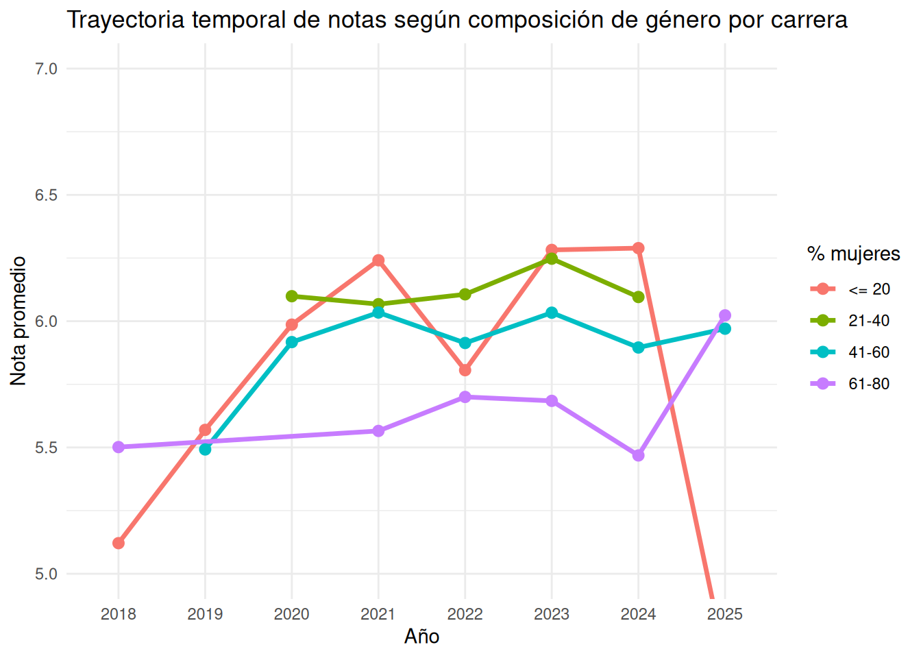
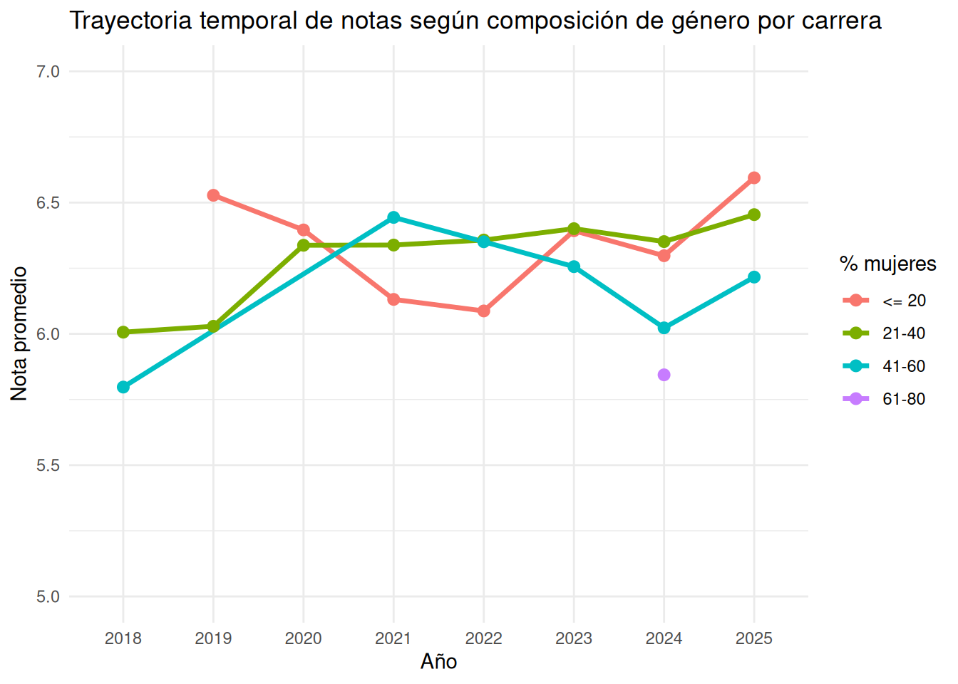
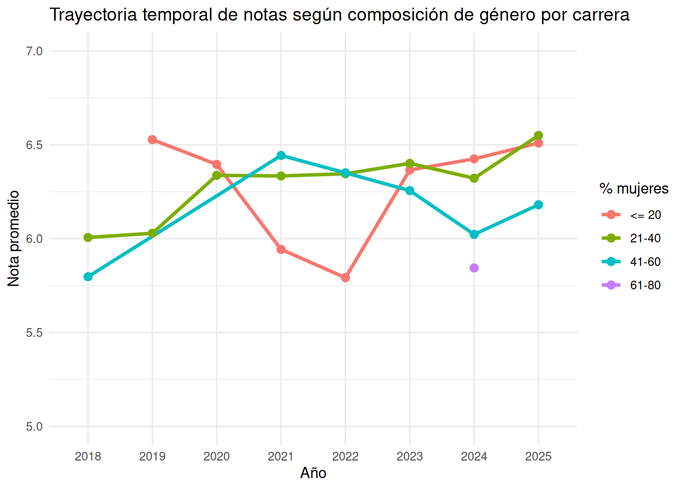
### Carrera en el tiempo
```{r}
#| echo: false
trayectoria_genero <- base_genero %>%
group_by(ano, tramo_mujeres, carrera) %>%
summarise(
nota_promedio = mean(nota_promedio, na.rm = TRUE),
.groups = "drop"
)
trayectoria_genero_nos <- base_genero_nos %>%
group_by(ano, tramo_mujeres, carrera) %>%
summarise(
nota_promedio = mean(nota_promedio, na.rm = TRUE),
.groups = "drop"
)
```
::: {.panel-tabset}
#### Sociología con secciones
```{r}
ggplot((trayectoria_genero %>% filter(carrera == "Sociología")),
       aes(x     = ano,
           y     = nota_promedio,
           color = tramo_mujeres,
           group = tramo_mujeres)) +

  geom_line(linewidth = 1.2) +

  geom_point(size = 2.5) +

  coord_cartesian(ylim = c(5, 7)) +

  labs(
    x     = "Año",
    y     = "Nota promedio",
    color = "% mujeres",
    title = "Trayectoria temporal de notas según composición de género por carrera"
  ) +

  theme_minimal()
```
#### Sociología sin secciones
```{r}
ggplot((trayectoria_genero_nos %>% filter(carrera == "Sociología")),
       aes(x     = ano,
           y     = nota_promedio,
           color = tramo_mujeres,
           group = tramo_mujeres)) +

  geom_line(linewidth = 1.2) +

  geom_point(size = 2.5) +

  coord_cartesian(ylim = c(5, 7)) +

  labs(
    x     = "Año",
    y     = "Nota promedio",
    color = "% mujeres",
    title = "Trayectoria temporal de notas según composición de género por carrera"
  ) +

  theme_minimal()
```
#### Psicología con secciones
```{r}
ggplot((trayectoria_genero %>% filter(carrera == "Psicología")),
       aes(x     = ano,
           y     = nota_promedio,
           color = tramo_mujeres,
           group = tramo_mujeres)) +

  geom_line(linewidth = 1.2) +

  geom_point(size = 2.5) +

  coord_cartesian(ylim = c(5, 7)) +

  labs(
    x     = "Año",
    y     = "Nota promedio",
    color = "% mujeres",
    title = "Trayectoria temporal de notas según composición de género por carrera"
  ) +

  theme_minimal()
```
#### Psicología sin secciones
```{r}
ggplot((trayectoria_genero_nos %>% filter(carrera == "Psicología")),
       aes(x     = ano,
           y     = nota_promedio,
           color = tramo_mujeres,
           group = tramo_mujeres)) +

  geom_line(linewidth = 1.2) +

  geom_point(size = 2.5) +

  coord_cartesian(ylim = c(5, 7)) +

  labs(
    x     = "Año",
    y     = "Nota promedio",
    color = "% mujeres",
    title = "Trayectoria temporal de notas según composición de género por carrera"
  ) +

  theme_minimal()
```
#### Antropología con secciones
```{r}
ggplot((trayectoria_genero %>% filter(carrera == "Antropología")),
       aes(x     = ano,
           y     = nota_promedio,
           color = tramo_mujeres,
           group = tramo_mujeres)) +

  geom_line(linewidth = 1.2) +

  geom_point(size = 2.5) +

  coord_cartesian(ylim = c(5, 7)) +

  labs(
    x     = "Año",
    y     = "Nota promedio",
    color = "% mujeres",
    title = "Trayectoria temporal de notas según composición de género por carrera"
  ) +

  theme_minimal()
```
#### Antropología sin secciones
```{r}
ggplot((trayectoria_genero_nos %>% filter(carrera == "Antropología")),
       aes(x     = ano,
           y     = nota_promedio,
           color = tramo_mujeres,
           group = tramo_mujeres)) +

  geom_line(linewidth = 1.2) +

  geom_point(size = 2.5) +

  coord_cartesian(ylim = c(5, 7)) +

  labs(
    x     = "Año",
    y     = "Nota promedio",
    color = "% mujeres",
    title = "Trayectoria temporal de notas según composición de género por carrera"
  ) +

  theme_minimal()
```
#### Trabajo Social con secciones
```{r}
ggplot((trayectoria_genero %>% filter(carrera == "Trabajo Social")),
       aes(x     = ano,
           y     = nota_promedio,
           color = tramo_mujeres,
           group = tramo_mujeres)) +

  geom_line(linewidth = 1.2) +

  geom_point(size = 2.5) +

  coord_cartesian(ylim = c(5, 7)) +

  labs(
    x     = "Año",
    y     = "Nota promedio",
    color = "% mujeres",
    title = "Trayectoria temporal de notas según composición de género por carrera"
  ) +

  theme_minimal()
```
#### Trabajo Social sin secciones
```{r}
ggplot((trayectoria_genero_nos %>% filter(carrera == "Trabajo Social")),
       aes(x     = ano,
           y     = nota_promedio,
           color = tramo_mujeres,
           group = tramo_mujeres)) +

  geom_line(linewidth = 1.2) +

  geom_point(size = 2.5) +

  coord_cartesian(ylim = c(5, 7)) +

  labs(
    x     = "Año",
    y     = "Nota promedio",
    color = "% mujeres",
    title = "Trayectoria temporal de notas según composición de género por carrera"
  ) +

  theme_minimal()
```
#### Educación Parvularia con secciones
```{r}
ggplot((trayectoria_genero %>% filter(carrera == "Educación Parvularia")),
       aes(x     = ano,
           y     = nota_promedio,
           color = tramo_mujeres,
           group = tramo_mujeres)) +

  geom_line(linewidth = 1.2) +

  geom_point(size = 2.5) +

  coord_cartesian(ylim = c(5, 7)) +

  labs(
    x     = "Año",
    y     = "Nota promedio",
    color = "% mujeres",
    title = "Trayectoria temporal de notas según composición de género por carrera"
  ) +

  theme_minimal()
```
#### Educación Parvularia sin secciones
```{r}
ggplot((trayectoria_genero_nos %>% filter(carrera == "Educación Parvularia")),
       aes(x     = ano,
           y     = nota_promedio,
           color = tramo_mujeres,
           group = tramo_mujeres)) +

  geom_line(linewidth = 1.2) +

  geom_point(size = 2.5) +

  coord_cartesian(ylim = c(5, 7)) +

  labs(
    x     = "Año",
    y     = "Nota promedio",
    color = "% mujeres",
    title = "Trayectoria temporal de notas según composición de género por carrera"
  ) +

  theme_minimal()
```
:::
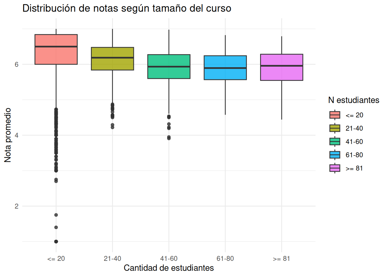
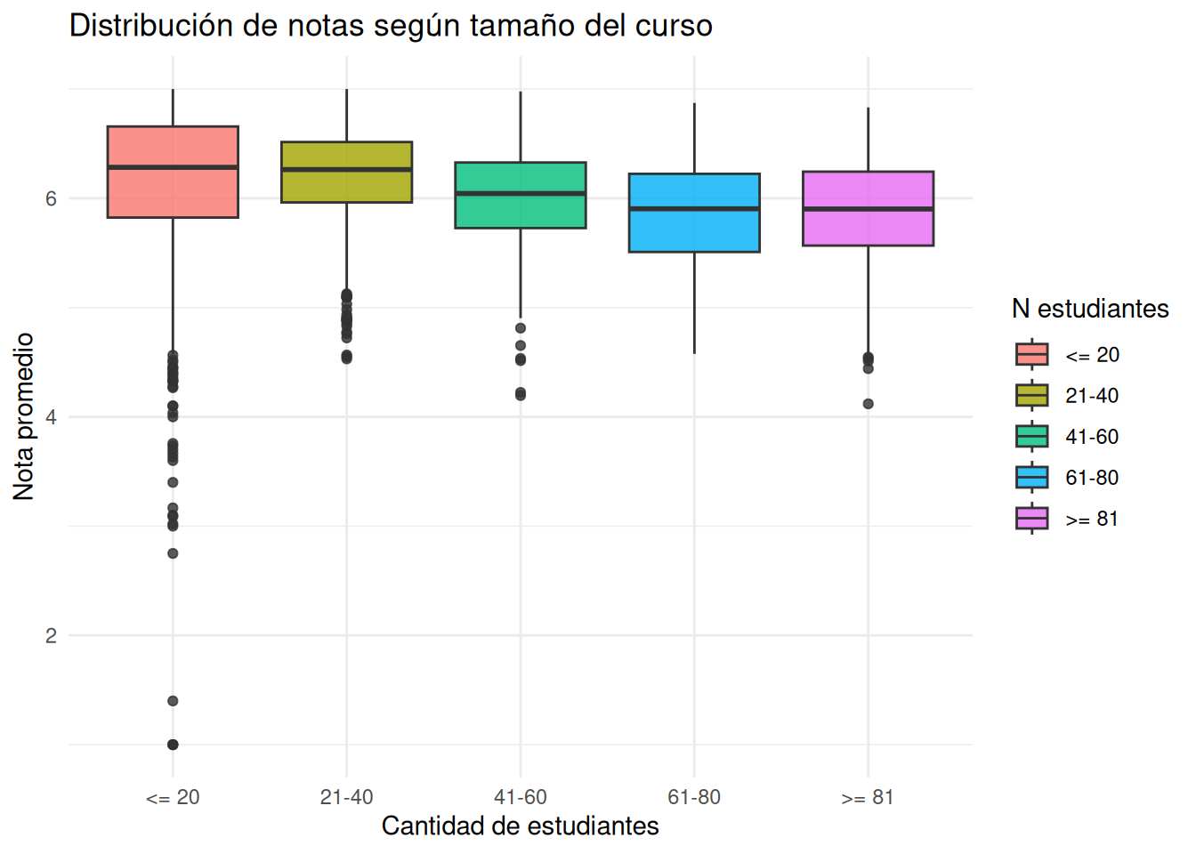
## N estudiantes
```{r}
#| echo: false
cc_n <- cc_facso %>%
mutate(
tramo_estudiantes = case_when(
n_estudiantes <= 20 ~ "<= 20",
n_estudiantes <= 40 ~ "21-40",
n_estudiantes <= 60 ~ "41-60",
n_estudiantes <= 80 ~ "61-80",
TRUE ~ ">= 81"
),
tramo_estudiantes = factor(
tramo_estudiantes,
levels = c("<= 20", "21-40", "41-60", "61-80", ">= 81")
)
)
tiempo_n <- cc_facso %>%
mutate(
tramo_estudiantes = case_when(
n_estudiantes <= 20 ~ "<= 20",
n_estudiantes <= 40 ~ "21-40",
n_estudiantes <= 60 ~ "41-60",
n_estudiantes <= 80 ~ "61-80",
TRUE ~ ">= 81"
),
tramo_estudiantes = factor(
tramo_estudiantes,
levels = c("<= 20", "21-40", "41-60", "61-80", ">= 81")
)
) %>%
group_by(ano, tramo_estudiantes) %>%
summarise(
nota_promedio = mean(nota_promedio, na.rm = TRUE),
.groups = "drop"
)
cc_nos <- cc_nosection %>%
mutate(
tramo_estudiantes = case_when(
n_estudiantes <= 20 ~ "<= 20",
n_estudiantes <= 40 ~ "21-40",
n_estudiantes <= 60 ~ "41-60",
n_estudiantes <= 80 ~ "61-80",
TRUE ~ ">= 81"
),
tramo_estudiantes = factor(
tramo_estudiantes,
levels = c("<= 20", "21-40", "41-60", "61-80", ">= 81")
)
)
tiempo_nos <- cc_nosection %>%
mutate(
tramo_estudiantes = case_when(
n_estudiantes <= 20 ~ "<= 20",
n_estudiantes <= 40 ~ "21-40",
n_estudiantes <= 60 ~ "41-60",
n_estudiantes <= 80 ~ "61-80",
TRUE ~ ">= 81"
),
tramo_estudiantes = factor(
tramo_estudiantes,
levels = c("<= 20", "21-40", "41-60", "61-80", ">= 81")
)
) %>%
group_by(ano, tramo_estudiantes) %>%
summarise(
nota_promedio = mean(nota_promedio, na.rm = TRUE),
.groups = "drop"
)
```
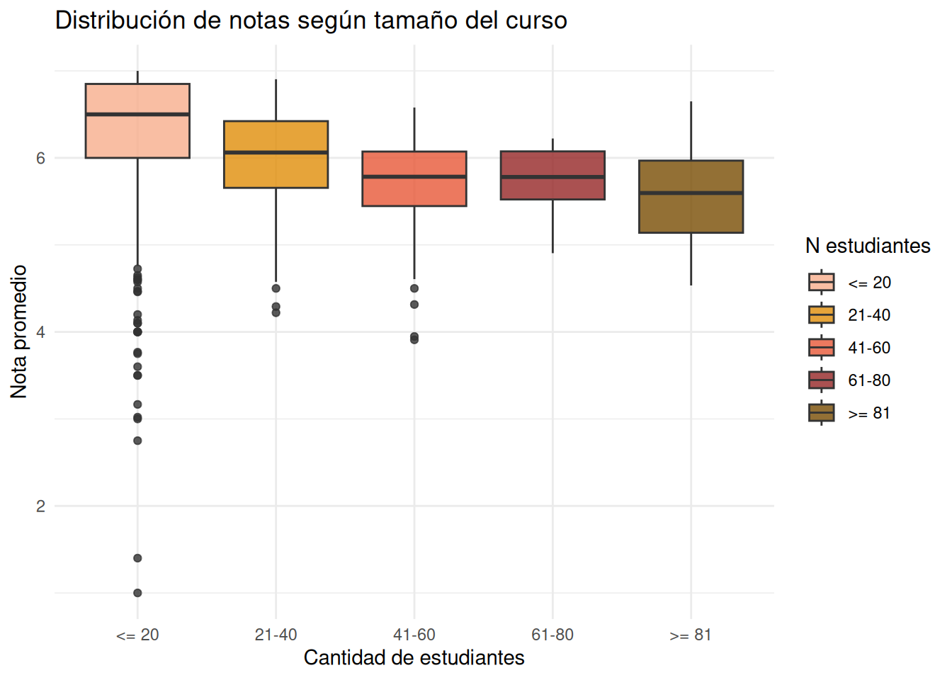
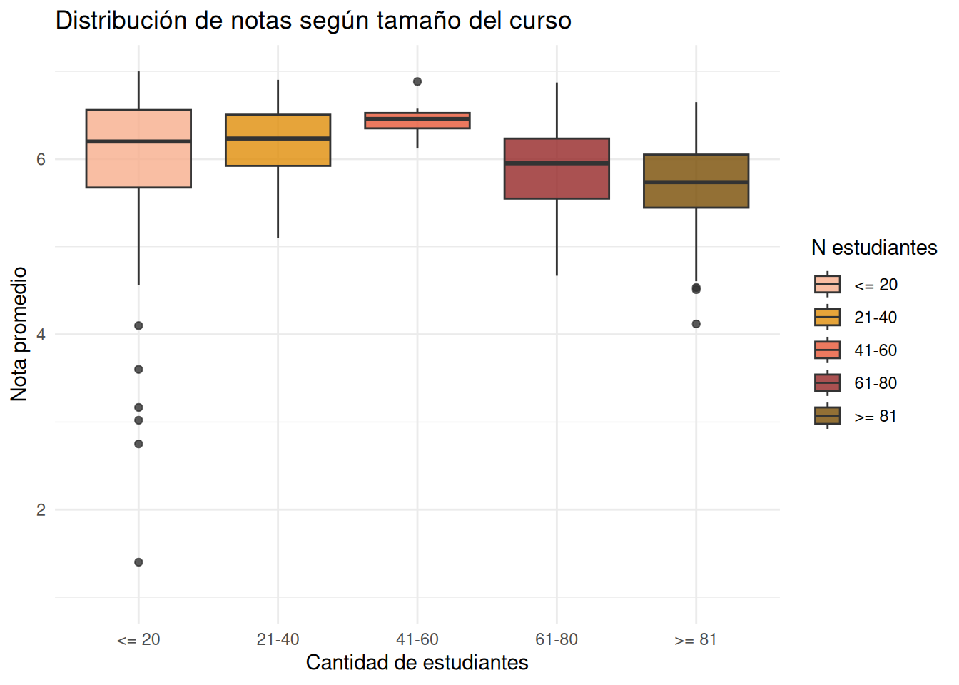
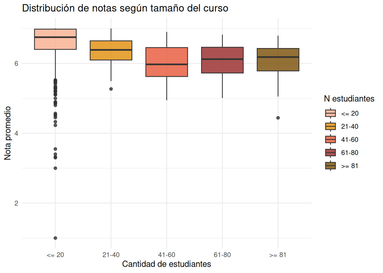
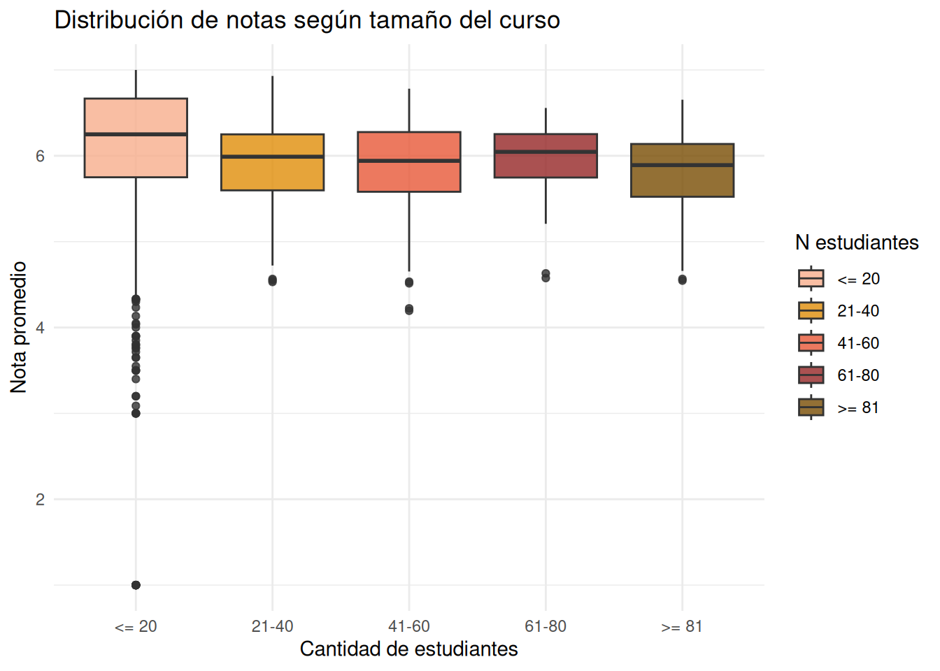
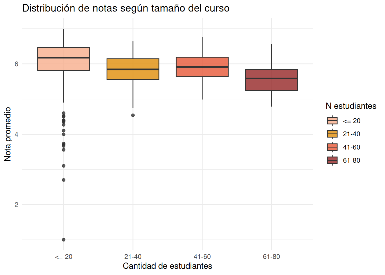
### Facultad pooled
:::panel-tabset
#### Con secciones
```{r}
#| echo: false
ggplot(cc_n,
aes(x = tramo_estudiantes,
y = nota_promedio,
fill = tramo_estudiantes)) +
geom_boxplot(alpha = 0.8) +
coord_cartesian(ylim = c(1, 7)) +
labs(
x = "Cantidad de estudiantes",
y = "Nota promedio",
fill = "N estudiantes",
title = "Distribución de notas según tamaño del curso"
) +
theme_minimal()
```
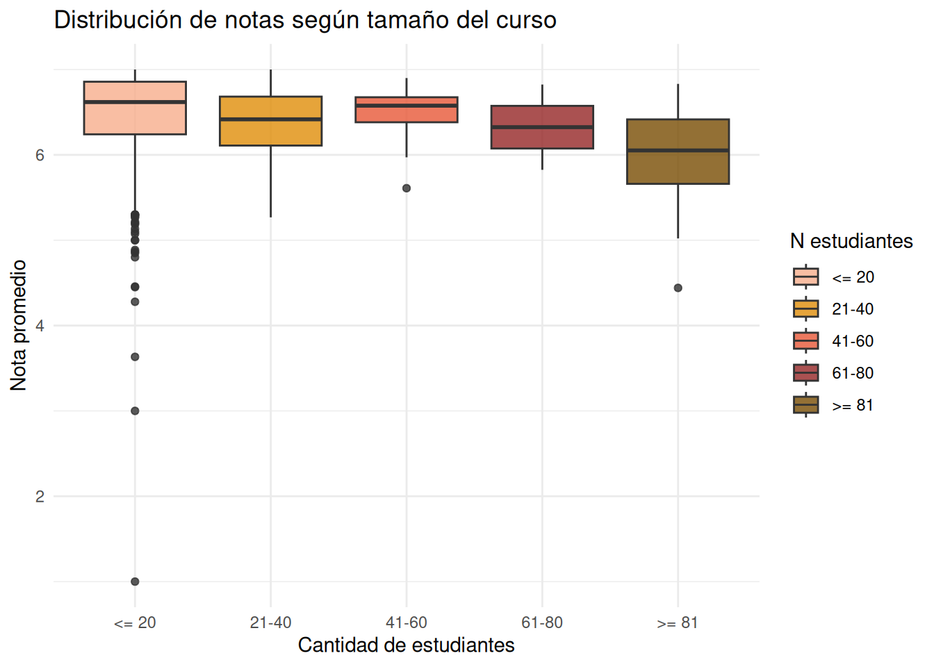
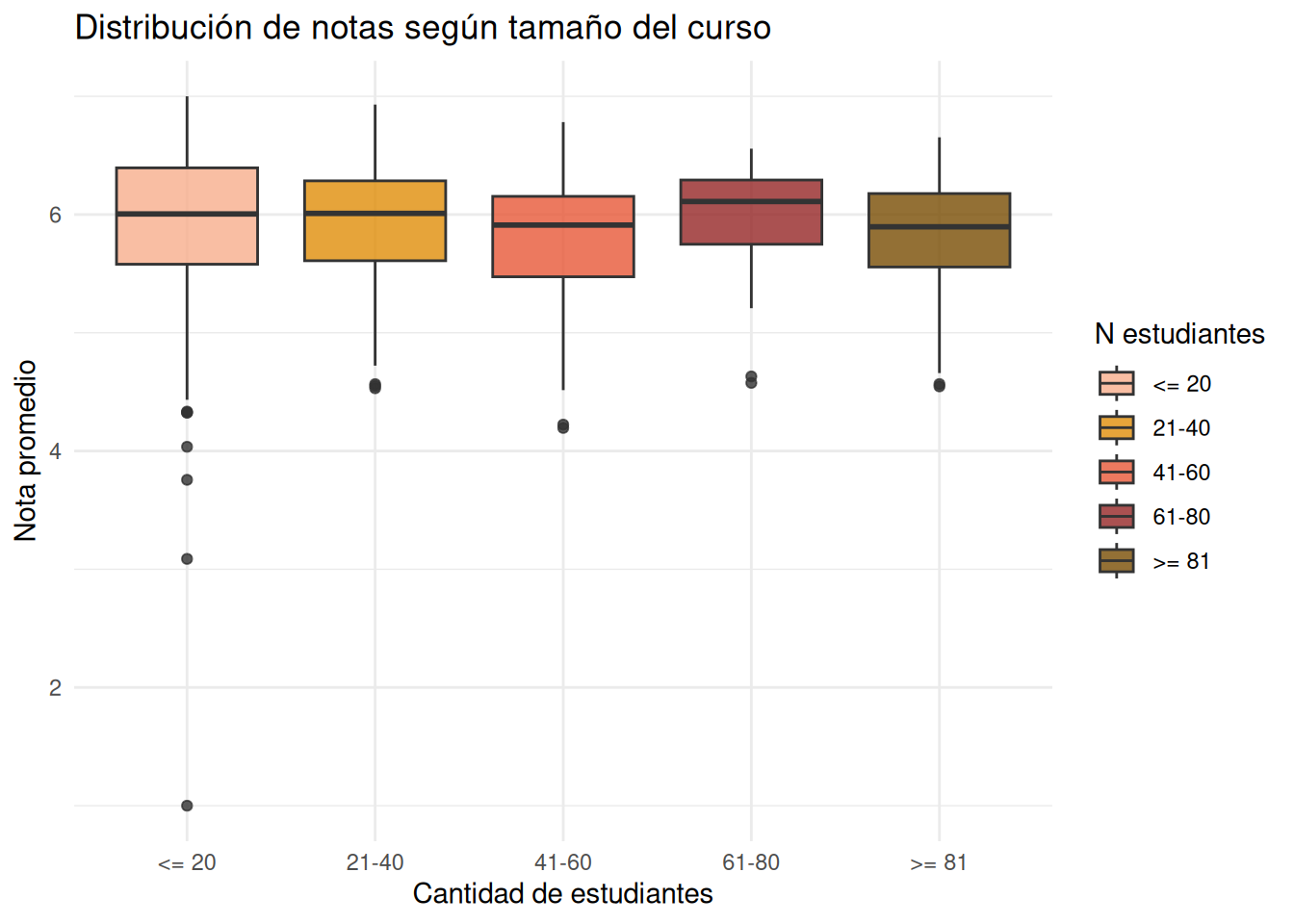
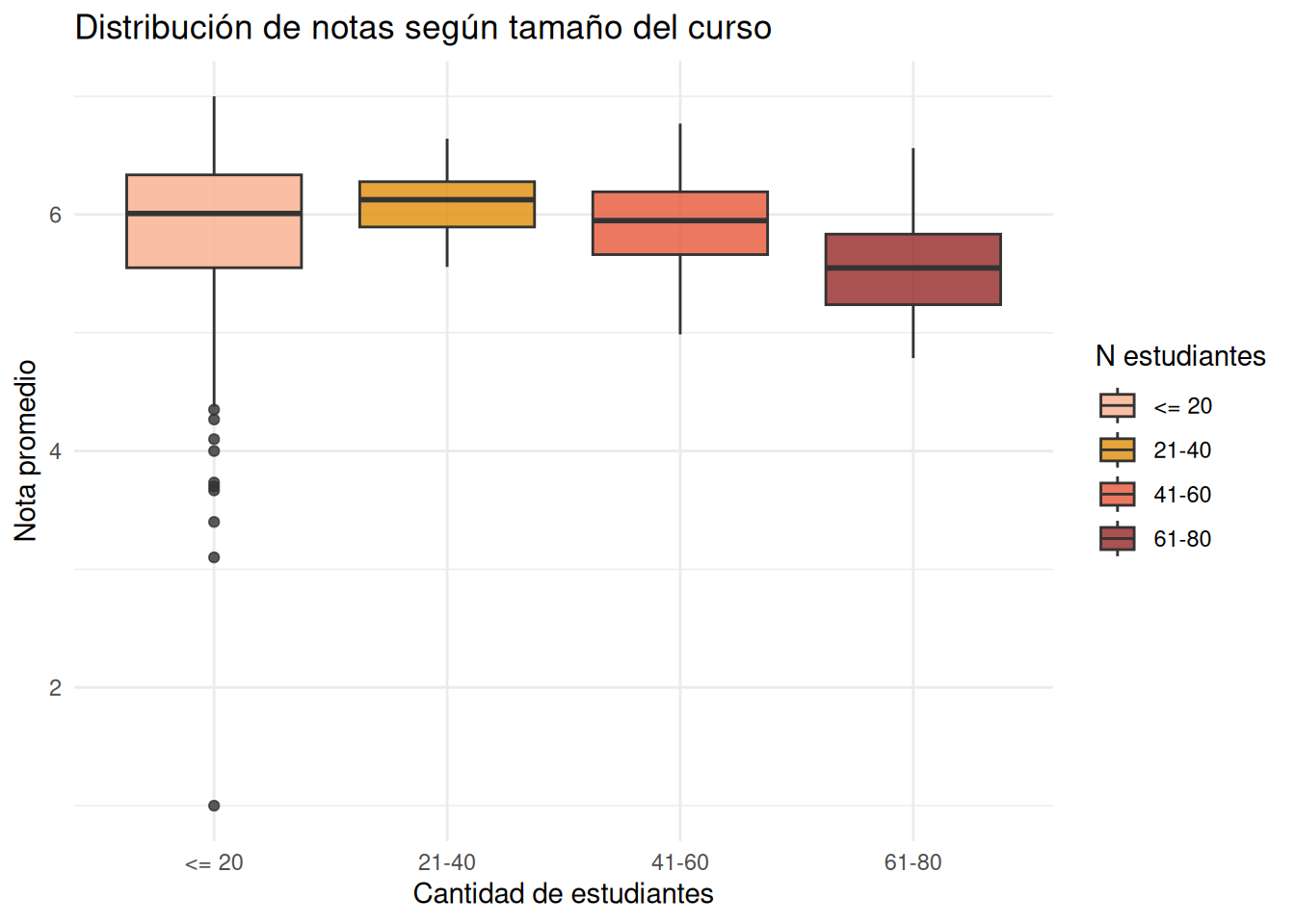
#### Sin secciones
```{r}
#| echo: false
ggplot(cc_nos,
aes(x = tramo_estudiantes,
y = nota_promedio,
fill = tramo_estudiantes)) +
geom_boxplot(alpha = 0.8) +
coord_cartesian(ylim = c(1, 7)) +
labs(
x = "Cantidad de estudiantes",
y = "Nota promedio",
fill = "N estudiantes",
title = "Distribución de notas según tamaño del curso"
) +
theme_minimal()
```
:::
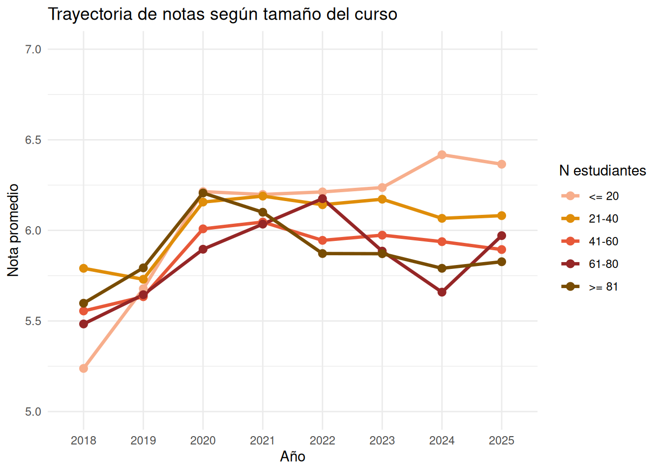
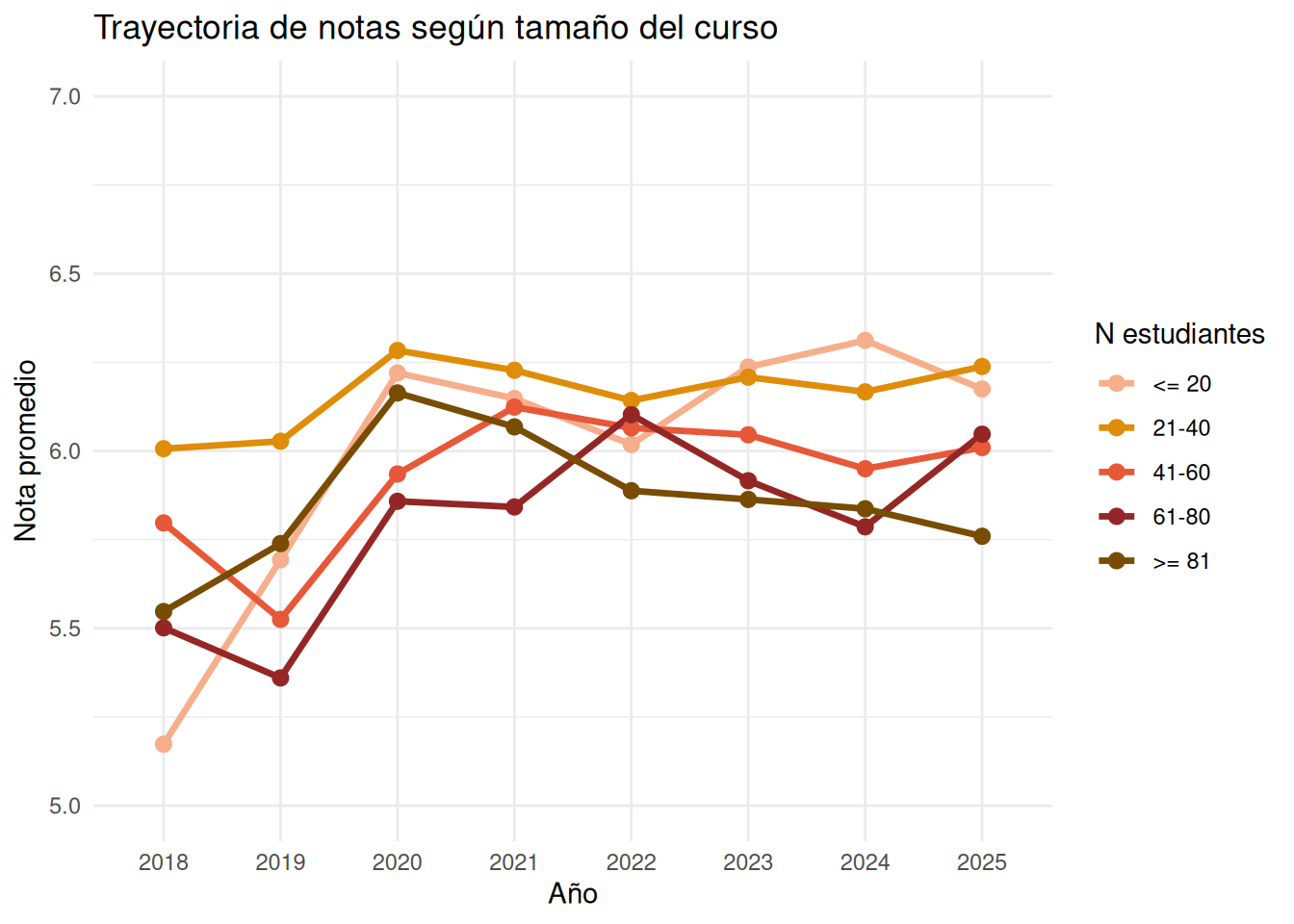
### Facultad por año
:::panel-tabset
#### Con secciones
```{r}
ggplot(tiempo_n,
       aes(x = ano,
           y = nota_promedio,
           color = tramo_estudiantes,
           group = tramo_estudiantes)) +

  geom_line(linewidth = 1.2) +

  coord_cartesian(ylim = c(5, 7)) +

  geom_point(size = 2.5) +

  scale_color_manual(
    values = c(
      "<= 20" = "#f7ae8c",
      "21-40" = "#df8d09",
      "41-60" = "#e75838",
      "61-80" = "#952626",
      ">= 81" = "#784c03"
    )
  ) +

  labs(
    x = "Año",
    y = "Nota promedio",
    color = "N estudiantes",
    title = "Trayectoria de notas según tamaño del curso"
  ) +

  theme_minimal()
```
#### Sin secciones
```{r}
ggplot(tiempo_nos,
       aes(x = ano,
           y = nota_promedio,
           color = tramo_estudiantes,
           group = tramo_estudiantes)) +

  geom_line(linewidth = 1.2) +

  coord_cartesian(ylim = c(5, 7)) +

  geom_point(size = 2.5) +

  scale_color_manual(
    values = c(
      "<= 20" = "#f7ae8c",
      "21-40" = "#df8d09",
      "41-60" = "#e75838",
      "61-80" = "#952626",
      ">= 81" = "#784c03"
    )
  ) +

  labs(
    x = "Año",
    y = "Nota promedio",
    color = "N estudiantes",
    title = "Trayectoria de notas según tamaño del curso"
  ) +

  theme_minimal()
```
:::
### Nivel carrera
:::panel-tabset
#### Sociología con secciones
```{r}
ggplot((cc_n) %>% filter(carrera == "Sociología"),
       aes(x = tramo_estudiantes,
           y = nota_promedio,
           fill = tramo_estudiantes)) +

  geom_boxplot(alpha = 0.8) +

  coord_cartesian(ylim = c(1, 7)) +

  scale_fill_manual(
    values = c(
      "<= 20" = "#f7ae8c",
      "21-40" = "#df8d09",
      "41-60" = "#e75838",
      "61-80" = "#952626",
      ">= 81" = "#784c03"
    )
  ) +

  labs(
    x = "Cantidad de estudiantes",
    y = "Nota promedio",
    fill = "N estudiantes",
    title = "Distribución de notas según tamaño del curso"
  ) +

  theme_minimal()
```
#### Sociología sin secciones
```{r}
ggplot((cc_nos) %>% filter(carrera == "Sociología"),
       aes(x = tramo_estudiantes,
           y = nota_promedio,
           fill = tramo_estudiantes)) +

  geom_boxplot(alpha = 0.8) +

  coord_cartesian(ylim = c(1, 7)) +

  scale_fill_manual(
    values = c(
      "<= 20" = "#f7ae8c",
      "21-40" = "#df8d09",
      "41-60" = "#e75838",
      "61-80" = "#952626",
      ">= 81" = "#784c03"
    )
  ) +

  labs(
    x = "Cantidad de estudiantes",
    y = "Nota promedio",
    fill = "N estudiantes",
    title = "Distribución de notas según tamaño del curso"
  ) +

  theme_minimal()
```
#### Psicología con secciones
```{r}
ggplot((cc_n) %>% filter(carrera == "Psicología"),
       aes(x = tramo_estudiantes,
           y = nota_promedio,
           fill = tramo_estudiantes)) +

  geom_boxplot(alpha = 0.8) +

  coord_cartesian(ylim = c(1, 7)) +

  scale_fill_manual(
    values = c(
      "<= 20" = "#f7ae8c",
      "21-40" = "#df8d09",
      "41-60" = "#e75838",
      "61-80" = "#952626",
      ">= 81" = "#784c03"
    )
  ) +

  labs(
    x = "Cantidad de estudiantes",
    y = "Nota promedio",
    fill = "N estudiantes",
    title = "Distribución de notas según tamaño del curso"
  ) +

  theme_minimal()
```
#### Psicología sin secciones
```{r}
ggplot((cc_nos) %>% filter(carrera == "Psicología"),
       aes(x = tramo_estudiantes,
           y = nota_promedio,
           fill = tramo_estudiantes)) +

  geom_boxplot(alpha = 0.8) +

  coord_cartesian(ylim = c(1, 7)) +

  scale_fill_manual(
    values = c(
      "<= 20" = "#f7ae8c",
      "21-40" = "#df8d09",
      "41-60" = "#e75838",
      "61-80" = "#952626",
      ">= 81" = "#784c03"
    )
  ) +

  labs(
    x = "Cantidad de estudiantes",
    y = "Nota promedio",
    fill = "N estudiantes",
    title = "Distribución de notas según tamaño del curso"
  ) +

  theme_minimal()
```
#### Antropología con secciones
```{r}
ggplot((cc_n) %>% filter(carrera == "Antropología"),
       aes(x = tramo_estudiantes,
           y = nota_promedio,
           fill = tramo_estudiantes)) +

  geom_boxplot(alpha = 0.8) +

  coord_cartesian(ylim = c(1, 7)) +

  scale_fill_manual(
    values = c(
      "<= 20" = "#f7ae8c",
      "21-40" = "#df8d09",
      "41-60" = "#e75838",
      "61-80" = "#952626",
      ">= 81" = "#784c03"
    )
  ) +

  labs(
    x = "Cantidad de estudiantes",
    y = "Nota promedio",
    fill = "N estudiantes",
    title = "Distribución de notas según tamaño del curso"
  ) +

  theme_minimal()
```
#### Antropología sin secciones
```{r}
ggplot((cc_nos) %>% filter(carrera == "Antropología"),
       aes(x = tramo_estudiantes,
           y = nota_promedio,
           fill = tramo_estudiantes)) +

  geom_boxplot(alpha = 0.8) +

  coord_cartesian(ylim = c(1, 7)) +

  scale_fill_manual(
    values = c(
      "<= 20" = "#f7ae8c",
      "21-40" = "#df8d09",
      "41-60" = "#e75838",
      "61-80" = "#952626",
      ">= 81" = "#784c03"
    )
  ) +

  labs(
    x = "Cantidad de estudiantes",
    y = "Nota promedio",
    fill = "N estudiantes",
    title = "Distribución de notas según tamaño del curso"
  ) +

  theme_minimal()
```
#### Trabajo Social con secciones
```{r}
ggplot((cc_n) %>% filter(carrera == "Trabajo Social"),
       aes(x = tramo_estudiantes,
           y = nota_promedio,
           fill = tramo_estudiantes)) +

  geom_boxplot(alpha = 0.8) +

  coord_cartesian(ylim = c(1, 7)) +

  scale_fill_manual(
    values = c(
      "<= 20" = "#f7ae8c",
      "21-40" = "#df8d09",
      "41-60" = "#e75838",
      "61-80" = "#952626",
      ">= 81" = "#784c03"
    )
  ) +

  labs(
    x = "Cantidad de estudiantes",
    y = "Nota promedio",
    fill = "N estudiantes",
    title = "Distribución de notas según tamaño del curso"
  ) +

  theme_minimal()
```
#### Trabajo Social sin secciones
```{r}
ggplot((cc_nos) %>% filter(carrera == "Trabajo Social"),
       aes(x = tramo_estudiantes,
           y = nota_promedio,
           fill = tramo_estudiantes)) +

  geom_boxplot(alpha = 0.8) +

  coord_cartesian(ylim = c(1, 7)) +

  scale_fill_manual(
    values = c(
      "<= 20" = "#f7ae8c",
      "21-40" = "#df8d09",
      "41-60" = "#e75838",
      "61-80" = "#952626",
      ">= 81" = "#784c03"
    )
  ) +

  labs(
    x = "Cantidad de estudiantes",
    y = "Nota promedio",
    fill = "N estudiantes",
    title = "Distribución de notas según tamaño del curso"
  ) +

  theme_minimal()
```
#### Educación Parvularia con secciones
```{r}
ggplot((cc_n) %>% filter(carrera == "Educación Parvularia"),
       aes(x = tramo_estudiantes,
           y = nota_promedio,
           fill = tramo_estudiantes)) +

  geom_boxplot(alpha = 0.8) +

  coord_cartesian(ylim = c(1, 7)) +

  scale_fill_manual(
    values = c(
      "<= 20" = "#f7ae8c",
      "21-40" = "#df8d09",
      "41-60" = "#e75838",
      "61-80" = "#952626",
      ">= 81" = "#784c03"
    )
  ) +

  labs(
    x = "Cantidad de estudiantes",
    y = "Nota promedio",
    fill = "N estudiantes",
    title = "Distribución de notas según tamaño del curso"
  ) +

  theme_minimal()
```
#### Educación Parvularia sin secciones
```{r}
ggplot((cc_nos) %>% filter(carrera == "Educación Parvularia"),
       aes(x = tramo_estudiantes,
           y = nota_promedio,
           fill = tramo_estudiantes)) +

  geom_boxplot(alpha = 0.8) +

  coord_cartesian(ylim = c(1, 7)) +

  scale_fill_manual(
    values = c(
      "<= 20" = "#f7ae8c",
      "21-40" = "#df8d09",
      "41-60" = "#e75838",
      "61-80" = "#952626",
      ">= 81" = "#784c03"
    )
  ) +

  labs(
    x = "Cantidad de estudiantes",
    y = "Nota promedio",
    fill = "N estudiantes",
    title = "Distribución de notas según tamaño del curso"
  ) +

  theme_minimal()
```
:::
### Carrera en el tiempo
```{r}
#| echo: false
trayectoria_n <- cc_n %>%
group_by(ano, tramo_estudiantes, carrera) %>%
summarise(
nota_promedio = mean(nota_promedio, na.rm = TRUE),
.groups = "drop"
)
trayectoria_n_nos <- cc_nos %>%
group_by(ano, tramo_estudiantes, carrera) %>%
summarise(
nota_promedio = mean(nota_promedio, na.rm = TRUE),
.groups = "drop"
)
```
::: {.panel-tabset}
#### Sociología con secciones
```{r}
ggplot((trayectoria_n %>% filter(carrera == "Sociología")),
       aes(x     = ano,
           y     = nota_promedio,
           color = tramo_estudiantes,
           group = tramo_estudiantes)) +

  geom_line(linewidth = 1.2) +

  geom_point(size = 2.5) +

  coord_cartesian(ylim = c(5, 7)) +

  labs(
    x     = "Año",
    y     = "Nota promedio",
    color = "% mujeres",
    title = "Trayectoria temporal de notas según composición de género por carrera"
  ) +

  theme_minimal()
```
#### Sociología sin secciones
```{r}
ggplot((trayectoria_n_nos %>% filter(carrera == "Sociología")),
       aes(x     = ano,
           y     = nota_promedio,
           color = tramo_estudiantes,
           group = tramo_estudiantes)) +

  geom_line(linewidth = 1.2) +

  geom_point(size = 2.5) +

  coord_cartesian(ylim = c(5, 7)) +

  labs(
    x     = "Año",
    y     = "Nota promedio",
    color = "% mujeres",
    title = "Trayectoria temporal de notas según composición de género por carrera"
  ) +

  theme_minimal()
```
#### Psicología con secciones
```{r}
ggplot((trayectoria_n %>% filter(carrera == "Psicología")),
       aes(x     = ano,
           y     = nota_promedio,
           color = tramo_estudiantes,
           group = tramo_estudiantes)) +

  geom_line(linewidth = 1.2) +

  geom_point(size = 2.5) +

  coord_cartesian(ylim = c(5, 7)) +

  labs(
    x     = "Año",
    y     = "Nota promedio",
    color = "% mujeres",
    title = "Trayectoria temporal de notas según composición de género por carrera"
  ) +

  theme_minimal()
```
#### Psicología sin secciones
```{r}
ggplot((trayectoria_n_nos %>% filter(carrera == "Psicología")),
       aes(x     = ano,
           y     = nota_promedio,
           color = tramo_estudiantes,
           group = tramo_estudiantes)) +

  geom_line(linewidth = 1.2) +

  geom_point(size = 2.5) +

  coord_cartesian(ylim = c(5, 7)) +

  labs(
    x     = "Año",
    y     = "Nota promedio",
    color = "% mujeres",
    title = "Trayectoria temporal de notas según composición de género por carrera"
  ) +

  theme_minimal()
```
#### Antropología con secciones
```{r}
ggplot((trayectoria_n %>% filter(carrera == "Antropología")),
       aes(x     = ano,
           y     = nota_promedio,
           color = tramo_estudiantes,
           group = tramo_estudiantes)) +

  geom_line(linewidth = 1.2) +

  geom_point(size = 2.5) +

  coord_cartesian(ylim = c(5, 7)) +

  labs(
    x     = "Año",
    y     = "Nota promedio",
    color = "% mujeres",
    title = "Trayectoria temporal de notas según composición de género por carrera"
  ) +

  theme_minimal()
```
#### Antropología sin secciones
```{r}
ggplot((trayectoria_n_nos %>% filter(carrera == "Antropología")),
       aes(x     = ano,
           y     = nota_promedio,
           color = tramo_estudiantes,
           group = tramo_estudiantes)) +

  geom_line(linewidth = 1.2) +

  geom_point(size = 2.5) +

  coord_cartesian(ylim = c(5, 7)) +

  labs(
    x     = "Año",
    y     = "Nota promedio",
    color = "% mujeres",
    title = "Trayectoria temporal de notas según composición de género por carrera"
  ) +

  theme_minimal()
```
#### Trabajo Social con secciones
```{r}
ggplot((trayectoria_n %>% filter(carrera == "Trabajo Social")),
       aes(x     = ano,
           y     = nota_promedio,
           color = tramo_estudiantes,
           group = tramo_estudiantes)) +

  geom_line(linewidth = 1.2) +

  geom_point(size = 2.5) +

  coord_cartesian(ylim = c(5, 7)) +

  labs(
    x     = "Año",
    y     = "Nota promedio",
    color = "% mujeres",
    title = "Trayectoria temporal de notas según composición de género por carrera"
  ) +

  theme_minimal()
```
#### Trabajo Social sin secciones
```{r}
ggplot((trayectoria_n_nos %>% filter(carrera == "Trabajo Social")),
       aes(x     = ano,
           y     = nota_promedio,
           color = tramo_estudiantes,
           group = tramo_estudiantes)) +

  geom_line(linewidth = 1.2) +

  geom_point(size = 2.5) +

  coord_cartesian(ylim = c(5, 7)) +

  labs(
    x     = "Año",
    y     = "Nota promedio",
    color = "% mujeres",
    title = "Trayectoria temporal de notas según composición de género por carrera"
  ) +

  theme_minimal()
```
#### Educación Parvularia con secciones
```{r}
ggplot((trayectoria_n %>% filter(carrera == "Educación Parvularia")),
       aes(x     = ano,
           y     = nota_promedio,
           color = tramo_estudiantes,
           group = tramo_estudiantes)) +

  geom_line(linewidth = 1.2) +

  geom_point(size = 2.5) +

  coord_cartesian(ylim = c(5, 7)) +

  labs(
    x     = "Año",
    y     = "Nota promedio",
    color = "% mujeres",
    title = "Trayectoria temporal de notas según composición de género por carrera"
  ) +

  theme_minimal()
```
#### Educación Parvularia sin secciones
```{r}
ggplot((trayectoria_n_nos %>% filter(carrera == "Educación Parvularia")),
       aes(x     = ano,
           y     = nota_promedio,
           color = tramo_estudiantes,
           group = tramo_estudiantes)) +

  geom_line(linewidth = 1.2) +

  geom_point(size = 2.5) +

  coord_cartesian(ylim = c(5, 7)) +

  labs(
    x     = "Año",
    y     = "Nota promedio",
    color = "% mujeres",
    title = "Trayectoria temporal de notas según composición de género por carrera"
  ) +

  theme_minimal()
```
:::